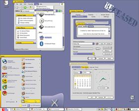
Yellow Tab
Average Rating: 9
Yours: -1
File Size: .16MB
Downloads Today: 0 Downloads Total: 11236

Yellow Tab

Updated Jan 16, 2005 by SkinStudio


First Previous Page 1 of 2 Next Last
mjmarino
Comment #1 Sunday, January 16, 2005 2:09 AM
I'm really enjoying this one - smooth, clean lines and I like the colors - easy on the eyes
BX
Comment #2 Sunday, January 16, 2005 4:45 AM
Great skin ....
APB
Comment #3 Sunday, January 16, 2005 7:08 AM
I like this work!
jardragon901
Comment #4 Sunday, January 16, 2005 7:51 AM
Wow, nice skin but, when you maximize a window it really looks wierd because it cuts off the top of the tab and looks a little bleh. Other than that it just feels smooooth, I love it .
Boss019
Comment #5 Sunday, January 16, 2005 11:44 AM
Really really like this one, looks and feels great...I added a compact start and it rocks even more...super job
butch123
Comment #6 Sunday, January 16, 2005 12:25 PM
nice skin,
syonin
Comment #7 Sunday, January 16, 2005 12:33 PM
I like this one alot.

Be is the bomb.
DPG
Comment #8 Sunday, January 16, 2005 12:38 PM
Well done!! At first I didn't think I'd like it(Yellow is not my thing), but after using it for awile I find it quite usable. The BlueCurve Animations and Toolbar Icons I ported work well with this skin.
http://dpg.wincustomize.com/Gallery.aspx?SID=4289
cakeypower
Comment #9 Sunday, January 16, 2005 2:13 PM
Very nice! The XFce4 version is great too --> http://www.clanfss.com/forum/uploads/post-5-1093285615.jpg
SkinStudio
Comment #10 Sunday, January 16, 2005 3:43 PM
Thanks everyone for your kind words.

DPG - thanks for your icons and animations - I'll add links to them in the skin description.

cakeypower, the problem with the link is that it's on Linux. Plus they've only changed the titlebar to Beos 6 - the rest is still BeOs 4. It's still nice.
Randahl
Comment #11 Sunday, January 16, 2005 4:40 PM
you stole my idea!
Just kidding!
I was thinking about where BeOs went and was just beginning to dream up my first attempt with something very similar! But, oh well, back to the olde drawing board so they say!

Another fine piece of work from you! This will be used for a while!
TheD2JBug
Comment #12 Sunday, January 16, 2005 6:07 PM
This skin is the shiznat .. Awesome work .
forget 5/5 stars this one gets a star on the Walk of Fame.
Steve Grenier
Comment #13 Sunday, January 16, 2005 6:27 PM
Great work Adam. I like this a lot. There needed to be a nice BeOS theme out there. All the others were outdated.
kt
Comment #14 Sunday, January 16, 2005 10:48 PM
I agree with TheD2JBug , this is INCREDIBLY , as it does bring back memories , This makes me wonder if skinning will encompass all OSes in the future I.E... how far can it all go?, I just look at some of the OSX skins and desktopx and objectdock trying to look like mack now this, I think i dont wanna go back into my Wb library for a while. Ratings/Schmatings this is 10 out of 10
CygnusXII
Comment #15 Monday, January 17, 2005 8:21 PM
Very Interesting and unique ideafor a BeSkin.
1ke
Comment #16 Tuesday, January 18, 2005 1:38 AM
This is a fine tribute to a great experiment of an OS.

It's a shame more people don't port their WB skins to Opera, but most full-featured WBs include IE stuff. Just in case anyone's interested, info on skinning for Opera can be found at these links:
Link - General How-To
Link - Full skinning specs
Link - A nice resource, with TONS of buttons
Link - This is almost voodoo, it's a page that allows you to mix/match, edit, and create skins for Opera from a large list of the currently available user-made ones as well as all the native program ones. Takes a bit of getting used to with the simple interface, but very cool.

I mention this because whoever ported the BeOS skin to Opera didn't use
sevyn
Comment #17 Tuesday, January 18, 2005 6:19 PM
Very nice work. I miss BeOS and was really glad to see this as the only acceptable BeOS Windowblinds skin is REALLY old (although it aged well ).
acrane13
Comment #18 Wednesday, January 19, 2005 3:48 PM
I love this skin. It is now my skin of choice.

I do have one comment though. Although not a BeOS feature, it would be really nice to the the application icon just to the left of the window title.

Keep up the good work!
Christine Hill
Comment #19 Monday, January 24, 2005 10:36 PM
wanted to let you know I think this is a very nice skin. . . like the colors and the whole thing. . . with one exception. .. the status bar is bright pink and on your pictures it is not. . . can you let me know if this is a problem or is there a way to fix this on my end?

XP Home SP2 used here.

Thanks,
christy
SkinStudio
Comment #20 Tuesday, January 25, 2005 2:01 PM
Christine, that would probably mean an old versionof WindowBlinds.

Please login to comment and/or vote for this skin.

Welcome Guest! Please take the time to register with us.
There are many great features available to you once you register, including:

  • Richer content, access to many features that are disabled for guests like commenting on the forums and downloading files.
  • Access to a great community, with a massive database of many, many areas of interest.
  • Access to contests & subscription offers like exclusive emails.
  • It's simple, and FREE!
Downloads remaining: 5
User Level: Visitor

Featured WindowBlinds

Popular WindowBlinds

Top WindowBlinds Skinners

Yesterday  |   Last 30 Days  |   All Time
1. LightStar 6903
2. don5318 4358
3. Vampothika 3649
4. SimplexDesigns 3184
5. adni18 2611
6. 2of3 1372
7. retiredmaster 1205
8. AeroPurple 899
9. SemoB 656
10. DaveBax 609
11. IceBabee 584
12. gmc2 574
13. BoXXi 541
14. Dcrew57 444
15. jazzymjr 345


web-wc01