Comment #42 Tuesday, September 20, 2005 7:06 PM

Comment #43 Tuesday, September 20, 2005 7:07 PM
Comment #44 Tuesday, September 20, 2005 7:16 PM
actully i did make a very thin line between the toolbar and the title bar in perious ver
whcih means u can grab it by clicking on the thin line
but my tester said that it is not very gd
it is impossible to make "FUZZY?BLURRY" type border until wb5 release
pls enjoy it before wb5 release
^^
may be i will release the version with thin bar on the toolbar tonight
Comment #45 Tuesday, September 20, 2005 7:40 PM
So I removed it, went back to the skin I had been using, closed WB, then reopened it, choose this skin and the font issue disappeared

Comment #46 Tuesday, September 20, 2005 8:25 PM
 - Q
- QComment #47 Tuesday, September 20, 2005 11:03 PM
Comment #48 Wednesday, September 21, 2005 12:29 AM
Comment #49 Wednesday, September 21, 2005 12:59 AM
 Thank you for the full start
  Now we have Aero/Longhorn/Vitsa!
Comment #50 Wednesday, September 21, 2005 2:44 AM
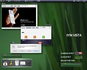
And... I've kept looking all over the web, and I mean EVERYWHERE, for the Aero Glass effect, whether it's a WB skin or not.
No, this isn't a perfect replication of Aero Glass, but it IS by far, the finest emulation I've come across to date!
I did have to change the default font to "Segoe UI", in "User Overrides", but that did the trick... I already had the font on my system, 'cause either it came on my PC, or it installed when I installed Kol's theme. No biggie...
What I've really gotta say, though, is that this is one heck of a creative effort! It took real smarts to figure out how to get this effect to work in WB 4.6, and you've done it!!!!! That's really why I keep coming back to this community... to see who's coming up with the fresh ideas!
So, give yourself a big pat on the back here, for a tricky job EXTREMELY well done, and I'm sure we're all looking forward to seeing what you come up with next! Congratulations!
Comment #51 Wednesday, September 21, 2005 3:15 AM

i had some problems with the font but i've solved that.

Comment #52 Wednesday, September 21, 2005 3:20 AM
bravo on a job well done


Comment #53 Wednesday, September 21, 2005 5:46 AM
Comment #54 Wednesday, September 21, 2005 9:04 AM
Great skin btw! Congrats

Comment #55 Wednesday, September 21, 2005 9:44 AM
Comment #56 Wednesday, September 21, 2005 11:59 AM
Would you please contact me? I have a question for you, You can find my mail in my profile,
thanks!
Comment #57 Wednesday, September 21, 2005 12:37 PM
Comment #58 Wednesday, September 21, 2005 12:53 PM
Nice work.
But which skin did you use for the objectdock?
Comment #60 Wednesday, September 21, 2005 1:45 PM
Please login to comment and/or vote for this skin.
Welcome Guest! Please take the time to register with us.
There are many great features available to you once you register, including:
- Richer content, access to many features that are disabled for guests like commenting on the forums and downloading files.
- Access to a great community, with a massive database of many, many areas of interest.
- Access to contests & subscription offers like exclusive emails.
- It's simple, and FREE!


Comment #41 Tuesday, September 20, 2005 6:30 PM
Tadad offers a skin with thin horizontal lines in the border, which allows you to click and reposition the window. This seems to work only half the time because I seem to miss grabbing one of the horizontal lines when I try to grab and move the window. Here's the link: http://www.deviantart.com/deviation/22194544/ Does all this make sense to you? If this can be fixed, then a definite 10/10! Great skin never the less.