


|
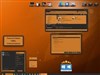
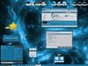
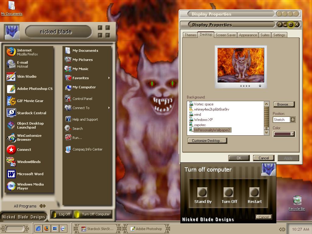
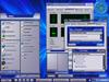
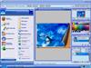
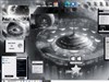
Up Town RevisitedUpdated Oct 05, 2005 by Nicked Blade |
||||||||
_TAPPER_
Comment #2 Friday, October 7, 2005 9:17 PM
Comment #2 Friday, October 7, 2005 9:17 PM
This is a great looking WB nicked blade, Can't wait to try it out. 

aimzzz
Comment #3 Friday, October 7, 2005 9:29 PM
Comment #3 Friday, October 7, 2005 9:29 PM
Nicked,
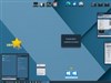
Here's the best link on making a Compact Start Menu-- Adam explains how to add the extra menu without adding the weight of an entire duplicate shell. I use this approach any time the WB doesn't include a Compact Start menu. (Well almost-- a few designs are too asymmetrical for this approach.) Anyway, good stuff:
How to make a compact start menus in a substyle By Adam Najmanowicz http://adam.wincustomize.com/Articles.aspx?AID=22482
Fairyy~
Comment #4 Tuesday, October 11, 2005 5:32 AM
Comment #4 Tuesday, October 11, 2005 5:32 AM
I agree with aimzzz ..lots of improvements..still love the original color but I know I will also use this one also. Hopefully someone explained how to add the compact as a Substyle. I make the compact anyway but I know others like a Comp too.
Good job.
Good job.
Nick Blade
Comment #5 Tuesday, October 11, 2005 9:01 AM
Comment #5 Tuesday, October 11, 2005 9:01 AM
i found a tutorial on it but i have not done anything yet because of the new featura on WB5 takeing up my time. i'll get to it today and get it uploaded.
fasterus
Comment #6 Tuesday, October 11, 2005 11:01 PM
Comment #6 Tuesday, October 11, 2005 11:01 PM
---- I didn't catch the first one but using your "new and improved" version is ----(brain cramp)----fun? -- exciting?-- ahhhhhhh! OK--- It's a Darn Good Skin.Some of the little things make the difference like how the arrows are drawn and flur de le (poor spelling,I know).It's a great skin when you really have to see what you're doing.Nice Job!!-- 

TopDog
Comment #7 Monday, January 2, 2006 11:32 PM
Comment #7 Monday, January 2, 2006 11:32 PM
Really nice colors and contrast. This is easy on the eyes and pleasant to use. Thanks for a great looking skin. I'm running this in WB5 and have no problems.
Nick Blade
Comment #8 Tuesday, January 3, 2006 5:35 PM
Comment #8 Tuesday, January 3, 2006 5:35 PM
thanks TOPDOG! i use it alot but lately i have been running a skin i want to release soon!
Please login to comment and/or vote for this skin.
Welcome Guest! Please take the time to register with us.
There are many great features available to you once you register, including:
- Richer content, access to many features that are disabled for guests like commenting on the forums and downloading files.
- Access to a great community, with a massive database of many, many areas of interest.
- Access to contests & subscription offers like exclusive emails.
- It's simple, and FREE!


Comment #1 Friday, October 7, 2005 8:52 PM
There are a couple of links that explain how to make a Compact Start Menu. I will look them up later. If somebody has them handy, please post.
Doing great!