Comment #124 Saturday, November 19, 2005 1:03 PM
Comment #125 Saturday, November 19, 2005 9:49 PM
Comment #126 Saturday, November 19, 2005 10:06 PM

It'd be perfect if it had a thin taskbar substyle.. Hopefully we'll see this in future updates!

Great work!!
Comment #128 Sunday, November 20, 2005 12:19 AM
I finally found out that the problem with vertical taskbar is obvious because of the big start button.
If the taskbar wouldn't pop up on top of the startmenu the upper part of the start button would be hidden behind the startmenu.
So the skin only works properly for people using the taskbar at the bottom of the screen.
May Mike could make a variation of the skin for ppl that don't use the taskbar at buttom with a smaller button , eventhough the startbutton looks amazing this way.
Comment #129 Sunday, November 20, 2005 9:01 AM
Unfortunately, the Skin has some problem with a double sized taskbar. The shadow of the start-orb doesn't extend to the second row and the popup menus from Freelaunchbar (www.freelaunchbar.com) show behind the taskbar instead of in front of it.
Comment #130 Sunday, November 20, 2005 10:23 AM
hherbzilla: The start button is vertically centered on the taskbar (as long as it's only one row high), so it should be in the same position whether the bar is on top or bottom. Try locking your taskbar so you'll lose the sizer bar and see more overhang.
Etienne, oOSHUUMIOo, and 2much: Those sound like problems with the WindowBlinds beta and the newly added support for oversized start buttons. You may want to report them in the WindowBlinds support forum here.
JoeWang: Unfortunately, WindowsXP only allows for one Start button image, regardless of the taskbar height or position. All I could do was try to make it look as good as possible under those various circumstances.
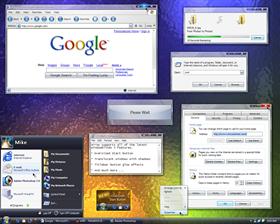
Everyone: Thanks for the feedback.  At this point, I'm just trying to make this as accurate a replica as possible. Down the road sometime, I may add some substyles to cater to some of these requests.
Comment #131 Sunday, November 20, 2005 11:44 AM
Comment #132 Sunday, November 20, 2005 11:47 AM
I'm having a problem with with its menus. Link |
I have the same problem, but ist does not appear directly afer the skin is aplied. It takes some time until the menus are broken.
Comment #133 Monday, November 21, 2005 6:36 AM
Thank you thank you thank you. Nice skin BTW.

Comment #134 Tuesday, November 22, 2005 12:31 AM

Comment #135 Tuesday, November 22, 2005 3:26 PM
Comment #136 Tuesday, November 22, 2005 8:18 PM
Comment #137 Wednesday, November 23, 2005 10:09 AM
Comment #138 Wednesday, November 23, 2005 5:08 PM
LarryH, it was never intended to only appear on mouse over. It just wasn't fully implemented yet in the older WB builds. The bug here appears to be that the start button overlay isn't hidden when the taskbar is. Hopefully that will be fixed in the near future.
Comment #139 Thursday, November 24, 2005 3:11 PM
also: watching TV on my computer in windowed mode will prevent the tv image from being shown. this seems to be an common issue with several programs, I'm using DScaler but someone else already reported that the hauppauge software can't display windowed tv video either.
cheers
IRID1UM
Comment #140 Friday, November 25, 2005 7:32 AM
Please login to comment and/or vote for this skin.
Welcome Guest! Please take the time to register with us.
There are many great features available to you once you register, including:
- Richer content, access to many features that are disabled for guests like commenting on the forums and downloading files.
- Access to a great community, with a massive database of many, many areas of interest.
- Access to contests & subscription offers like exclusive emails.
- It's simple, and FREE!


Comment #121 Saturday, November 19, 2005 8:50 AM