


dirtbreath
Comment #2 Tuesday, October 25, 2005 9:30 AM
Comment #2 Tuesday, October 25, 2005 9:30 AM
Not getting any glass effect. Using 4.6 enhanced on my machine. Nice skin... What's happening?
dirtbreath
Comment #4 Tuesday, October 25, 2005 10:19 AM
Comment #4 Tuesday, October 25, 2005 10:19 AM
Using WB5 enhanced now, Septimus, and still no glass effect. Looks great on the screenshot but still a very nice skin! Thanks for the comment, but if I'm missing something don't know what it is! lol
Mr Shmoe
Comment #5 Tuesday, October 25, 2005 12:08 PM
Comment #5 Tuesday, October 25, 2005 12:08 PM
Great WB skin!
which obejctdock skin are you using?
which obejctdock skin are you using?
Andrew Leonard
Comment #6 Tuesday, October 25, 2005 7:13 PM
Comment #6 Tuesday, October 25, 2005 7:13 PM
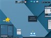
Cool Skin - Can i get the bubble wallpaper?
DesignCaddy
Comment #7 Wednesday, October 26, 2005 12:47 AM
Comment #7 Wednesday, October 26, 2005 12:47 AM
repost ( lost in the meltdown )
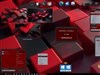
great scheme of blue, good unique design! however i think a couple things are working against your goal of making something easy on the eyes.
The glass version feels choppy, too much contrast. Its mostly those borders, i think they don't sit well with the flat blues. I much prefer the 'normal' style - no borders to get in the way and thus you don't have that extra light color to conflict with your darker content colors. Its more fluid.
On normal, i especially like how you gave shape to the toolbar (something that is lost on glass) but where it meets the scroll bar and task pane you have what appear to be holes from the negative space and these read as a mistake. what if you put more space between to let the toolbar shape stand out?
On both skins, your gray toolbar and taskbar text doesn't stand out so well from the blue - especially in high res. I'd recommend making this text black. it stands out much better and keeps in scheme with your color.
overall i like it, keep it up!
DesignCaddy
Comment #8 Wednesday, October 26, 2005 12:52 AM
Comment #8 Wednesday, October 26, 2005 12:52 AM
someone had posted that this looked like dreamland.... i think not, so many differences especially the corners, scrollbars, and toolbar.
andrew the bubble wallpaper is one of Vlad's and its in the wallpaper library here on WC.
andrew the bubble wallpaper is one of Vlad's and its in the wallpaper library here on WC.
 ~
~
abitestranged
Comment #10 Thursday, October 27, 2005 10:04 PM
Comment #10 Thursday, October 27, 2005 10:04 PM
what icons are you using on your dock bar? Does anyone know?
djAffe
Comment #11 Friday, October 28, 2005 8:34 PM
Comment #11 Friday, October 28, 2005 8:34 PM
I only see WB4.6 for download and 4.x for sale on the stardock site. Where do you get WB5?
zinph
Comment #12 Sunday, October 30, 2005 8:09 AM
Thanks for your suggestion! 
Curaçao Icons
Comment #12 Sunday, October 30, 2005 8:09 AM
| repost ( lost in the meltdown ) great scheme of blue, good unique design! however i think a couple things are working against your goal of making something easy on the eyes. The glass version feels choppy, too much contrast. Its mostly those borders, i think they don't sit well with the flat blues. I much prefer the 'normal' style - no borders to get in the way and thus you don't have that extra light color to conflict with your darker content colors. Its more fluid. On normal, i especially like how you gave shape to the toolbar (something that is lost on glass) but where it meets the scroll bar and task pane you have what appear to be holes from the negative space and these read as a mistake. what if you put more space between to let the toolbar shape stand out? On both skins, your gray toolbar and taskbar text doesn't stand out so well from the blue - especially in high res. I'd recommend making this text black. it stands out much better and keeps in scheme with your color. overall i like it, keep it up! |

| what icons are you using on your dock bar? Does anyone know? |
Curaçao Icons

vorsk
Comment #13 Sunday, November 6, 2005 10:56 AM
Comment #13 Sunday, November 6, 2005 10:56 AM
I'd like to know what icon set those folder icons come from
Really nice skin b.t.w
Really nice skin b.t.w
daggerz
Comment #14 Friday, December 2, 2005 12:35 AM
Comment #14 Friday, December 2, 2005 12:35 AM
Not sure if this is just me or what, but I get an error message when going to control panel and trying to view it in categoy view. The messages reads: parse error '<' at line 1. I don't get this error with any other skin except yours.
Please login to comment and/or vote for this skin.
Welcome Guest! Please take the time to register with us.
There are many great features available to you once you register, including:
- Richer content, access to many features that are disabled for guests like commenting on the forums and downloading files.
- Access to a great community, with a massive database of many, many areas of interest.
- Access to contests & subscription offers like exclusive emails.
- It's simple, and FREE!

Comment #1 Tuesday, October 25, 2005 8:41 AM