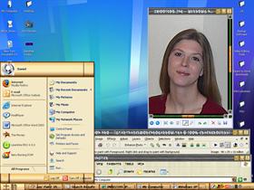
Bushido 2006
Average Rating: 2
Yours: -1
File Size: .48MB
Downloads Today: 0 Downloads Total: 1211

Bushido 2006

Updated Feb 13, 2006 by BobbyLoopa


BX
Comment #1 Monday, February 13, 2006 1:39 PM
A nice try --- !!

Concept is good and color choice is nice --- but this seems to be very very unfinished skin ... try giving it some good touches
DesignCaddy
Comment #2 Monday, February 13, 2006 4:40 PM
A skin you found?

is it your skin?
Buttermaker
Comment #3 Monday, February 13, 2006 9:45 PM
I'd give it a 5 star rating, just because of the cute chick in the photo
BobbyLoopa
Comment #4 Wednesday, February 15, 2006 1:28 AM
Ths skin is one that was uncomplete, I forgot about it when I started a new one based around the blade/metal and scabard concept. I found it before I formated my computer, posted it so that maybe I could complete it later.

I am the original author of the skin.

One thing I would like to point out is the Kenji that I used. That took a while to figure out.

The cute chick is my fiance, and she says it's a waste of time customizing my computer.

The Kenji on the buttons actually(according to the dictionary I used) means (from left to right) little, biggest, and gone. The start button says "starting a journey"

I don't remember what the shutdown menu says, but special thanks to royalty free photographers who let me use the wonderfull shut down image.
TN Brat!
Comment #5 Thursday, February 16, 2006 6:05 AM
Love the movie too, and was looking forward to seeing this skin, but there are many many things that make me unable to use this skin....I know I'm not a WB Skinner personally, but I would have liked to see this one cleaner. Like I don't care for the way the text is interrupted in the task bar...things like that here and there...then some of the images seem to have a "rounded" feel and others are "square" I look forward to an updated version.
boopish
Comment #6 Friday, February 17, 2006 11:44 AM
I must agree with TN Brat! The concept is great...and I like what I see so far. However, as for the taskbar buttons being segmented I find it is distracting...I would like to see them more like "indents", sort of like you see the holes on a bamboo flute. And the Logoff buttons don't do your great photo background justice. I really like the sliders, though! Am looking forward to seeing a more complete version.

Ps...customizing is never a waste of time!!! I consider it part of my overall home decorating scheme

Please login to comment and/or vote for this skin.

Welcome Guest! Please take the time to register with us.
There are many great features available to you once you register, including:

  • Richer content, access to many features that are disabled for guests like commenting on the forums and downloading files.
  • Access to a great community, with a massive database of many, many areas of interest.
  • Access to contests & subscription offers like exclusive emails.
  • It's simple, and FREE!
Downloads remaining: 5
User Level: Visitor

More From This Author

Featured WindowBlinds

Popular WindowBlinds

Top WindowBlinds Skinners

Yesterday  |   Last 30 Days  |   All Time
1. LightStar 7247
2. don5318 4399
3. SimplexDesigns 3188
4. Vampothika 3181
5. adni18 2918
6. 2of3 1265
7. retiredmaster 1203
8. AeroPurple 754
9. SemoB 612
10. gmc2 567
11. IceBabee 565
12. BoXXi 531
13. DaveBax 502
14. jazzymjr 424
15. Dcrew57 417


web-wc01