JASX
Average Rating: 4
Yours: -1
File Size: .85MB
Downloads Today: 0 Downloads Total: 3559

JASX

Updated Feb 16, 2006 by jasonc624


NightTrainthedark
Comment #1 Thursday, February 16, 2006 6:45 PM
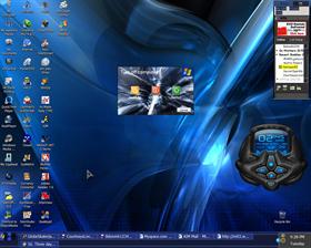
Can we see a window? sheeesh
Hippie
Comment #2 Thursday, February 16, 2006 7:45 PM
And, what media player is that. Looks like WMP.
terigw
Comment #3 Thursday, February 16, 2006 8:49 PM
That is winamp
Matches_Malone
Comment #4 Thursday, February 16, 2006 8:59 PM
Where is the start menu? I know it may be your first skin and all. But if you frequent the skin sites such as wincustomize it has to be more than just a screenshot especially if you are submitting a "WINDOWBLIND" you have to include the start menu, window, shell, and etc... but you have some type of media player no one knows what it is because you did'nt specify and specifics on your write up. 'Get you mind right' or leave the skinning up to the big boys. Nice try however. Not going to be that cruel.
JinnRikki
Comment #5 Thursday, February 16, 2006 9:05 PM
Why do people want icons all over their desktop? I put all mine in quick launch and make it invisible until mouseover. I guess I just like seeing my wallpaper without icons messing it up.
jasonc624
Comment #6 Thursday, February 16, 2006 10:06 PM
what do u mean by shell and all that stuff? why does it matter what media player i have , its just there t make it look good, i like to show off my icons thank you very much
Adrenochrome
Comment #7 Thursday, February 16, 2006 10:32 PM
The most obvious glaring detail, as observed above, is: "Where's the skin?" One point for trying. I'm sure you're on a good path with this first skin. If you can manage to make your previews show the actual elements of your skin, you should be on your way.
-scion-
Comment #8 Friday, February 17, 2006 12:02 AM
a screenshot is meant to "sell" your skin to potential downloaders. you took all this time to create a windowblind, make the screenshot about your creation, not about the stuff on your desktop. showing off your desktop is what the screenshots section is for.

the skin is a really nice job for a first try. tighten up your graphics and skin everything for your next project. there's still bits and peices of luna in there. you have potential and are off to a great start.
sTonEbLuE
Comment #9 Friday, February 17, 2006 7:07 AM
It's his first skin. I don't think it's to bad. So what if he likes icons. Some of these comments are the reason why people leave. If people can't be more encouraging maybe they shouldn't say anything...... At least say what you want without the smartass meanings behind them.....

sheeesh
Joan Polishan
Comment #10 Friday, February 17, 2006 10:43 AM
Good job ,keep skinning.
snowhawk77c
Comment #11 Friday, February 17, 2006 5:21 PM
All i see is Winamp and the shut down menu and sothing that looks similar to a start button. 1 its to dark and 2 the min/max and exit buttons look messed and dont blend in well.i for one wouldnt use this skin i would use it however if it was lighter and everything looked..well..good?
jasonc624
Comment #12 Friday, February 17, 2006 6:50 PM
thank you all for ur wonder ful comments, i actually updated the start button the day after i made this skin, and just to tell you, this skin was from scratch not from luna, i will try to put the updated skin later
Y3HUDARTS
Comment #13 Saturday, February 18, 2006 1:25 PM
Very amateuristic, and painful to watch.
IT-Slave
Comment #14 Sunday, February 19, 2006 10:03 PM
Most of the comments here are just trying to help you out. It's a good skin, and adding the player skin is nice, but most of us want to "re-create" what we see in your skining efforts. So take the suggestions with a grain of salt and keep doing what you're doing. It does help to take a screen shot showing the versatility of your work.
Malaeus
Comment #15 Saturday, February 25, 2006 11:50 PM
nice first try, but read through how to submit your art first, we need to see each item before we can critique.

also, work on using clearer images, and not just boxes. a little rounding is easy to do with the right tools

ie (photoshop CS2)
Razor1991
Comment #16 Saturday, November 17, 2007 5:29 PM
Are you a skater? ">

Oh also a nice skin, thx

ICQ: 440732264
MSN: matze-vo@hotmail.de

I'm from Germany

Please login to comment and/or vote for this skin.

Welcome Guest! Please take the time to register with us.
There are many great features available to you once you register, including:

  • Richer content, access to many features that are disabled for guests like commenting on the forums and downloading files.
  • Access to a great community, with a massive database of many, many areas of interest.
  • Access to contests & subscription offers like exclusive emails.
  • It's simple, and FREE!
Downloads remaining: 5
User Level: Visitor

Featured WindowBlinds

Popular WindowBlinds

Top WindowBlinds Skinners

Yesterday  |   Last 30 Days  |   All Time
1. LightStar 6903
2. don5318 4358
3. Vampothika 3649
4. SimplexDesigns 3184
5. adni18 2611
6. 2of3 1372
7. retiredmaster 1205
8. AeroPurple 899
9. SemoB 656
10. DaveBax 609
11. IceBabee 584
12. gmc2 574
13. BoXXi 541
14. Dcrew57 444
15. jazzymjr 345


web-wc01