Comment #23 Friday, February 17, 2006 2:01 PM
 Special note to Skinner Joseph: thank you very much for all your lovelly commentes, they were deeply appreciated. Apprentice jarget: Yes, there is an Icon Packager theme, but I am trying to upload it during the last 3 hours without success, the file is huge because all the icons have sizes from 16x16 all the way up to 256x256 and I am recieving a lot of "request timed out" error messages. But don't worry, I am keep trying
Comment #24 Friday, February 17, 2006 3:00 PM
Comment #25 Friday, February 17, 2006 3:08 PM

Comment #26 Friday, February 17, 2006 3:19 PM


Comment #27 Friday, February 17, 2006 3:40 PM

Comment #28 Friday, February 17, 2006 3:49 PM

Comment #29 Friday, February 17, 2006 3:54 PM

Comment #30 Friday, February 17, 2006 3:55 PM
Unfortunately two problems of not little importance.
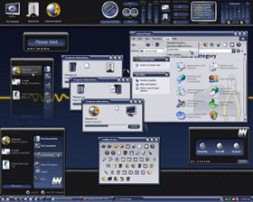
When you select the tolbars icons in Internet Explorer it appears undouble and with a casual selection in terms of pictures.
In the compact men the descriptions of the icons (in the start men) stay rough on the right.
Some solution?
Maurice

Comment #31 Friday, February 17, 2006 3:58 PM

Treetog : Is there any chance for a fitting tabbed ObjectDock ?

Comment #33 Friday, February 17, 2006 4:22 PM
Annoying because apart from that I love the skin!
Comment #34 Friday, February 17, 2006 4:35 PM
 Been waiting on something from ya. This is a 10 Star suite

Comment #35 Friday, February 17, 2006 4:42 PM
Is it only one problem of mine?
Comment #36 Friday, February 17, 2006 4:45 PM

Comment #37 Friday, February 17, 2006 5:13 PM


it´s no more to say

Comment #38 Friday, February 17, 2006 5:16 PM
I, habitually, use the small icons, but for this very beautiful skin I will use those great.
If Treetog doesn't desire to make an intervention there is no problem, but a limitation stays that there is not however in the other skins.
Thanks however.
Maurice.

Comment #40 Friday, February 17, 2006 7:10 PM
Please login to comment and/or vote for this skin.
Welcome Guest! Please take the time to register with us.
There are many great features available to you once you register, including:
- Richer content, access to many features that are disabled for guests like commenting on the forums and downloading files.
- Access to a great community, with a massive database of many, many areas of interest.
- Access to contests & subscription offers like exclusive emails.
- It's simple, and FREE!


Comment #21 Friday, February 17, 2006 1:44 PM
Night Train, how did you fix it? Thanks.