Comment #3 Thursday, April 20, 2006 8:17 AM
I have run into that 'parse error line 1' before with the 'Clear One skin' but I didn't know what caused it. Thanks Cavan.
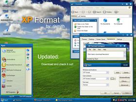
My first impression is that it is simple, clean, a little nostalgic, and well done. I'll let you know more after I play around with it. Good first skin, though!

Comment #4 Thursday, April 20, 2006 8:17 AM
Comment #5 Thursday, April 20, 2006 8:20 AM
Welldone and welcome to the family

Comment #6 Thursday, April 20, 2006 9:00 AM
I like, In the all programs part of start menu the green and blue mixture is great. The red and blues are nice.
could do with some more work on buttons, ...also for you 1st update a very minor bug... hover over the close button it changes red (nice) but it is then 1px off from the right border (look closely)
Nice start!

Comment #7 Thursday, April 20, 2006 9:34 AM

Comment #8 Thursday, April 20, 2006 9:43 AM
Anyhow, I really like your sense of style and the colors that you've selected. This is a very pleasant skin to look at and it just works well. It's a great blend of simplicity and elegance. I really really like it. You need to keep developing this talent of yours because I could see you turning out some awesome stuff in the future. You rock.
Comment #9 Thursday, April 20, 2006 9:50 AM

I would like to see a non-compact start menu version though.

Comment #10 Thursday, April 20, 2006 10:55 AM

ERICDRUM: I am not sure about the black, but it is most likely that the program that you spoke of does not support transparent tabs...maybe...I am not sure. And yes I will make a few substyles; maybe a new shellstyle.
Comment #11 Thursday, April 20, 2006 2:22 PM

Comment #12 Thursday, April 20, 2006 4:12 PM

If you are feeling super hardcore, you can go to eclipse.org and download it (100MB). You don't have to install it, you just put on your local drive somewhere and run it from the file system directly. It's super light weight.

Comment #14 Thursday, April 20, 2006 7:38 PM
 Super skin, crisp, clear, practical and fully usable on a day-to-day basis.
 Just one comment on top of above is that I can't read any tooltips, they are white on light beige. The colours need to be of higher contrast. Also, you don't appear to have set the height of toolbars correctly and the bottom few pixels are getting overdrawn by the main window (for example, see Stardock Central). Thanks for your hard work.
Comment #15 Thursday, April 20, 2006 9:07 PM

Comment #16 Thursday, April 20, 2006 9:46 PM
i know there is a few like it. that 1, the night time one, and the original day time 1. can any1 tell me where i can get them? i love the skin. good job for a first skinner. a few bugs, but overall, GREAT SKIN!


Comment #18 Friday, April 21, 2006 9:23 AM

Comment #19 Friday, April 21, 2006 10:54 AM
Working on an update, but until my upload section get working correctly, it'll have to wait.
Any site admins wishing to help...email me please.
Comment #20 Friday, April 21, 2006 12:46 PM
When I highligh text, the font color changes to white. Would you mind changing the highlight color to something darker?
Here's what the window borders look like in Mirc
http://suprfile.com/src/1/n3q7hm/mirc.jpg
And in Photoshop
http://suprfile.com/src/1/n3x9pc/photoshop.jpg
Perhaps it's the same issue with Eclipse?
Please login to comment and/or vote for this skin.
Welcome Guest! Please take the time to register with us.
There are many great features available to you once you register, including:
- Richer content, access to many features that are disabled for guests like commenting on the forums and downloading files.
- Access to a great community, with a massive database of many, many areas of interest.
- Access to contests & subscription offers like exclusive emails.
- It's simple, and FREE!


Comment #1 Thursday, April 20, 2006 6:42 AM