Comment #42 Sunday, June 4, 2006 9:23 AM


Comment #43 Sunday, June 4, 2006 3:35 PM
Your skin is fantastic!
There is unfortunately a problem with WB verifiable in many skins as yours.
This occurs when you reduce the window of Internet Explorer.
The edges of the window (in low and to the right) are not skinned.
I repeat: it is not a problem of your skin but of WB.
I know it for over a year.
Five stars!

Maurizio.
Comment #45 Sunday, June 4, 2006 5:39 PM

Comment #46 Sunday, June 4, 2006 8:20 PM

Comment #47 Sunday, June 4, 2006 9:25 PM
| I've noticed that you included 5 'hidden balls' of 'magic'. I've found the uses of the first 4, but what does the 5th do? |
...the fifth extra button seems to minimize the window, but maintains focus on it.
Comment #48 Monday, June 5, 2006 12:56 AM


keep up the good work man
Comment #49 Monday, June 5, 2006 5:02 PM
| the fifth extra button seems to minimize the window, but maintains focus on it. |
on my computer (using WB 4.5), the fifth (lower right) circle does nothing. I think ur talking about the third (top right) on the first (top left). When i click the fifth it doesnt even stay on.
Comment #53 Wednesday, June 7, 2006 12:07 AM
Comment #54 Wednesday, June 7, 2006 11:55 AM

Can't wait for the "coming soon" stuff.

Comment #55 Wednesday, June 7, 2006 9:07 PM

Comment #56 Thursday, June 8, 2006 7:40 PM
This skin is so great I would marry it...
I give it a 20/10

The only thing is
[It's not a bad thing either, It just doesn't match with my Theme]

Is when I rollover the running programs and Press them, it has the Red/Yellow/Green Sytle.
My wallpaper is just Black and Red.

If it's possible can you create a style to this theme called.
MotoXP [No Lights]- I swear if you do you rock sooooooooo much.
And for this Theme you would just have darker shades of red when I rollover and press the Running programs on my Taskbar/
I swear if you did this it would be a 100000+/10.
ChaNinja you are the greatest WB designer ever.
[This is my first post ever on this site
I look foward to the new version.

Comment #58 Saturday, June 10, 2006 1:40 AM

Comment #59 Saturday, June 10, 2006 6:44 PM
Other than these things and a couple of things i would change for personal preference.. this is an awesome skin.
Start Menu is as original as i have seen.

Comment #60 Monday, June 19, 2006 1:46 PM
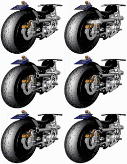
If I could do a WB to do that bike justice I would have created this!
Changed the hue to match the green of that sadly-lamented bike.
This absolutely f*&%!ing rocks !!


Please login to comment and/or vote for this skin.
Welcome Guest! Please take the time to register with us.
There are many great features available to you once you register, including:
- Richer content, access to many features that are disabled for guests like commenting on the forums and downloading files.
- Access to a great community, with a massive database of many, many areas of interest.
- Access to contests & subscription offers like exclusive emails.
- It's simple, and FREE!


Comment #41 Saturday, June 3, 2006 9:32 PM