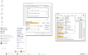
Whity
Average Rating: 5
Yours: -1
File Size: .09MB
Downloads Today: 3 Downloads Total: 7753

Whity

Updated Jun 22, 2006 by non is better


First Previous Page 1 of 2 Next Last
suniart
Comment #1 Thursday, June 22, 2006 1:04 PM
Nice . Simple yet elegant. I LIKE IT!
BoXXi
Comment #2 Friday, June 23, 2006 4:37 AM
certainly deserves a better rating....... so I gave it a better rating.
samadhi
Comment #3 Friday, June 23, 2006 9:29 AM
Master piece. This is the core of the anti-skinning method. Congratulations for the impudent upload.
cygng
Comment #4 Friday, June 23, 2006 10:47 AM
sorry dude, a bit too kracka for me...
bawksayspring
Comment #5 Friday, June 23, 2006 11:09 AM
Whity went & made me Blindy
kin242
Comment #6 Friday, June 23, 2006 2:04 PM
min
roottwice
Comment #7 Friday, June 23, 2006 2:06 PM
how do i open this? my computer says it cant recgonize .wba files?
roottwice
Comment #8 Friday, June 23, 2006 2:06 PM
how do i open this? my computer says it cant recgonize .wba files?
spinal
Comment #9 Friday, June 23, 2006 4:00 PM
I almost like it, but I'm having difficulty telling different parts of my computre from other parts.
ben38
Comment #10 Friday, June 23, 2006 5:32 PM
No Thanks!!
che_pi
Comment #11 Friday, June 23, 2006 9:32 PM
This is great, thanks!
ZekeTheSquirrel
Comment #12 Saturday, June 24, 2006 3:11 AM
Too...bright...must...look away.

Otherwise, good job.
lgspence
Comment #13 Saturday, June 24, 2006 5:15 PM
To much white.
drkshdw4u
Comment #14 Saturday, June 24, 2006 11:57 PM
little too plain but nice i guess
vStyler
Comment #15 Sunday, June 25, 2006 12:35 AM
owww... it burns !!!

jk.. juss too whitey...matey.
DesignCaddy
Comment #16 Monday, June 26, 2006 11:44 PM
'anti skinning method?' haha deconstructivist interface design, lets have it!

You can get away with very basic stuff like this, its a neat idea - but you could make it a bit more usable at the same time, with more obvious distrinction between focused windows, buttons, etc. Definitly worth a look at
retiredmaster
Comment #17 Tuesday, June 27, 2006 8:12 AM
ooh - it's 'Progenitor', well a bit.
footballer62
Comment #18 Wednesday, June 28, 2006 9:59 PM
dude, I love this, if you could though, make a black one (probally have to change the min, max, exit, and font color), and maybe make a dif colored one, like blue, or sumthin that can be custom colored later on in wb.

AWESOME, it is what I have for my blind right now!
non is better
Comment #19 Saturday, July 1, 2006 5:11 PM
thanks footballer62, you seem to be one of few how really likes it (that really gets is)
see if i make some other collors, if i do i let you know, and if you feel like it make do it your self that would be nice.

see you man
nightbirdsf
Comment #20 Monday, July 3, 2006 6:18 AM
I like it! It reminds me of the virtual space of Zion Traffic Control from the second Matrix movie.


If you need to mark off active items, could you use light gray?

Please login to comment and/or vote for this skin.

Welcome Guest! Please take the time to register with us.
There are many great features available to you once you register, including:

  • Richer content, access to many features that are disabled for guests like commenting on the forums and downloading files.
  • Access to a great community, with a massive database of many, many areas of interest.
  • Access to contests & subscription offers like exclusive emails.
  • It's simple, and FREE!
Downloads remaining: 5
User Level: Visitor

Featured WindowBlinds

Popular WindowBlinds

Top WindowBlinds Skinners

Yesterday  |   Last 30 Days  |   All Time
1. LightStar 6832
2. don5318 4383
3. Vampothika 3498
4. SimplexDesigns 3109
5. adni18 2472
6. 2of3 1365
7. retiredmaster 1184
8. AeroPurple 863
9. SemoB 644
10. BoXXi 575
11. DaveBax 571
12. IceBabee 565
13. gmc2 528
14. Dcrew57 443
15. jazzymjr 362


web-wc01