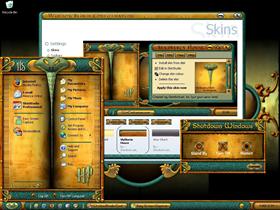
Slytherin House
Average Rating: 8
Yours: -1
File Size: 2.9MB
Downloads Today: 1 Downloads Total: 49535

Slytherin House

Updated Jan 24, 2007 by HeirOfSlytherin


First Previous Page 2 of 6 Next Last
Jan Oscar
Comment #21 Sunday, August 6, 2006 8:25 PM
Different & excellent!
Grayelk
Comment #22 Sunday, August 6, 2006 9:48 PM
love your skin, i did it up as a screen shot someone said i have no taste thankyou for this skin i love the colors and the snake cool
PandaPaws
Comment #23 Sunday, August 6, 2006 10:29 PM
Excellent job on this skin....i like the details and hard work you put into it. Harry Potter rules!
kmlane
Comment #24 Sunday, August 6, 2006 10:44 PM
Wow! Very original skin and well done at that. Reminds me of mid-evil times.
HeirOfSlytherin
Comment #25 Monday, August 7, 2006 12:06 AM
Thanks again to everyone on the great commets. Did you hear what happens to Harry Potter in the final book?
nuttygardener
Comment #26 Monday, August 7, 2006 7:03 AM
Thanks nuttygardener. Did you use my animated wall and WB skin at the same time? It takes up alot of memory


Nope. Just the WB. Could be just my system, I guess.
DocX
Comment #27 Monday, August 7, 2006 10:10 AM
Nice to see someone do something differnt and original for a change. Nice work man!
HeirOfSlytherin
Comment #28 Monday, August 7, 2006 10:29 AM
nuttygardener. I noticed the same thing when i was making it. Could be all the animation. I'm running 2GB of ram with a Pentium 4. I'm working on another theme without animation and it works ok. Must be my Slytherin theme. Thanks DocX. When you have a great subject like Harry Potter, It's easy.
Bampster
Comment #29 Monday, August 7, 2006 12:34 PM
Great Skin! very original design, and the colour is excellent. Enjoyable to use- very user friendly.
HeirOfSlytherin
Comment #30 Monday, August 7, 2006 1:35 PM
Thanks Bampster. I'm glad that this theme is working for everyone. The fewer the problems, the better.
grocks
Comment #31 Monday, August 7, 2006 3:41 PM
Love this skin, the fonts are terrific and the textures are great!! One suggestion for us workaholics, though - could you make the document pages in Word white instead of the lovely green background color? Makes drafting boring lawsuits easier to see!! Please keep up the good work, would love to see you do a Hogwarts skin and maybe even some cursors!! Thanks for making my day!!
Wildharp
Comment #32 Monday, August 7, 2006 8:02 PM
Unbelievable - incredibly well done - skin and walls. congratulations
HeirOfSlytherin
Comment #33 Tuesday, August 8, 2006 1:43 AM
Thanks grocks and Wildharp. I hate to change the doc's page. the green kinda tones down the overall look. White to me sorta shouts at me. The green sets that darkness of Slytherin. A Hogwarts theme has been on my mind to do. There are so many things i want to do, but just don't know where to start. I would like to do something with The Goblet of Fire.
Wildharp
Comment #34 Tuesday, August 8, 2006 11:00 PM
I know I have already commented but since then I have had plenty of chance to set up on my work laptop. this skin and wall combination are amongst the best of many i have used. The textures in the menu and start bar are outstanding. The wb translates to ie7 beautifully - truly amazing - thanks for sharing. This is talented art work.
HeirOfSlytherin
Comment #35 Wednesday, August 9, 2006 2:03 AM
Thanks so much Wildharp. I had no idea that this skin would get a great review. I am happy that everyone is enjoying my theme. And most of all, very little problems with the skin. I guess i got my work cut out for me to make another Harry Potter theme to top this one. Thanks again Wildharp and everyone for your wonderfull comments and support.
blazeaway
Comment #36 Wednesday, August 9, 2006 11:51 AM
--- "ATTABOY"!!!! --- Yes sir ladies and gents, it's been awhile since a special'Theme' skin has come around that has excellent readability and unique design using not only tried and true applications but also innovative concepts by it's creator.The color combinations 'out of the box' are quite striking and are natural attention getters however, if one chooses to tone down or change a shade or two from a green, yellow, or blue, there is no problem using the coloring box in the 'blinds' config.staging area. I for one, am impressed with the detail that has gone into this work and I'm sure many painstaking hours of physical, emotional and mental strife have gone into the development of this "One Of A Kind" skin.----- Great Job!!!!!! -- Mr.B! -------- ---------
djjonwest
Comment #37 Wednesday, August 9, 2006 12:01 PM
I like you origionality. good job!
HeirOfSlytherin
Comment #38 Wednesday, August 9, 2006 2:18 PM
I must say, that is the most outstanding complement i have ever recived. Thankyou very very much blazeaway.
ShitMonkey
Comment #39 Wednesday, August 9, 2006 5:25 PM
That's how we all feel. Great way of putting it Blazeaway. That says it all.
ShitMonkey
Comment #40 Wednesday, August 9, 2006 5:30 PM
And the rainlendar is great. All we need yet is a SysMetrix and I think that would finnish it. Ooops...... I for got a winamp and a winmedia.

Please login to comment and/or vote for this skin.

Welcome Guest! Please take the time to register with us.
There are many great features available to you once you register, including:

  • Richer content, access to many features that are disabled for guests like commenting on the forums and downloading files.
  • Access to a great community, with a massive database of many, many areas of interest.
  • Access to contests & subscription offers like exclusive emails.
  • It's simple, and FREE!
Downloads remaining: 5
User Level: Visitor

Featured WindowBlinds

Popular WindowBlinds

Top WindowBlinds Skinners

Yesterday  |   Last 30 Days  |   All Time
1. LightStar 7478
2. don5318 4712
3. SimplexDesigns 3184
4. Vampothika 3170
5. adni18 2777
6. 2of3 1382
7. retiredmaster 1304
8. AeroPurple 765
9. gmc2 682
10. IceBabee 622
11. SemoB 600
12. DaveBax 542
13. BoXXi 533
14. jazzymjr 453
15. Dcrew57 429


web-wc01