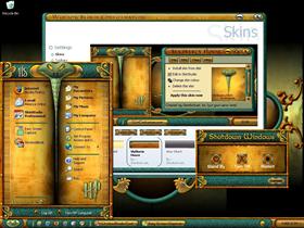
Slytherin House
Average Rating: 8
Yours: -1
File Size: 2.9MB
Downloads Today: 1 Downloads Total: 49535

Slytherin House

Updated Jan 24, 2007 by HeirOfSlytherin


First Previous Page 4 of 6 Next Last
Biffthekid
Comment #61 Friday, August 18, 2006 4:23 AM
You should make a suite with everything like iconpackanger and cursorxp logon studio, boot skin, and the whole deal that would be really really cool to have a whole suite set up
woodmonkey
Comment #62 Thursday, August 24, 2006 12:26 AM
This should get five stars, I never comented on anyones work here before.
I Love it, right up my alley. Good Job
HeirOfSlytherin
Comment #63 Thursday, August 24, 2006 2:47 AM
Thanks so much woodmonkey.
grocks
Comment #64 Friday, September 15, 2006 12:43 PM
I already commented, but I'll post again about how much I adore (ADORE!!) this skin. Can you tell me, though, how to change the grey text in the subject lines of read e-mails in Outlook to a darker or lighter color? They're almost impossible for my middle-aged eyes to read against the green background, even with glasses! Can't wait to see what youc ome up with next, you talked about doing a Hogwart's skin, any luck for us fans? Also, do you have any interest in a cursor set? Maybe based on Harry's wand? Thanks for your time and work on these pieces of art!
Justin Rhoades
Comment #65 Saturday, September 30, 2006 10:09 PM
yes i was wondering if ur still going to recolor this to red
HeirOfSlytherin
Comment #66 Sunday, October 1, 2006 2:34 AM
Hi grocks and Justin. Sorry for not replying. I have been working on some projects for the GUI contest. Icons are'not my thing. I have a lot of problems making them. They don't look too good. A Hogwarts and a red Slytherin House is in the works. It may be another month or so befor i get the new Harry Potter themes done. Keep an eye out for them and thanks for your intrest in them.
Justin Rhoades
Comment #67 Sunday, October 1, 2006 12:50 PM
ok thanks and good luck on ur icons for the GUI Championship
freebird4155
Comment #68 Wednesday, October 11, 2006 2:35 AM
I have tried to download this beautiful skin 3 times. When I open the zip file there is nothing inside......I absolutely LOVE this skin. Can you help me out?

JeriLynn
Justin Rhoades
Comment #69 Saturday, October 14, 2006 2:34 AM
There is no zip file its just a wba file u open it with windowblinds and it should work
freebird4155
Comment #70 Monday, October 16, 2006 9:32 PM
I don't understand why it isn't working but I love this skin and I have to have it, so I'll keep trying. Thanks for your input Justin.
BiffBKStudmuffin
Comment #71 Tuesday, December 19, 2006 12:48 AM
Hey im still wondering if you r releasing ur Red one of this and i also want to know how your Hogwarts one is coming along. Would be great to hear how everything is going
HeirOfSlytherin
Comment #72 Friday, December 22, 2006 4:04 PM
I will spend a lot of attention on the Hogworts theme after the holidays. I started one, but it looks too much like the Slytherin House. I have been watching the first movie over and over to see what key parts of Hogwarts look like so that i can incorprate it into a rendering of my own.
Norman Kent
Comment #73 Tuesday, January 16, 2007 10:25 AM
"Awesome" is the word.. where can we obtain the wallpaper..
rric1
Comment #74 Wednesday, January 24, 2007 12:16 PM
NO THERE IS NO wallpaper in this
rric1
Comment #75 Wednesday, January 24, 2007 12:18 PM
whwre is the wll in this thingt�
lzvk25
Comment #76 Wednesday, January 24, 2007 4:36 PM
The wba file that is hosted here, seems to have corrupted files. For instance dumbledore.ttf and the bottom part of the screens displays that nasty pink color. This is specially noticeable with Outlook.
Jeff T
Comment #77 Wednesday, January 24, 2007 6:07 PM
Nice update...thanks for revisiting this theme.
You made a great blind even better!
Spagnacious
Comment #78 Wednesday, January 24, 2007 7:41 PM
HeirOfSlytherin, this is a beautiful skin. I think you have captured the look and feel of Hogwarts. No small feat.

This is strictly an FYI and NO criticism. I have a 1600x1200 display(s) setup and use double wide Taskbar. The Start Menu and the Taskbar start to "fall apart" a bit. I think the stretch params could be at their limit or maybe it is basic bit map size. Dunno. Kinda bums me because I can see how beautiful your graphic building blocks are.

Just for your info. I still enjoy the skin immensely.
bawksayspring
Comment #79 Thursday, January 25, 2007 12:52 AM
yes very nice work. i have seen a great inprovement in your work from them the 1st v to this v
HeirOfSlytherin
Comment #80 Thursday, January 25, 2007 3:48 AM
Thanks all for your great comments and bug report. I wasen't sure about the color combo for everyone, but it just for some reason looked good. If your running WB 4, you will probably get the magic pink in your brousers for some reason. I updated this theme for WB5. Although i have rebuilt this theme three times useing various SkinStudio upgrades. So far Welcome to Hogwarts seams to work ok for everyone. I will transfer some of the settings from that theme to Slytherin House and see if that clears up the bugs.�

Please login to comment and/or vote for this skin.

Welcome Guest! Please take the time to register with us.
There are many great features available to you once you register, including:

  • Richer content, access to many features that are disabled for guests like commenting on the forums and downloading files.
  • Access to a great community, with a massive database of many, many areas of interest.
  • Access to contests & subscription offers like exclusive emails.
  • It's simple, and FREE!
Downloads remaining: 5
User Level: Visitor

Featured WindowBlinds

Popular WindowBlinds

Top WindowBlinds Skinners

Yesterday  |   Last 30 Days  |   All Time
1. LightStar 7478
2. don5318 4712
3. SimplexDesigns 3184
4. Vampothika 3170
5. adni18 2777
6. 2of3 1382
7. retiredmaster 1304
8. AeroPurple 765
9. gmc2 682
10. IceBabee 622
11. SemoB 600
12. DaveBax 542
13. BoXXi 533
14. jazzymjr 453
15. Dcrew57 429


web-wc01