Comment #62 Wednesday, September 13, 2006 2:20 AM


Comment #63 Wednesday, September 13, 2006 1:01 PM
| Quote Reply Martin Eden said: I find text boxes for input difficult as they're pretty much invisible Where are those 'invisible" boxes? I don't understand... techtype said: If you try to write an email in Outlook, you can't tell where anything should go I don't have any diffculty to write emails in Outlook... I don't get it... |
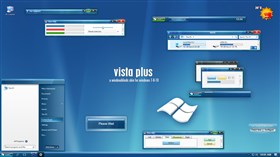
It took some color definitions to get enough contrast to see text boxes on my LCD screens, see image for adjusted colors.

Comment #64 Wednesday, September 13, 2006 2:13 PM
Comment #65 Wednesday, September 13, 2006 2:32 PM
| techtype, still can't see anything wrong and still can't understand what are you talking about... sorry. |
OK, your screen must show the colors differently. It works fine for me with the color edits shown above. I did those in SkinStudio and saved your modified skin. For me, your skin is a "must have". I love it!!! I've tried them all and this one works the best for me, thanks for sharing!!!
Comment #66 Wednesday, September 13, 2006 3:18 PM
| techtype said: For me, your skin is a "must have". I love it!!! I've tried them all and this one works the best for me, thanks for sharing!!! |
That's a nice comment dear techtype! Thank you

Comment #67 Wednesday, September 13, 2006 4:42 PM

Yer website is very awsome too! keep up the good work!!
Comment #68 Wednesday, September 13, 2006 8:57 PM
Comment #69 Wednesday, September 13, 2006 9:37 PM

[nope...the "selected items" darkening didn't change the text-entry box, so I'll try and use Skin Studio as described above.]
Comment #70 Wednesday, September 13, 2006 10:47 PM
Very nice work my friend.
You are the Master when it comes to detailing and color choices.
This skin is easy on these old eyeballs and very useable from day to day.
Thanks for coming out of the woodwork and sharing your work with us Nikos!

Comment #72 Thursday, September 14, 2006 3:42 AM
| seldomseen said: a slight issue with the textboxes |
Now I understand the "problem of the invisible textboxes", they don't have border...
Personally doesn't bother me at all, but seems that for some of you it is important.
SkinStudio says about it: Default value is none This attribute is optional.
Solution with Skinstudio: Controls->Edit Box->Edge color: Choose a dark color instead of none.
This will solve the problem.
Until the next update you can have the corrected version from: http://www.adni18.com/gallery/details.php?image_id=253
Thank you all again for your nice comments, appreciate them

Comment #74 Thursday, September 14, 2006 10:24 AM
| Now I understand the "problem of the invisible textboxes", they don't have border... Personally doesn't bother me at all, but seems that for some of you it is important. SkinStudio says about it: Default value is none This attribute is optional. Solution with Skinstudio: Controls->Edit Box->Edge color: Choose a dark color instead of none. This will solve the problem. |
Thanks, I added this and it is a big help! I'm still using the color edits too to get a little more contrast for edit boxes and midi windows.
Comment #75 Thursday, September 14, 2006 4:12 PM
 ) Many thanks!!

Comment #77 Thursday, September 14, 2006 5:40 PM
| Solution with Skinstudio: Controls->Edit Box->Edge color: Choose a dark color instead of none |
Hah! I can do it!! Gave it a "grey #10" box, and now I can see it everywhere!! Yay, Nikos!!


Comment #78 Thursday, September 14, 2006 6:23 PM
Comment #80 Friday, September 15, 2006 2:13 AM
Please login to comment and/or vote for this skin.
Welcome Guest! Please take the time to register with us.
There are many great features available to you once you register, including:
- Richer content, access to many features that are disabled for guests like commenting on the forums and downloading files.
- Access to a great community, with a massive database of many, many areas of interest.
- Access to contests & subscription offers like exclusive emails.
- It's simple, and FREE!


Comment #61 Wednesday, September 13, 2006 2:06 AM
Where are those 'invisible" boxes? I don't understand...
I don't have any diffculty to write emails in Outlook... I don't get it...
Thanks for your positive comments