The Next
Average Rating: 4
Yours: -1
File Size: 4.69MB
Downloads Today: 0 Downloads Total: 3793

The Next

Updated Oct 17, 2006 by djjonwest


3 cs 16
Comment #1 Wednesday, October 18, 2006 10:21 AM
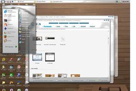
REALLY cool skin it loks great. but i just have to ask y their is such an ugly wallpaper on the screen shot background i think more people would use it if you showed a wallpaper that was better.
djjonwest
Comment #2 Wednesday, October 18, 2006 12:15 PM
Like what, what kind of wallpaper did you have in mind? clouds, 3d abstract, graffiti, aero/mac like? throw me a bone here. I will be releasing an update soon.
dj cole
Comment #3 Wednesday, October 18, 2006 1:53 PM
i think you did a fine job with most of the skin.
the only thing i have a problem with is the taskbar and it's because
you use preset bevels and that makes your images look distorted.
do you see the way the color changes it's to bright at the center and dark at the edges.

try using the gradient tool to make your images it makes a big differance in how your skin looks.
you can make better bevels with it just by haveing a lighter forground and darker background.
play with it and see what you think.
as far as wallpaper goes i would use maybe a windows wallpaper of a like color.
it would make your skin look much better.
can't wait to see the update you have good idias

hope this helps
dj cole
Comment #4 Wednesday, October 18, 2006 2:02 PM
p.s.
the fonts in the tasbar buttons are verry fuzzy when tere white
also save your images in png format and go through your blinds folder and delete any of the
unskined parts this will reduce the size of your zip instead of 5mb download it should be more like
1mb.

good luck
WeezleRox
Comment #5 Friday, October 20, 2006 9:53 AM
Looks nice - I'm a bit of a sucker for glossy/glassy finishes! Some of the text can look a little fuzzy, but other than that it all looks good and functions well. As for the wallpaper, it's such a matter of personal taste that it is hard to say what would look best, so I guess try a few for yourself and see what you think compliments the skin.....
wolepi
Comment #6 Saturday, October 21, 2006 12:30 AM
I really love the concept of this wb. Though it took me a while to get used to the three buttons (min, max, close), once I did, it was no problem. I can't wait until the next ones come out, because I prefer darker colors and the white kind of hurts my eyes. Great work and thank you.
djjonwest
Comment #7 Tuesday, October 24, 2006 3:34 PM
Since I am so new at the whole skinning thing. I have been learning as I go. which files exactly do I not need for the skin to function.

that is one of the things keeping me from making a second release soon
djjonwest
Comment #8 Monday, October 30, 2006 7:05 PM
It is very hard to help you all if nobody posts their problems and ideas.
wolepi
Comment #9 Thursday, November 16, 2006 8:14 PM
Isn't this the next month? If you're still working on v 1.1, I kind of like royal purple, maybe a dark one, or something with silver and black. Everything else in the skins seems fine to me.
gihayes
Comment #10 Wednesday, December 13, 2006 4:06 AM
I really love this skin. I am very particular about the look and feel of the desktop. I am running Vista and it takes a lot to compete,but I would love to run this wb. I am having a problem with ghost images in the back of the windows. I know you have the tranlucent "tabs" in the back but below on either side are squares of white translucence that becomes transparent but for a blur effect. I have found it on the two skins I love the most. this one and Inspiration in glass. It has the same thing. any ideas?


Thank you for a wonderful piece of artistry,


iam bennu


cplair
Comment #11 Thursday, December 21, 2006 7:17 PM
Off the chain Djjon. Beautiful details all around!


I am experiencing some of the blurr the others were talking about as well. I'm getting it on my active window in the task bar before mouse over. And in the All Programs menu, but it blurrs on the mouse over.

This one is a keeper, I'm looking forward to revised version. Top notch designing and superior details!
djjonwest
Comment #12 Monday, February 5, 2007 10:13 AM
I have fixed all errors for the skin but I unfortunatly will be releasing "The Next 2x" as a premium suite this week. it will be packaged with a DesktopX theme, ObjectDock theme and settings, IconX theme, WB theme. etc...

look foreward to hearing from you guys.

Please login to comment and/or vote for this skin.

Welcome Guest! Please take the time to register with us.
There are many great features available to you once you register, including:

  • Richer content, access to many features that are disabled for guests like commenting on the forums and downloading files.
  • Access to a great community, with a massive database of many, many areas of interest.
  • Access to contests & subscription offers like exclusive emails.
  • It's simple, and FREE!
Downloads remaining: 5
User Level: Visitor

Featured WindowBlinds

Popular WindowBlinds

Top WindowBlinds Skinners

Yesterday  |   Last 30 Days  |   All Time
1. LightStar 7125
2. don5318 4337
3. Vampothika 3356
4. SimplexDesigns 3222
5. adni18 2814
6. 2of3 1382
7. retiredmaster 1210
8. AeroPurple 817
9. SemoB 629
10. IceBabee 620
11. gmc2 605
12. BoXXi 601
13. DaveBax 599
14. jazzymjr 434
15. Dcrew57 429


web-wc01