Comment #2 Tuesday, December 5, 2006 11:22 AM
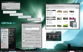
One small 'issue': only the middle of the window-borders are transparent. I'd personally prefer a full tranparent border on both sides, but that's a matter of taste of course. Perhaps you could make a (sub)skin with full tranparency.
But again: it's a great skin!
Comment #3 Tuesday, December 5, 2006 12:10 PM
One small 'issue': only the middle of the window-borders are transparent. I'd personally prefer a full tranparent border on both sides, but that's a matter of taste of course. Perhaps you could make a (sub)skin with full tranparency.
But again: it's a great skin!
Comment #4 Tuesday, December 5, 2006 12:47 PM
 You did an awesome job!
Thank You for sharing

Comment #7 Tuesday, December 5, 2006 9:27 PM

Comment #8 Tuesday, December 5, 2006 9:44 PM

Comment #9 Tuesday, December 5, 2006 10:25 PM
| I think this is better than your original version. |
Personally, I can't decide which one I like better. I know that many of the elements in Ceirous SX are improved over the previous version, but I think it's mostly an matter of personal taste. That's part of the reason I created two versions, to see what people like more, dark or light. But I'm very glad you like this version, and thank you all for the wonderful comments.

Comment #11 Wednesday, December 6, 2006 3:41 AM
Comment #12 Wednesday, December 6, 2006 5:15 AM
You might as well copy and paste this into the comments for the original Ceirous. Amazing job on both.

Comment #13 Wednesday, December 6, 2006 5:32 AM
Comment #14 Wednesday, December 6, 2006 9:43 AM
Dark wall: http://www.deviantart.com/deviation/30152190/
Took some searching but I finally found them.
Comment #15 Wednesday, December 6, 2006 9:44 AM
As I've said from the beginning, I like it and this one also. You're learning, which is good. Keep it up.
Now that these are completed, are you going to make another Ceirous skin or are you going to try your hand at a new skin?
Comment #16 Wednesday, December 6, 2006 10:33 AM
Comment #17 Wednesday, December 6, 2006 11:38 AM

P.S. CYY Skyline icons go great with this skin

Comment #19 Wednesday, December 6, 2006 12:04 PM
Seconding the problem with the taskbar at the top. I've looked at the skin in SkinStudio and it should work, not sure why it isn't.
Comment #20 Wednesday, December 6, 2006 12:12 PM
This skin is great, with a few tweaks it will be absolutely perfect.

Please login to comment and/or vote for this skin.
Welcome Guest! Please take the time to register with us.
There are many great features available to you once you register, including:
- Richer content, access to many features that are disabled for guests like commenting on the forums and downloading files.
- Access to a great community, with a massive database of many, many areas of interest.
- Access to contests & subscription offers like exclusive emails.
- It's simple, and FREE!


Comment #1 Tuesday, December 5, 2006 11:14 AM
One small 'issue': only the middle of the window-borders are transparent. I'd personally prefer a full tranparent border on both sides, but that's a matter of taste of course. Perhaps you could make a (sub)skin with full tranparency.
But again: it's a great skin!