|
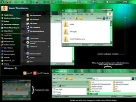
Vista JadeUpdated Feb 24, 2007 by IRaidedTheFridge |
||||||||
Comment #2 Saturday, February 24, 2007 9:09 AM
Comment #3 Saturday, February 24, 2007 9:54 AM
Comment #4 Saturday, February 24, 2007 11:11 AM
It looks like created this windowblinds on a vista machine(or you got a hold of a decent vista icon set for the wb), I'm running xp and maybe alot of the problems experienced with this skin are because of that. Possibly in the future you could state that the windowblinds was created specifically for the windows vista environment and may not look as good in a winxp environment - it's not a deal breaker per se but it's helpful to include info like that I think.
Good for a first try but I think you have room for improvement - this is meant as constructive criticism and not meant to insult or take away from the hard work you put into this skin.
Comment #5 Saturday, February 24, 2007 11:44 AM
Comment #7 Saturday, February 24, 2007 3:55 PM
Magic Pink everywhere on my area too.

Comment #8 Saturday, February 24, 2007 11:06 PM
 �
�Comment #9 Sunday, February 25, 2007 9:31 AM

Comment #10 Monday, February 26, 2007 9:31 AM
Jason, I think they have an ointment for that now. �
 �
�Comment #11 Monday, February 26, 2007 9:42 AM

If I could vote, I'd give you a 4/5 rating -- for some reason it always says there's an error processing my vote.
Comment #12 Monday, February 26, 2007 10:59 AM
Comment #13 Monday, February 26, 2007 11:04 AM

Comment #14 Monday, February 26, 2007 3:58 PM
When I'm testing, I like to open up several windows & internet explorer sessions, open up an office app (email), open up windows explorer & the control panel & open up my computer, device manager, etc. and see how your wb theme affects all of these areas and verify what looks good and what doesn't and go back & fix it. Also make sure you move the taskbar to the right & left sides of the screen and to the top as well. Resize the taskbar, verify that your startbutton looks & acts the same way when you move the task bar, verify that the elements you skinned for your horizontal taskbar look the same when you move the taskbar to a vertical left or right position, view the taskbar quick launch area and see if it works & looks the same way in horizontal & vertically aligned taskbar modes. Even with all this testing you will usually miss something but you'll catch most of it. Test, test & then test some more and use it for a few weeks before you release it on the site. I find that when you use your own theme for a few weeks or more you'll end up noticing bugs that never appeared originally and then you go back & fix it. Once you've used it for a while and it behaves reasonably on your system, go ahead and upload it to the site and hope for the best.
Comment #15 Tuesday, February 27, 2007 4:07 AM
�
 �
�As for the theme, for your second its not bad, as unclerob said, try to spend more time evaluating your work in ALL areas of windows. Use it for an extended period of time to make sure you havent left anything unskinned.
Patience is a skinner's best friend imo. We all want to upload our latest work ASAP but if you hold off a little, keep working at it... trust me, it helps you in the long run.
Good luck and keep on skinning! �
 �
�Comment #16 Tuesday, February 27, 2007 7:26 AM
While I am making a blind, I use it exclusively. It's not very pretty in the beginning with all the luna junk, but I find that this helps me to really see how the blind works, and to find errors. It takes me about 3-4 weeks to make a blind, so by the time I upload it, it has been used for some time.
You could upload your blind to skinartristry to their WIP...they could test it for you.
Also, about the black in the middle of your buttons, check your sizing margins..make sure the top and bottom margins are not set too close together.
I would test your blind for you, but I am not at home, and am using my laptop which does not have WB on it. I will be back home on the 30th, though.
Keep at it and don't give up!
Comment #17 Tuesday, February 27, 2007 10:35 AM

Comment #18 Tuesday, February 27, 2007 3:19 PM
All the more reason for "on the job experience" Don't worry , you'll get it, as long as you don't give up. Besides.. the Forums or IRC are a super place to get answers to anything that stumps you or is causing indigestion or hair loss �
 �
�Don't be afraid to ask, someone here will almost certainly give you the answer.
Keep on skinning!
Comment #19 Wednesday, February 28, 2007 3:29 PM

and also if you change the size of the taskbar it looks strange at the left end...also the right end of it can be improved...
but as i said i like it...please keep on working at it...
Comment #20 Thursday, March 1, 2007 1:35 AM

Please login to comment and/or vote for this skin.
Welcome Guest! Please take the time to register with us.
There are many great features available to you once you register, including:
- Richer content, access to many features that are disabled for guests like commenting on the forums and downloading files.
- Access to a great community, with a massive database of many, many areas of interest.
- Access to contests & subscription offers like exclusive emails.
- It's simple, and FREE!


Comment #1 Saturday, February 24, 2007 4:58 AM