|
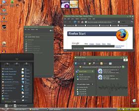
SteamUpdated Mar 28, 2007 by Deviousoverdose |
||||||||
Comment #3 Wednesday, March 28, 2007 11:29 PM
I'm a big fan of minimalist skin designs, but the Steam program's visual elegance is in both its simplicity and consistency.
Keep at it, buddy. You'll get there.

Comment #4 Thursday, March 29, 2007 12:42 AM
 �
�Comment #6 Thursday, March 29, 2007 8:07 AM
 ��
�� �
�Comment #7 Thursday, March 29, 2007 4:03 PM
Comment #8 Thursday, March 29, 2007 5:32 PM
Do take on the comments and critiqu� to improve the skin though. It will end up as a must-have skin in my library, and for any serious HL gamer.
�
 �
�Comment #9 Thursday, March 29, 2007 6:29 PM
Comment #10 Monday, May 28, 2007 5:29 AM
Comment #11 Thursday, June 28, 2007 4:04 PM
Keep at it and you'll have an amazing skin on your hands.
Comment #12 Monday, December 17, 2007 1:19 AM
Only thing I have to say is that I'd prefer the slider icon to change sometime from the original.
And a small matter: Would you be able to make a menu option to make a Steam-styled menu of sorts? I like the current one though, and I don't want to lose it.
Comment #13 Sunday, March 30, 2008 7:16 AM
Comment #14 Saturday, November 28, 2009 9:52 AM
Please login to comment and/or vote for this skin.
Welcome Guest! Please take the time to register with us.
There are many great features available to you once you register, including:
- Richer content, access to many features that are disabled for guests like commenting on the forums and downloading files.
- Access to a great community, with a massive database of many, many areas of interest.
- Access to contests & subscription offers like exclusive emails.
- It's simple, and FREE!


Comment #1 Wednesday, March 28, 2007 9:32 PM
Not a bad try but it needs quite a bit of work:
1) Steam's UI has slightly rounded corners in the title bar and borders.
2) The title bar is a bit too thick.
3) The font text color is currently set to light gray when itshould be black in some controls (for instance, as I type this, my font is light light gray on white which is almost unusable.
4) The inactive title bar controls are gray, not white.
Otherwise, it's a pretty good effort.