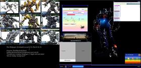
Transformers
Average Rating: 2
Yours: -1
File Size: 1.32MB
Downloads Today: 0 Downloads Total: 12931

Transformers

Updated Jul 16, 2007 by Jeditharcus


First Previous Page 1 of 2 Next Last
Jeditharcus
Comment #1 Tuesday, July 17, 2007 3:13 AM
Oh that chrome really doesn't work too well does it? I will fix�
Jeditharcus
Comment #2 Tuesday, July 17, 2007 10:46 AM
It Is Fixed�
kin242
Comment #3 Tuesday, July 17, 2007 11:20 AM
Why the X-Wing?
Jeditharcus
Comment #4 Tuesday, July 17, 2007 11:24 AM
Ignore the x wing ,it is just the cursor I use
Ooberman
Comment #5 Tuesday, July 17, 2007 4:20 PM
No offense but you are churning these out with little regard for quality. Take your time and commit yourself to one theme for a while. Don't take this comment the wrong way. Good luck.
Phoon
Comment #6 Tuesday, July 17, 2007 10:00 PM
I'll have to agree with Ooberman. Quality trumps Quantity, no contest.
Also, the Wallpaper does not make the Windowblind any better at all. Concentrate more on the quality of the graphics of the blind and forget the walls.�
Jeditharcus
Comment #7 Tuesday, July 17, 2007 10:14 PM
I am a little confused here I spend alot of time doing one and people say it is too much and simpler is better so I do a couple of simple ones and I am told quality is better and I am just rushing them out.I will meet everyone in the middle then on my next one and see how that one is recieved. I agree with you all though about quality being better than quantity at least personally.I also agree about the wallpapers but as I was going to use the white one originally but then changed my mind and used the Optimus prime one instead I just decided to give the other one out as well.I think that any windowblind should have at least one wallpaper to go with it though as It is much better with than without. Thanks for the input.�
vStyler
Comment #8 Tuesday, July 17, 2007 10:29 PM
Jeditharcus - Even when making a simple minimal theme you should spend as long working on the quality as a more complicated one. Simple doesn't neccesarily mean easy. My advice to you is this. Next theme.. take far longer.. use it more.. study it more.. ask yourself.. is this absolutely as good as I can make it look. Also what helped me along the way was disecting skins by skinners respected community skinners and comparing my work ..to theirs. As a beginner you should easily be able to spot areas in which you can improve. Main thing.. dont rush and be your own worst critic.

Good luck.
Jeditharcus
Comment #9 Tuesday, July 17, 2007 11:52 PM
Good advice vStyler thx
RPGFX
Comment #10 Wednesday, July 18, 2007 10:27 AM
Ooberman, Phoon, vStyler... you guys gave perfect examples of how to critique a poor skin (sorry) without being hurtful or blasting. Others should take example of you guys. Usually when a sub-par skin is uploaded, the creator gets insulted, and many times will never try again. Thanks to you guys, I'm sure Jeditharcus will try again, and take your advice to create a better skin.
kin242
Comment #11 Wednesday, July 18, 2007 11:10 AM
I'm not a skinner, but having downloaded and installed the skin here are my thoughts:

- most of the graphics seem to have been saved at the lowest possible quality setting- there is little to no anti-aliasing and everything is very blocky. If you are using photoshop, when saving files make sure you sav them to the highest quality setting.
- Fonts are very important when it comes to windowblinds. They all too often are the decider in whether I use a skin or not. Your main font is OK if again very blocky, but the one used on the start button matches neither the rest of the blind nor the transfomers theme itself.
- Simple and minimal takes sometimes more work that flashy skins. It is so hard to get a minimal skin right. The devil is in the details! In this skin it almost seems to me (even though I'm quite colourblind) that every side of your windows has a different colour. Unless I am mistaken there's a small white line on the right hand side, a green one on the left, a messy blue and black one on top and a black one underneath? I am in Vista though...
- Smoothness & consistency. Either go for totally flat minimal skins or fully blended 3d ones. Mixing between the two- doesnt usually work... Curves or straight lines.
- Theme means theme. Apart from a couple of poor quality jpegs I'm not sure what is 'transformers' about this theme?

I hope this helps and is taken as constructive criticism. I admire you for sharing your work and working so hard to make these. I've tried it myself and I know it is a lot easier to criticise than to produce!
Jeditharcus
Comment #12 Wednesday, July 18, 2007 11:23 AM
I am using Paintshop pro photo XI and thanks for your thoughts.Actually I will admit I didn't spend any time on this one at all and I personally wanted a black skin so I did this one for myself but then just sent it in anyways along with my yoda skin.I am always open to constructive critisizm and really like that you pointed out the things that you found you didn't like instead of just saying it is crappy.
shagpiece
Comment #13 Wednesday, July 18, 2007 4:22 PM
are you finished soon. this one actually has potencial.
Jeditharcus
Comment #14 Wednesday, July 18, 2007 5:28 PM
I might do more on this skin once the new skinstudio comes out but for now I won't be doing much with this one
decilling
Comment #15 Thursday, July 19, 2007 6:14 PM
OH MY GOD ITS HIDEOUS
ghostrideradam
Comment #16 Thursday, July 19, 2007 10:18 PM
If you got nothing nice to say then don't say it at all...how does this person above me have any right to say anything when they don't contribute to the stardock community...just freeloading...and bashing. Good luck Jedi!!... keep up the practice and the updates could turn out cool.Later'!
Jeditharcus
Comment #17 Friday, July 20, 2007 1:40 AM
Thx ghostrideradam and It's all a (here's the word) CONSPIRACY started by the evil a00783 Jeerk McQueerk. I think he keeps signing up as different users and makes it look like it is a bunch of others (with brand new accounts) when actually it is him. You will notice when you click on the basher's names and go to their sites they all haven't done any blinds or screens at all so how can they have a valid opinion?
decilling
Comment #18 Friday, July 20, 2007 9:58 AM
Oh I make skins, just Only release the good ones hahaha. for example a work in progress

http://i26.photobucket.com/albums/c140/decilling/noob.jpg

I may release it, or I may not its up to me
Jeditharcus
Comment #19 Friday, July 20, 2007 10:49 AM
This from the guy who was calling me a dumbass and a**hole on my yoda skin 5 minutes ago with no mention of him at all by me previously to warrant such behaviour.I hope you get booted off this site for your profanity and unprofessional behaviour.
taky
Comment #20 Friday, July 20, 2007 12:14 PM
My eyes hurt

Please login to comment and/or vote for this skin.

Welcome Guest! Please take the time to register with us.
There are many great features available to you once you register, including:

  • Richer content, access to many features that are disabled for guests like commenting on the forums and downloading files.
  • Access to a great community, with a massive database of many, many areas of interest.
  • Access to contests & subscription offers like exclusive emails.
  • It's simple, and FREE!
Downloads remaining: 5
User Level: Visitor

Featured WindowBlinds

Popular WindowBlinds

Top WindowBlinds Skinners

Yesterday  |   Last 30 Days  |   All Time
1. LightStar 7247
2. don5318 4399
3. SimplexDesigns 3188
4. Vampothika 3181
5. adni18 2918
6. 2of3 1265
7. retiredmaster 1203
8. AeroPurple 754
9. SemoB 612
10. gmc2 567
11. IceBabee 565
12. BoXXi 531
13. DaveBax 502
14. jazzymjr 424
15. Dcrew57 417


web-wc01