|
I am ColourlessUpdated Sep 13, 2007 by mangesh kulkarni |
||||||||
Comment #2 Thursday, September 13, 2007 8:59 AM
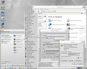
The skin feels the same throughout
You did skin pretty much all of the elements
It's very usable
Stuff to maybe improve on-
Being a little more creative. (the buttons on windows look just like xp)
Less is more (the windows have really wide borders that take up space)
Watch your sizing margins so images don't get stretched (tabs look stretched out)
Keep it up! Good job
Comment #3 Thursday, September 13, 2007 10:39 AM

It seems to me that many of your images have a jagged look to them - especially in the special panes and tabs section. I don't know if it's the rounded buttons you are using or if the sizing margins are off.
Also in the section "combo box" you seem to have two images fighting each other. The Deprecated Glyph and the Glyph image are the same, resulting in double down arrows slightly offset from each other. To fix this you can import the default Sks image for the Deprecated Glyph.
You should also look at the quick launch buttons (check the sizing and content margins)
I hope you take this as constructive advice not as slamming, I only want to help

Have fun!
Comment #5 Thursday, September 13, 2007 1:59 PM
You can only get better from this nice initial skin.
I like the 3D layered feel to the skin, But do pay attention to jagged edges and stretched images.
Keep on skinning!
Comment #7 Thursday, September 13, 2007 9:27 PM
Your manners and dignity, that's WHAT died ragamuffin.
Comment #9 Friday, September 14, 2007 3:49 AM
Comment #10 Sunday, September 16, 2007 6:01 PM
It seems to be the images, if anti-aliasing was used for them there is no feathering to smooth them out. Sizing margins will/did not fix jagged look.
No offense mangesh: this is his 17th WB skin here, as he stated first with round buttons. With that many skins created he should have a good idea how to make nice smooth images regardless of the shape of them.
Comment #12 Monday, September 24, 2007 10:49 PM
 �
�Comment #13 Wednesday, March 12, 2008 5:28 PM
Please login to comment and/or vote for this skin.
Welcome Guest! Please take the time to register with us.
There are many great features available to you once you register, including:
- Richer content, access to many features that are disabled for guests like commenting on the forums and downloading files.
- Access to a great community, with a massive database of many, many areas of interest.
- Access to contests & subscription offers like exclusive emails.
- It's simple, and FREE!


 ��
�� ��
�� �
�


Comment #1 Thursday, September 13, 2007 5:58 AM
But what do I know, I'm using a skin recolored in black.