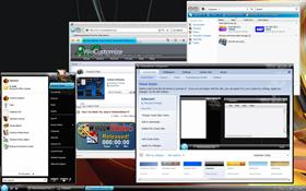
Adamant
Average Rating: 9
Yours: -1
File Size: .62MB
Downloads Today: 0 Downloads Total: 48740
Vista Ready

Adamant

Updated Oct 02, 2007 by Stardock Design


First Previous Page 3 of 5 Next Last
MichaelG04_NEW
Comment #41 Wednesday, October 3, 2007 8:09 AM
using on vista ultimate, the start menu text in programs is cut off, in weird parts, anyone else see this? have tried on 2 different pc's to test


edit..........sorry didn't see the bug was reported, great skin otherwise, not enough vista skins out there
I.R. Brainiac
Comment #42 Wednesday, October 3, 2007 8:17 AM
Great looking vista skin.�
loyd2006
Comment #43 Wednesday, October 3, 2007 8:21 AM
very nice good job continue.���
Stardock Design
Comment #44 Wednesday, October 3, 2007 9:18 AM
The Vista Start menu truncating bug has been fixed.
Qx9
Comment #45 Wednesday, October 3, 2007 10:40 AM
Wonderful Skin!

But!!! ...is it not possible, after generations of Windowblinds, to actually make the "all programs" mouseover so that it's not a solid color as seen in this skin? The non-attention to that detail has me using Aero more than WB6. Come on Stardock, fix that small detail already!

rocket2009
Comment #46 Wednesday, October 3, 2007 11:57 AM
good job
RottynDawg
Comment #47 Wednesday, October 3, 2007 12:06 PM
Very nice skin!
Mackintosh
Comment #48 Wednesday, October 3, 2007 3:19 PM
Bit gutted by the lack of window shadows, I got so used to them that any skin without them just doesn't tickle my fancy as much as it could. Other than that, it's clean, aesthetically pleasing, overall a well-designed skin. Nothing jaw dropping though and that is a pity.
jrolson
Comment #49 Wednesday, October 3, 2007 3:37 PM
Very nice, the greatest skin I have seen so far for wb6
song-birdie
Comment #50 Wednesday, October 3, 2007 4:07 PM
nice
song-birdie
Comment #51 Wednesday, October 3, 2007 4:10 PM
AGAIN!!!--- "NICE!!!" --- looks, very simple to me... yet simple things sometimes come up to be the best...
JRSCCivic98
Comment #52 Wednesday, October 3, 2007 4:29 PM
Thanks for fixing the text issue on the Start Menu. However, you guys might want to make corrections to all your Vista skins. The shutdown buttons should match the "different" shutdown schemes just like Aero does. It makes it easier to know what you have the shutdown button set to. With it just being one color it makes it hard not knowing what the button does unless you hover and read the text. Please correct this.... a lot of people making skins for Vista should make these changes as well to their skins.
JRSCCivic98
Comment #53 Wednesday, October 3, 2007 4:43 PM
There's also a problem with the Task Manager tabs and button not being fully visible in Vista with this skin. Please fix this bug as well.
robertbruce1954
Comment #54 Wednesday, October 3, 2007 4:51 PM
i also like this skin too however the "white" background on the start menuu is whiting out my lighter icons,and making them invisable is there a way to greyout or darken this part of the start menu ? thank you
Martin_Merdjanov
Comment #55 Wednesday, October 3, 2007 6:33 PM
Am I the only one that gets big red and blue rectangles at the close resize minimize buttons?
Great skin though
Morpheous416
Comment #56 Wednesday, October 3, 2007 8:00 PM
The Vista Start menu truncating bug has been fixed.


hmmmmm...... not seeing the fix.

Vista Ultimate: WB6

Downloaded and installed this theme today, bug is still there.


But.... I'm in the same boat as the others, great theme!

Stardock Design
Comment #57 Wednesday, October 3, 2007 8:22 PM

Downloaded and installed this theme today, bug is still there.

Did you delete the old one first?  Also, please double check and make sure you are actually running the Vista version.  If you are not, then it will still have the text issue.

JRSCCivic98
Comment #58 Wednesday, October 3, 2007 9:07 PM
If you are not, then it will still have the text issue.


So is that a "Half Fix"? I ask because my XP system did the same thing yesterday...
Jeddycakes
Comment #59 Thursday, October 4, 2007 5:58 AM
Looks great, but I've been having trouble with the buttons in the top right (minimise, maximise and exit). The colour isn't confined to the button, but rather a big block of colour that seeps out all over the top corner of the window

A shame for me as I quite like this skin.
Elsius Saint
Comment #60 Thursday, October 4, 2007 10:27 AM


Did somebody say Alexandrie?

The best babe in the game ����

Please login to comment and/or vote for this skin.

Welcome Guest! Please take the time to register with us.
There are many great features available to you once you register, including:

  • Richer content, access to many features that are disabled for guests like commenting on the forums and downloading files.
  • Access to a great community, with a massive database of many, many areas of interest.
  • Access to contests & subscription offers like exclusive emails.
  • It's simple, and FREE!
Downloads remaining: 5
User Level: Visitor

Featured WindowBlinds

Popular WindowBlinds

Top WindowBlinds Skinners

Yesterday  |   Last 30 Days  |   All Time
1. LightStar 7125
2. don5318 4337
3. Vampothika 3356
4. SimplexDesigns 3222
5. adni18 2814
6. 2of3 1382
7. retiredmaster 1210
8. AeroPurple 817
9. SemoB 629
10. IceBabee 620
11. gmc2 605
12. BoXXi 601
13. DaveBax 599
14. jazzymjr 434
15. Dcrew57 429


web-wc01