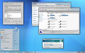
Solarion
Average Rating: 9
Yours: -1
File Size: .62MB
Downloads Today: 1 Downloads Total: 33507
Vista Ready

Solarion

Updated Oct 26, 2007 by Stardock Design


First Previous Page 2 of 5 Next Last
unclerob
Comment #21 Thursday, October 4, 2007 11:52 AM
Mike this is just another in a long list of reasons why you're one of the best wb skinners around. This is an awesome skin which could easily have been released as a master skin and sold for a decent profit - thank you for making it free! �
jhayes3
Comment #22 Thursday, October 4, 2007 12:03 PM
Great job on this It looks fantastic I really appreciate the free hi quality skins that your doing here

Island Dog
Comment #23 Thursday, October 4, 2007 12:13 PM
Great job! 

Unkn0wn
Comment #24 Thursday, October 4, 2007 12:49 PM
Thanks for the free skin!
sdsmk1
Comment #25 Thursday, October 4, 2007 12:52 PM
Utterly and completely awesome~
EdgeRider289
Comment #26 Thursday, October 4, 2007 1:33 PM
I REALLY love the look of this skin and I would be using it already but the close button on the left drives me crazy. By the time I get used to the close button on the left, I am changing skins and have to re-learn. Add me to the list of people that would love a version with the close button on the right. Pleeeeese....
Leo the Lion
Comment #27 Thursday, October 4, 2007 1:49 PM
Mike, Nice clean simple skin. Thanks ���
aufisch
Comment #28 Thursday, October 4, 2007 1:49 PM
I love the combination of 'old style' (there were some great WB 3 skins) and brand new WB6 features.

Thanks a lot?
WebGizmos
Comment #29 Thursday, October 4, 2007 1:55 PM
Ahhh....been waiting for this one!
Hankers
Comment #30 Thursday, October 4, 2007 2:24 PM
Works like a charm and no "bugs" here.  Thanks Mike!
JRSCCivic98
Comment #31 Thursday, October 4, 2007 4:34 PM
JRSCCivic98, that's not a skin bug. That is just the way WindowBlinds handles the All Programs area. It doesn't change the text or arrow image when it is clicked.


Wait, are you saying that WB6.0 downgrades the All Programs function of the Start Menu to be XP like. Why is that?... if that's the reason for it? If that's the case can you tell me why I spent money on Vista Ultimate and then WB6 just to be back to XP "graphical" limitations? I thought WB6 was going to skin Vista like it was meant to be skinned. I thought the backwards compatibility with non-vista skins was the reason for WB5.5, but when 6.0 came out all those graphical limitations were going away. More and more stuff surprises/surfaces me about WB6 on a daily basis it seems. When can we as users expect these limitations to be removed from WB? Will this go away with the release of WB6.5 or higher and when do you think that will be?
skybright
Comment #32 Thursday, October 4, 2007 4:57 PM
Thank You Mike I am enjoying your skin. It is very nice to use. Love the close botton on the left. It took me a minute to find it, very different innovation.���
MikeB314
Comment #33 Thursday, October 4, 2007 5:23 PM

JRSCCivic98, you'll have to ask someone who works on the application. Perhaps you could post it on the forum. I don't know the reason for it. I just make skins.

To be clear, the only limitation here is that is doesn't currently support a "back" arrow image or change the words All Programs to Back. The menu still functions as you would expect in Vista.

KarmaGirl
Comment #34 Thursday, October 4, 2007 5:29 PM

If that's the case can you tell me why I spent money on Vista Ultimate and then WB6 just to be back to XP "graphical" limitations?

We know that you are dissatisfied with WB- you have posted all over the place about it, including amny places (like here) that the comments don't belong.  Skin comments are to be about the skin, not about the program.  Please keep your comments about the program contained to the appropriate forum section.

RoodVargas
Comment #35 Thursday, October 4, 2007 5:33 PM
I'm sorry but this skin is just plain UGLY.
nyteinc
Comment #36 Thursday, October 4, 2007 5:33 PM
I didn't even bother clicking the thumbnail to get a better look at this one. When I saw who made it I knew it was worth downloading! Great work on yet another in a long list of awesome blinds! Thanks much.
MC iRoc
Comment #37 Thursday, October 4, 2007 6:48 PM
Best one yet. And more to come.
sleepydawg
Comment #38 Thursday, October 4, 2007 7:59 PM
I like the idea of this skin. But could use a small bit of color here and there. Just my opinion.
ShelbyGT_The_Car
Comment #39 Thursday, October 4, 2007 8:13 PM
Great skin Mike... but with Vista there is no system fonts to support the use of office or any like program. The which must have a system font to work properly. The background highlight is the wrong color making fonts in the favorites for IE7 plain gray on gray.
Nice start button and great animations; very clean skin!

4.5 stars {still needs work - but great for free~!}

SGT
Poddytat
Comment #40 Thursday, October 4, 2007 8:17 PM
I am so loving this!

Please login to comment and/or vote for this skin.

Welcome Guest! Please take the time to register with us.
There are many great features available to you once you register, including:

  • Richer content, access to many features that are disabled for guests like commenting on the forums and downloading files.
  • Access to a great community, with a massive database of many, many areas of interest.
  • Access to contests & subscription offers like exclusive emails.
  • It's simple, and FREE!
Downloads remaining: 5
User Level: Visitor

Featured WindowBlinds

Popular WindowBlinds

Top WindowBlinds Skinners

Yesterday  |   Last 30 Days  |   All Time
1. LightStar 7094
2. don5318 4336
3. Vampothika 3374
4. SimplexDesigns 3214
5. adni18 2835
6. 2of3 1376
7. retiredmaster 1184
8. AeroPurple 830
9. IceBabee 628
10. SemoB 626
11. gmc2 613
12. DaveBax 603
13. BoXXi 600
14. Dcrew57 429
15. jazzymjr 428


web-wc01