


|
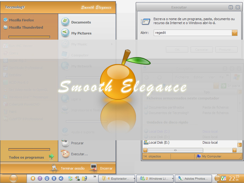
Smooth EleganceUpdated Oct 15, 2007 by TecznologY |
||||||||
rohaun
Comment #3 Monday, October 15, 2007 3:14 PM
Comment #3 Monday, October 15, 2007 3:14 PM
I love it, even though I am not a fan of orange, it still is beautiful.
StuSchellhamer
Comment #6 Tuesday, October 16, 2007 5:43 PM
Comment #6 Tuesday, October 16, 2007 5:43 PM
Thanks for building this! I did a tribute to Jairo and it goes great with this!� �
�
 �
�
big bad nana
Comment #7 Sunday, October 21, 2007 5:12 PM
Comment #7 Sunday, October 21, 2007 5:12 PM
ummm
WTF IS UP WITH DA PEACH????
U HAVE TO B KIDDING ME... U GUYS ACTUALLY THINK THIS IS WORTH USING?
DAM U R ALL BLIND....
WTF IS UP WITH DA PEACH????
U HAVE TO B KIDDING ME... U GUYS ACTUALLY THINK THIS IS WORTH USING?
DAM U R ALL BLIND....
TecznologY
Comment #8 Monday, October 22, 2007 8:51 AM
Comment #8 Monday, October 22, 2007 8:51 AM
lol, txs for your comment 'big bad nana'.
Sry if u didnt like it but I wanted to do something a little different for what we're used to see and I guess the result wasnt that bad, it feels good using it, its not heavy looking or has ugly elements.
I didnt make everything orange, most of the elements are actually smoothly gradiented white/gray colors. It has a modern feel with reflections and shinings and it is indeed pretty soft coloured.
Maybe you can have a try and see if it is that bad. Not everyone likes orange but substyles solve that problem well
Again I wanna thank you for your critic, and everybody that posted a comment/downloaded it.
Btw.. talking about heavy colors... my other skin TheAscent will be uploaded soon
Cheers,
TecZ
Sry if u didnt like it but I wanted to do something a little different for what we're used to see and I guess the result wasnt that bad, it feels good using it, its not heavy looking or has ugly elements.
I didnt make everything orange, most of the elements are actually smoothly gradiented white/gray colors. It has a modern feel with reflections and shinings and it is indeed pretty soft coloured.
Maybe you can have a try and see if it is that bad. Not everyone likes orange but substyles solve that problem well

Again I wanna thank you for your critic, and everybody that posted a comment/downloaded it.
Btw.. talking about heavy colors... my other skin TheAscent will be uploaded soon

Cheers,
TecZ
CompCarp
Comment #9 Saturday, October 27, 2007 9:00 AM
Comment #9 Saturday, October 27, 2007 9:00 AM
I'm using this one. I'm a big fan of bold colors - and particularly yellow/orange. And this one is SMOOTH, not heavy handed.
Thank you!
ToddSings.com
Thank you!
ToddSings.com
gardenerstouch
Comment #10 Saturday, November 17, 2007 10:24 PM
Comment #10 Saturday, November 17, 2007 10:24 PM
I like this skin, but if I had my druthers, here is what I would change to improve this skin:
1. Reduce the space between the horizontal divider bars in the start menu to get a lower profile.
2. Increase the size of the window control buttons.
3. When you left click on a grouped task bar button, up pops a garish blue menu. That has to go! Completely out of character with the rest of your skin.
4. Right click on an ungrouped task bar button produces a menu with a vertical orange bar running up the middle of the menu item icons.
5. Title bar font is not only too small, but it lacks sufficient contrast with the gray background to make it legible.
6. Is there a matching set of Explorer Icons somewhere?
Would love to see your next iteration of this skin, if that's what you decide to do.
LuDean
danger-is-my-middle-name
Comment #11 Monday, November 19, 2007 1:26 PM
Comment #11 Monday, November 19, 2007 1:26 PM
I like it. Thank you very much.
CharlieBrown21
Comment #12 Friday, December 19, 2008 5:34 PM
Comment #12 Friday, December 19, 2008 5:34 PM
Tks, for this one, since it's not like to dark, on the contrary it uses a lot of pastel colors, it fits so nicely in my desktop without making it look to heavy, like all the other dark themes do. 

Please login to comment and/or vote for this skin.
Welcome Guest! Please take the time to register with us.
There are many great features available to you once you register, including:
- Richer content, access to many features that are disabled for guests like commenting on the forums and downloading files.
- Access to a great community, with a massive database of many, many areas of interest.
- Access to contests & subscription offers like exclusive emails.
- It's simple, and FREE!


Comment #1 Monday, October 15, 2007 1:38 PM