


 |
|
Page 1 of 2 |
|---|
ash2478
Comment #2 Tuesday, October 7, 2008 9:37 AM
Comment #2 Tuesday, October 7, 2008 9:37 AM
Ok good try mate but maybe a little more work needed perhaps? But hey!! We all gotta start somewhere dude, so keep trying fella.
Kevin_C
Comment #3 Tuesday, October 7, 2008 11:39 AM
Comment #3 Tuesday, October 7, 2008 11:39 AM
Did either of you actually install the skin or are your opinions based solely on the preview? It really isn't that bad, very minimalistic and simple. I don't care for the thickness of the window title bars and the white in some places is a little bright but it's definitely not as bad as you would expect after reading the comments of Andrew Ryback. Who not surprisingly at all has never submitted a single skin, no surprise there really, armchair quarterback at his best.
Anyway, naalo it's a good first start maybe tone the colors down a bit so they aren't so harsh but other than that it's a really nice skin!
People in this world really need to learn some manners!!
Anyway, naalo it's a good first start maybe tone the colors down a bit so they aren't so harsh but other than that it's a really nice skin!
People in this world really need to learn some manners!!
kin242
Comment #4 Tuesday, October 7, 2008 12:15 PM
Comment #4 Tuesday, October 7, 2008 12:15 PM
Having installed it and tried the various subskins- I think its absolutely bloody gorgeous and one of the best minimal skinns I have seen in ages. I would heartily recommend you ignore the above negative comments- did these people even install the skin? Magnificent work. Submit it to the GUI Olymp... sorry championships! Keep up the great work naalo!
GeekDude
Comment #6 Tuesday, October 7, 2008 12:56 PM
Comment #6 Tuesday, October 7, 2008 12:56 PM
I agree with Kevin_C. It's a very original skin. I like the flat non-shadowed windows. I don't have any problem with the thickness of the title bars. My only recommendation would be to adjust the font color to provide some more contrast between the it and the window background. Other than that, good job.
Luuucc
Comment #7 Tuesday, October 7, 2008 3:36 PM
Comment #7 Tuesday, October 7, 2008 3:36 PM
Hi, like this skin in the GAIA style.  Hey Pepijn. Ik dacht al dat je Nederlands was door je naam, volgens my zijn wij wel de enigen!
 Hey Pepijn. Ik dacht al dat je Nederlands was door je naam, volgens my zijn wij wel de enigen!
InfamousTaipan
Comment #8 Tuesday, October 7, 2008 3:42 PM
Comment #8 Tuesday, October 7, 2008 3:42 PM
Correct me if I'm wrong but this is a port of the GAIA visual style, as detailed in the description graphics by imrik, so somewhat unfair to criticise the submission as its not his/her work.... WWW Link
Cavan1
Comment #9 Tuesday, October 7, 2008 4:38 PM
Do you have permission from imrik to port his VS to WB.
Comment #9 Tuesday, October 7, 2008 4:38 PM
Original graphics by imrik
Do you have permission from imrik to port his VS to WB.
Drzues
Comment #10 Tuesday, October 7, 2008 6:10 PM
Comment #10 Tuesday, October 7, 2008 6:10 PM
1st of all.....Ryback! your an idiot! While the skin is minimal the graphics are clean and professional looking. The corners are round and edges straight. The colors aren't garish like so many skins are and the layout is very user friendly. If it is a port, than yes permission should be included. I hope I haven't overstepped but everyone has a right to an opinion. One should know a little of what there criticizing though before hurling insults.
Bebi Bulma
Comment #11 Tuesday, October 7, 2008 7:22 PM
He couldn't because he submitted it here first and it's not his original work.
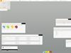
Looks kinda nice, although the preview leaves a LOT to be desired. It doesn't show much of anything except one small window.
Comment #11 Tuesday, October 7, 2008 7:22 PM
Submit it to the GUI Olymp... sorry championships!
He couldn't because he submitted it here first and it's not his original work.
Looks kinda nice, although the preview leaves a LOT to be desired. It doesn't show much of anything except one small window.
Elmo56
Comment #12 Wednesday, October 15, 2008 8:45 PM
Comment #12 Wednesday, October 15, 2008 8:45 PM
ITS PLAIN......ITS UGLY......ITS JUST PLAIN UGLY!
naalo
Comment #14 Friday, October 17, 2008 8:34 AM
Comment #14 Friday, October 17, 2008 8:34 AM
Thank you for the feedback people, good and bad, it's always good to learn what people think of our minimal styles outside of our regular places of submission (Customize.org and DeviantArt).
naalo
Comment #15 Friday, October 17, 2008 8:40 AM
Comment #15 Friday, October 17, 2008 8:40 AM
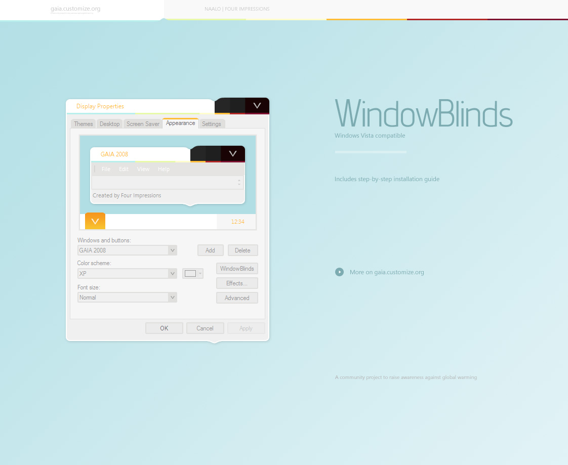
Btw, those of you wondering if I got permission for this skin, check 4impressions.net. Imrik and I work together, that being said, neither the visual style or this WindowBlinds skin is a port, they were both made based on the same mockup at the same time.
gmc2
Comment #16 Saturday, October 18, 2008 6:55 AM
Comment #16 Saturday, October 18, 2008 6:55 AM
1st of all.....Ryback! your an idiot!
are you taking your meds? Having been called an idiot by you before I feel compelled to comment that right or wrong, people are allowed to post negative comments about an upload. They are not necessarly attacking the person posting the upload, such as your comments, but that they don't like the "whatever". I hope I haven't overstepped but everyone has a right to an opinion.
I'm not trying to start a flame war with you, however practicing what you preach would be a good thing, yes/no?
Yo_Adrian
Comment #18 Saturday, October 18, 2008 8:55 PM
Comment #18 Saturday, October 18, 2008 8:55 PM
I've used this skin - a lot; and, I like it! The unique button shape, subtle gray colors and minimalist design is nice when compared to so many bright, over developed styles. But to each his own  If I could tweak anything it would be to thin down the title bars. I have also found a problem with radio buttons sometimes not rendering correctly but otherwise like this skin. Thanks for sharing!
 If I could tweak anything it would be to thin down the title bars. I have also found a problem with radio buttons sometimes not rendering correctly but otherwise like this skin. Thanks for sharing!
pjdark
Comment #19 Sunday, October 19, 2008 7:40 PM
Comment #19 Sunday, October 19, 2008 7:40 PM
Awesome stuff pep! For people who don't know Naalo, he has made many Vs's and is now just releasing windowblinds. From icons, to Vs's, to Windowblinds, This guy does ALOT for the customizing community. As for comment #12, Hey man, that's just plain rude and in poor taste.Should think twice before making comments like that. It's just not constructive whatsoever. Anyways, fantastic work Pepijn! 

Kevin_C
Comment #20 Sunday, October 19, 2008 9:23 PM
Comment #20 Sunday, October 19, 2008 9:23 PM
These skin comments need a way for other members to rate the comments on their helpfulness/usefulness maybe then if a given person feels the need to always post negatively their comments will end up in the crap bin where they belong. Something along the lines of slashdot where you can set a threshold for the comments you want to see. Of course this would probably require that comments be locked for anyone who isn't logged in, which is probably another good thing. Just my thoughts. It seems that while people are certainly allowed their opinion, if you aren't going to take the time to offer suggestions for what you feel might improve a piece you are commenting on maybe you shouldn't comment at all. Do comments like:
ITS PLAIN......ITS UGLY......ITS JUST PLAIN UGLY!
really need to be made?Please login to comment and/or vote for this skin.
Welcome Guest! Please take the time to register with us.
There are many great features available to you once you register, including:
- Richer content, access to many features that are disabled for guests like commenting on the forums and downloading files.
- Access to a great community, with a massive database of many, many areas of interest.
- Access to contests & subscription offers like exclusive emails.
- It's simple, and FREE!
|
|
Page 1 of 2 |
|---|

Comment #1 Tuesday, October 7, 2008 8:52 AM