Comment #2 Sunday, November 7, 2010 6:42 PM
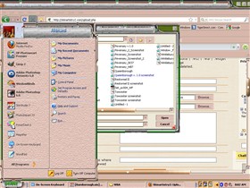
bit of constructive criticism this is ugly! the worst colours there is just no gel with me ![]()
Comment #3 Sunday, November 7, 2010 8:22 PM
Colour combos may be bad but it is something different than the blued and grays in all their various shades. Colours and the use of them can be seen in skin called Le Baron and Skin called parchment.
Comment #4 Sunday, November 7, 2010 9:43 PM
Wow Jakeco, you really need to revise your definition of "constructive criticism". CONSTRUCTIVE being the operative word. ![]()
Comment #5 Sunday, November 7, 2010 10:26 PM
Doesn't look so bad to me for an early work. Heck, there's some transparency going on and I don't mind the colors. From the preview it does look like something funky is going on with the Start Menu User Pic, maybe somebody could get you going in the right direction there. At least you got it done, that's certainly worth something. ![]()
Comment #6 Monday, November 8, 2010 1:08 AM
Oh my.... I have to wonder how Wincustomize actually approves this. Change the color scheme, learn to create much better graphics with your image editor. REALLY make sure what you upload is at least some decent quality for a windowblind. As it stands, this needs 100% re-working.I'm sorry for being the bad guy, but you also need to turn on clear type. The fonts make this look even worse. @ae4713..... you provided none as well. @ DaveRI.. That's all you see? Seriously? I'm very sorry for sounding rude. I just have to be completely honest.
Comment #7 Monday, November 8, 2010 9:23 AM
Things I would like to see in Skin.
When the skin is implemented in Internet explorer I would like the menu bar fonts to be a dark colour to offset the light blue of Internet explorer it would also be nice if it were outlined and given a 3d effect. I would like the fonts in the Skin to be a bit bigger than what is found in most skins for weary tired eyes. I usually change the window colour to a colour of parchment or light yellow for contrast reasons, I usually end up colouring the scroll bar as a lot of skinners forget this, I also use and change the colours to Active and inactive title bar into a some form of gradients as i find most skinners just use a solid colour for this. I usually change the active inactive borders to to a dark red for inactive and a for active I usually use a dark colour of the theme. I also usually change the button face colour in almost all cases if it is gray. For Tool tip I usually just go White Font and Black background at minimum there should always be good contrast between the font and the back ground colour for easy reading same goes for Highlight and the highlight font
Comment #8 Monday, November 8, 2010 5:55 PM
Yes pjdark that's all I see. Perhaps someone who has actually made a skin can help him out more.
Comment #9 Tuesday, November 30, 2010 3:54 PM
Comment #10 Saturday, May 28, 2011 1:50 PM
![]() I don't care what the others say I love this one I like how u did this and the colors are great.Angelsr4me
I don't care what the others say I love this one I like how u did this and the colors are great.Angelsr4me
Please login to comment and/or vote for this skin.
Welcome Guest! Please take the time to register with us.
There are many great features available to you once you register, including:
- Richer content, access to many features that are disabled for guests like commenting on the forums and downloading files.
- Access to a great community, with a massive database of many, many areas of interest.
- Access to contests & subscription offers like exclusive emails.
- It's simple, and FREE!


Comment #1 Sunday, November 7, 2010 6:11 PM
Sorry but I actually like camber better then this one. I am not sure about those start menu borders and color combinations. The green part of the border seems out of place to me.