Comment #2 Saturday, January 22, 2011 9:39 PM
You and I finally agree on something. Go figure. WB's scare me. ![]()
Comment #3 Saturday, January 22, 2011 10:07 PM
Not too bad at all! I understand this guy is 80 something (I'm 42 and can't imagine designing a WB much less doing it at age 80!).
Comment #4 Saturday, January 22, 2011 11:14 PM
Richie this is an improvement and I am happy your keeping at it. Your persistence is paying off. I would actually use this blind. Good job ![]()
In fact I like this enough that I am going to do a screenshot with it.
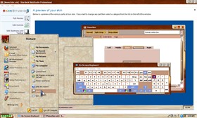
I would consider using this on a regular basis but have a problem with text. In some text boxes it has text on top of text making it impossible to read. It could be that I use Windows 7 and this skin was made for xp.
Check out this shot to see a sub version of it. http://img408.imageshack.us/img408/1936/87615511.jpg
Update. Thanks to Xiandi for giving me instructions on how to fix the problem with the text. It involved skinning the read only combo boxes and the instructions can be found in the forums. Here is the link. https://forums.wincustomize.com/404377
Comment #5 Sunday, January 23, 2011 9:43 AM
I am very much agree with JuniorCrooks, I am using it now and liked ait very much, there are a few little things but its very usable and working great in W7.
Browny 
Please login to comment and/or vote for this skin.
Welcome Guest! Please take the time to register with us.
There are many great features available to you once you register, including:
- Richer content, access to many features that are disabled for guests like commenting on the forums and downloading files.
- Access to a great community, with a massive database of many, many areas of interest.
- Access to contests & subscription offers like exclusive emails.
- It's simple, and FREE!


Comment #1 Saturday, January 22, 2011 9:31 PM
Richie you are getting better all the time. Just keep going it will get better and better with each one. At least you are making bilnds as I can't get the nerve to start one. Good job.