


 |
|
Page 3 of 4 |
|---|

Comment #45 Tuesday, September 6, 2011 12:15 AM
Nice job. I like it, simple, yet very functional. One complaint I do have, though, which actually applies to many skins here is you have to change the bg color of a lot of text areas, grey on grey just is not readable. This is just a suggestion to all artists, be careful w/ the text entry backgrounds. Otherwise, this is a great skin!

Comment #48 Thursday, September 8, 2011 1:46 AM
Outstanding skin Tim! I really like your color choices with the exception of some of the text that becomes illegible. Just needs some tweeking here and there otherwise very nice. Thanks for sharing! 
Comment #49 Thursday, September 8, 2011 2:20 AM
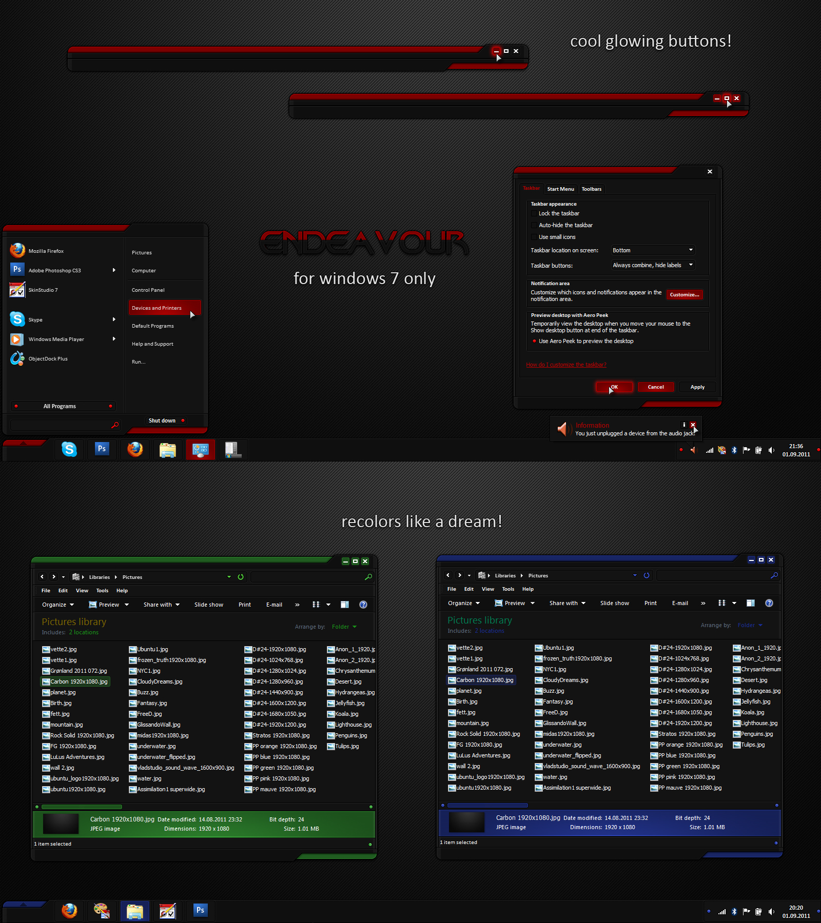
Unfortunately there are places in the windows UI where we do not have total control over text color. As well, there are other places where changing text colors will effect seemingly unrelated sections making them unusable.
I have used this skin all day while building and still have it applied. So far, I haven't run into any problems that switching to the light substyle can't fix. My goal with the light style was to fix any areas that are hard to use with the dark style applied so I encourage people to contact me via PM if they run into any problems.
Once again I thank everyone for the feedback!
Comment #51 Saturday, September 10, 2011 11:14 AM
Very, very nice.
I specially love the mouseover effect on taskbar buttons 
really talented 
Comment #56 Friday, September 23, 2011 10:39 AM
Excellent them, but when using a browse feature like choosing files to upload into gmail, the background and file texts are the same color in the browse window. I'm a noob on adjusting these themes, is there a way to change this in the settings?
Comment #57 Tuesday, September 27, 2011 5:03 PM
Can you tell me if this problem is evident both in the dark (default) and light substyles?
Comment #58 Tuesday, October 4, 2011 8:56 PM
The Skin looks fantastic but I'm having trouble changing the color not matter what I try to change it to the color remains red... can anyone help? The color changes in the preview but it will not change when I click apply, it remains red...
Comment #59 Thursday, October 20, 2011 12:18 AM
Awesome! My only gripe is that the RockMelt browser's address and search bars are *not* themed, so it's white text on off-white background. Any chance this'll be fixed in a later update? (same goes for Impulse's message boxes)
edit: I'd also like to congratulate you. Yours is the first UIS2 skin that doesn't cut of the text of message boxes in Office 2010. EVERY other one I've tried always ends up cutting stuff off, making me guess what they were saying.
Please login to comment and/or vote for this skin.
Welcome Guest! Please take the time to register with us.
There are many great features available to you once you register, including:
- Richer content, access to many features that are disabled for guests like commenting on the forums and downloading files.
- Access to a great community, with a massive database of many, many areas of interest.
- Access to contests & subscription offers like exclusive emails.
- It's simple, and FREE!
|
|
Page 3 of 4 |
|---|


Comment #41 Monday, September 5, 2011 2:11 AM
Thanks so much, everybody!