Comment #22 Friday, February 24, 2012 12:04 PM
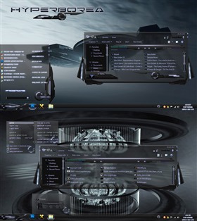
Screen shoot looks Nice. Downloading it now...
Comment #23 Saturday, February 25, 2012 3:20 AM
Bonjour Neone,
Il est important de ne pas diminuer votre talent d'artiste par trop de compliments.
Mais parfois de relever des critiques pour ne pas laisser s'endormir le maître.
Votre signature d'une barre des taches animée n'existe plus.
Votre animation 3D interieure au windowblind n'existe plus.
Ne l'oubliez pas.
Comment #24 Saturday, February 25, 2012 3:31 AM
hello Neone.
It's important not to diminish your artistic talent by too many compliments.
But sometimes face criticism for not letting sleep master
Your signing of an animated taskbar no longer exists.
3D animation to your inner windowblind no longer exists.
Do not forget it.
Felicitations !
Comment #25 Saturday, February 25, 2012 3:39 AM
@ Lecajef:
Don´t you worry about that.
Of course I´m not going to forget anything of what you´re referring to, but this blind felt quite finished like this.
Thanx for reminding me though Lecajefster man. ![]()
Comment #26 Saturday, February 25, 2012 9:36 AM
Just when I think you have reached the pinacle, you raise the bar higher and higher and then exceed it. This kicks azz ! Thank you for sharing. ![]()
![]()
![]()
Comment #27 Saturday, February 25, 2012 9:47 AM
Thanx Nairb13 !!
Send me a PM & tell me what style you want 4 your Avatar/profile pic. ![]()
Comment #29 Sunday, February 26, 2012 8:57 PM
As I said before.....awesome WB.....BUT....I am having problems when I bring up Ccleaner,Defraager,FireFox or IE! I am getting a 1 inch strip thats opaque on the right and left sides of the box! It doesn't do it on Pictures, Documents and such....just the others. I can send you a snapshot if ya send me an e-mail to send it too! Thank you ![]()
Comment #31 Monday, February 27, 2012 11:17 AM
It looks different which is good, but every time I clicked "Programs" it crashed Explorer!
Comment #32 Monday, February 27, 2012 1:17 PM
Comment #33 Tuesday, February 28, 2012 3:44 AM
needs some work, cool concept, just needs polished. Need to make text clearer.
Comment #34 Tuesday, February 28, 2012 5:14 AM
-
When making a skin this advanced you just have to skin around certain issues... The text on some places is so bright because it is the same text as used on the transparent backgrounds and there was either fuck up the skin by having another text color there or having it like it is and thus getting hard to read in some areas.
Comment #35 Tuesday, February 28, 2012 11:15 AM
You´re a very gifted person, mate. GORGEOUS ![]()
![]()
![]()
![]()
![]()
Comment #36 Tuesday, February 28, 2012 12:22 PM
Comment #37 Thursday, March 1, 2012 7:29 PM
What an awesome skin! Everything's spot on. ![]()
![]()
![]()
Comment #38 Friday, March 2, 2012 10:44 PM
Great skin! but was just wonderin how i can make the txt for fonts in firefox to b more visible?
Comment #39 Friday, March 2, 2012 10:50 PM
The skin is made for win7, other than that is all in the users hands... I use Internet explorer myself so that´s the one I care about if any.
Comment #40 Friday, March 9, 2012 11:50 PM
Bluddy amazing neone,great job.Different,and l like different. ![]()
![]()
Please login to comment and/or vote for this skin.
Welcome Guest! Please take the time to register with us.
There are many great features available to you once you register, including:
- Richer content, access to many features that are disabled for guests like commenting on the forums and downloading files.
- Access to a great community, with a massive database of many, many areas of interest.
- Access to contests & subscription offers like exclusive emails.
- It's simple, and FREE!


Comment #21 Friday, February 24, 2012 11:21 AM
Very nice work...Love the glass themes!
