Comment #9 Wednesday, October 3, 2012 7:05 PM
Rather good for your first WB, looks as good as Leo. ![]()
Comment #10 Thursday, October 4, 2012 6:34 AM
Looks better then Leo, which i have too. More shading, different effects. Smoother.
Comment #11 Thursday, October 4, 2012 10:52 AM
Wonderful Blind, Excellent Job... ! thank you ,, should be a master skin. ![]()
![]()
Comment #12 Friday, October 5, 2012 11:55 AM
This is the best Mac clone I have seen! Great job!
...hence the point of being a Mac clone... ![]()
Comment #13 Friday, October 5, 2012 1:24 PM
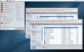
Thanks for all the great comments on my skin. I've tried to add as much color to it as i could but i wanted an authentic looking mac theme. I've worked over the last few years gathering all the mac skins and screenshots of actual macs to pull together the best features and this is what i have. This beats any and all windowblinds mac themes out there. This contains sounds attached to all the button fuction similar to Mac OS Panther but the sounds don't work for some reason.
FYI, if you want the finderbar at the top, checkout http://winmac.emuunlim.com/. This little program is 100% free and works on XP, Vista and Windows 7 flawlessly. No glitches. Only 2 drawbacks
1. you cannot change the skin to improve on it.
2. there is no system tray
The doc is from ObjectDoc which i find to be better than Rocket Dock
If you want tabs on your folders like a real mac, get Clover Tabs... http://lifehacker.com/5938342/clover-brings-chrome+style-tabs-to-windows-explorer FYI this application does not work well with this skin
If anyone out there wants to play with this skin and the tab application and find a way to make it work properly with the skin be you're welcome to do it just let me know if you find a solution.
Thanks again.
Comment #14 Sunday, October 7, 2012 8:46 AM
Great work Josh36! You have some real talent and hope to see more from you in the future. Don't get too warm out there in Arizona (I used to live in Tempe and Mesa). ![]()
Comment #15 Monday, October 8, 2012 5:25 PM
Thanks man. I'm working on trying to improve this skin. I'd like to some how figure out a way to add tabs to the top to make it more "Mac Like". The closest thing i can do is make the command bar in windows vista and windows 7 look like Safari tabs which is cool.
Comment #16 Tuesday, October 9, 2012 12:28 AM
Exactly what I was looking for! Your work is simply AMAZING! Thank you so much!
Comment #18 Saturday, October 27, 2012 9:24 AM
Why did you go and change the apple on the start menu to that little one. I installed it and on one laptop it is nioce and shiny and on the 14th of october you adited the skin. Now the apple is a tiny little dot.
Great skin still but
Why?.
Comment #19 Saturday, October 27, 2012 10:38 AM
Why did i do it? basically because i wasn't happy with the apple that i had. If more people complain i'll put the bigger one back in.
Did you download the skin today? I've added the blue bars on the right side of explorer to mimic the mac explorer and the left side of explorer is now blue to mimic mac.
If you have any suggestions I'd love to hear them.
Thanks.
Comment #20 Monday, November 5, 2012 7:12 PM
Parabens pelo trabalho, muito bom mesmo. Estou apenas com um problema: Os icones da barra de tarefa (som, internet, etc.) não ficam iguais ao que foi apresentado (parecido com os do MAC). Porque será? Também acho que com a "maçã", maior fica melhor. Porem isso não é defeito, ótimo trabalho.
Please login to comment and/or vote for this skin.
Welcome Guest! Please take the time to register with us.
There are many great features available to you once you register, including:
- Richer content, access to many features that are disabled for guests like commenting on the forums and downloading files.
- Access to a great community, with a massive database of many, many areas of interest.
- Access to contests & subscription offers like exclusive emails.
- It's simple, and FREE!


Comment #1 Wednesday, October 3, 2012 10:34 AM
This is fabulous for Windows 7!!! Very clean and easy on the eyes!! LOVE it, a job so well done!!!


