Comment #2 Wednesday, December 5, 2012 8:44 AM
Great skin, if that’s your first all I can say is WOW! Thank
you ![]()
![]()
Comment #7 Wednesday, December 5, 2012 11:07 AM
Really like the "matte" finish on this blind. Great job!
Comment #8 Wednesday, December 5, 2012 5:41 PM
Comment #9 Thursday, December 6, 2012 1:32 AM
Nice job Doc!!! I knew you'd do great things!
Comment #10 Thursday, December 6, 2012 8:15 AM
A very pleasant rarity....A darker blind that is useable and clear....Thanks..Looking forward to #2.
Comment #12 Friday, December 28, 2012 7:52 PM
Great looking skin!Will this skin work for Xp ,thats whet I have, it would be so cool on Xp too.jagreen
Comment #13 Friday, December 28, 2012 8:50 PM
CONGRATULATIONS You did a great job
Comment #14 Saturday, December 29, 2012 2:38 AM
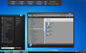
Doc, this is a very nice blind. I am using it as we speak. Just an advice from me. If you have updated the major elements ty to update the preview too. I do not know what you normally use for its creation but I use Photoshop when doing any preview. As well try to include more skin elements so that users can see what is your skin about. PLEASE this is just a thought of mine to help you. Do not take it personally. Because you have done a wonderful job here. I wish my first blind was of the same quality. ![]()
Comment #16 Sunday, December 30, 2012 12:01 PM
This is a great everyday skin, a bit more tame than I am used to but a great looking skin. Thank you for sharing, looking forward to future projects. ![]()
![]()
Comment #18 Monday, December 31, 2012 6:45 PM
Thanks to all who have downloaded my first design, I did download it myself just to check and had to make a couple of painting corrections to line up the start menu better. I re-posted and all should be right now. I'm still learning skin studio by teaching myself and with a lot of help from Xiandi and because of that my 3rd skin is almst done. I'm trying to pay attention to all sections but i do have to admit that because this was my first project, I did some color removing on graphics instead of designing new ones like I have on my 2nd skin Burloak.
Comment #19 Monday, December 31, 2012 7:03 PM
Seems hard to believe you made such a good job" one of theI'm looking forward to seeing the second sskin old I would like to see an updated start menu on this one more modern life win 7 todaythis one looks a bit XP like okay but just a little constructive criticism just keep up the good work thanks for sharing ![]()
Comment #20 Sunday, January 13, 2013 5:40 PM
Yea I'm a square corner fan just like my monitors corners ![]() Very nice clean job.
Very nice clean job. ![]()
Please login to comment and/or vote for this skin.
Welcome Guest! Please take the time to register with us.
There are many great features available to you once you register, including:
- Richer content, access to many features that are disabled for guests like commenting on the forums and downloading files.
- Access to a great community, with a massive database of many, many areas of interest.
- Access to contests & subscription offers like exclusive emails.
- It's simple, and FREE!


Comment #1 Wednesday, December 5, 2012 8:38 AM
Great looking skin!