Comment #4 Thursday, January 17, 2013 10:01 PM
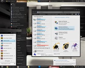
Reminds me of Dani's work. (especially the start button)
Try to be more Original ![]() I've seen some of yout past efforts, You have more within u.
I've seen some of yout past efforts, You have more within u.
Comment #6 Saturday, January 19, 2013 8:24 AM
This is a good skin. Really is. And it is very visible you have a perfect sense for colours. Skin is smoothly sharp and I just love that matte-black feel in it. The only snag I see is that you have done a quite similar stuff recently. Perhaps it is a right time for something else? ![]() By all manners of means this is a great "every day" skin.
By all manners of means this is a great "every day" skin. ![]()
![]() from me
from me ![]()
Comment #7 Friday, February 8, 2013 10:51 PM
It's clean, it's beautiful, it's functional. It's 007TINAR.
Is it similar to his other work? Yes. Do I mind that? No. In fact, I'm glad! TINAR's work is marked by his signature style... crisp, clear, and minimal. In many ways, perfect. I look forward to each new skin TINAR puts out, because each comes with subtle enhancements and light flavors that offer up what he does best: giving brillant signature designs that accents any desktop.
Great work, sir!
Comment #9 Friday, February 15, 2013 7:44 AM
Been using this for a while now and I really like it, clean, simple and very usable. Keep up the good work.
Comment #10 Thursday, February 6, 2014 8:39 AM
Thank you alot for the A-M-A-Z-I-N-G great clean skin ![]() +++++++ my fav so far
+++++++ my fav so far ![]()
![]()
![]()
Please login to comment and/or vote for this skin.
Welcome Guest! Please take the time to register with us.
There are many great features available to you once you register, including:
- Richer content, access to many features that are disabled for guests like commenting on the forums and downloading files.
- Access to a great community, with a massive database of many, many areas of interest.
- Access to contests & subscription offers like exclusive emails.
- It's simple, and FREE!


Comment #1 Wednesday, January 16, 2013 8:37 PM
that looks nice, reminds me of Firefox's FT DeepDark skin., good job.