Comment #2 Wednesday, May 28, 2014 12:10 PM
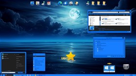
Very nice Blind! I cannot seem to get the system clock to show with this however.
Comment #3 Wednesday, May 28, 2014 12:42 PM
Ooops! My bad, will up fixed version for this in a minute. ![]()
Comment #5 Wednesday, May 28, 2014 1:16 PM
Thanks! Clock shows now. Very nice Windowblind!
Comment #6 Wednesday, May 28, 2014 1:39 PM
Great WB Tom. ![]()
![]()
So happens I got an SMX to match, almost. Lol
Comment #11 Saturday, June 7, 2014 7:41 PM
Very Bright at 1st then sort of grows on you especially with the wallpaper of DEVJIT'S all works very well another masterpiece in a great collection love your work can't wait to see what comes out next ![]()
![]() [e digicons](\
[e digicons](\![]()
![]() (\
(\![]() [/e]
[/e]
Comment #13 Tuesday, September 22, 2020 8:48 PM
Dang Tom. I completely missed this one. Pretty cool!![]()
Comment #14 Thursday, October 29, 2020 7:45 PM
I love this one too and this is just a question about whether it is hard to add a rollup button? Is it hard to "retro-fit"?
Thanks for all the beauty you have blessed us with!!!!!!
Comment #15 Friday, October 30, 2020 9:33 AM
Well, that would depend on whether or not you are experienced with SkinStudio. For me it would not be hard, but I am no longer adding it to my skins because you can set Windwoblinds itself to do a rollup by just double clicking on the title bar. It would not be that easy to explain the procedure to add it in SkinStudio starbucksphreaq.
Please login to comment and/or vote for this skin.
Welcome Guest! Please take the time to register with us.
There are many great features available to you once you register, including:
- Richer content, access to many features that are disabled for guests like commenting on the forums and downloading files.
- Access to a great community, with a massive database of many, many areas of interest.
- Access to contests & subscription offers like exclusive emails.
- It's simple, and FREE!


Comment #1 Wednesday, May 28, 2014 11:57 AM
Bluer than blue! Nice job, Tom. Keep em comin!