Comment #3 Thursday, June 18, 2020 3:31 PM
You did a great job for a first skin.....keep up the good work ![]()
Comment #6 Monday, June 22, 2020 7:41 PM
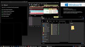
Looks like the standard windows 10 skin in dark mode.![]()
Comment #7 Wednesday, June 24, 2020 7:25 PM
Oh wow thanks everyone for your kind words! That's wonderful to hear~ ^^
Comment #8 Sunday, June 28, 2020 2:58 PM
Buen trabajo, para ser tu primer tema, ¡has acertado en lo que estaba buscando!
Comment #9 Sunday, November 15, 2020 6:01 AM
Well done on your first skin! was exactly what i was looking for, so thank you!
Comment #11 Saturday, December 12, 2020 11:48 AM
Moves the close button away from the top-right so you have to stop and think to move the mouse back away from the corner and I hate that!
There are some bits of text that are black text on black backgrounds. It's really frustrating trying to find a decent dark theme!
Comment #12 Sunday, December 13, 2020 2:59 PM
The close button is there because that's how it looked in 8.1, so I won't be changing that.
The black text on black backgrounds is something ive been trying to fix, but I can't figure out what exactly makes those specific win32 texts show up as black. I think it's something hard-wired into windows 10 to always be black. I'll have to do some more testing. Thank you for the feedback.
Just don't expect it to be fixed, since there's only so much that SkinStudio can do.
Comment #13 Sunday, December 13, 2020 11:33 PM
That absolutely warms my heart. I'm really glad to hear that!~
Comment #15 Monday, April 5, 2021 12:44 PM
Hi!
Thanks for returning to your work and updating your skin. I am always encouraged when skinners do this. I know it can be a lot of effort, but people like me who don't have this particular capability to make skins sure appreciate it.
A quick question. It would seem from your preview that your intention is for the user to have a flat solid black color as opposed to a wallpaper, is that correct?
Obviously a user can do whatever they choose to do, but I'm always interested in how either the developer utilizes the skin themselves, or the general vision they have for how it is supposed to be when all the elements are pulled together.
Thank you in advance!
Comment #16 Tuesday, April 6, 2021 3:37 PM
Well, it doesn't matter to me what you use as your background, I'd rather let the user pick their own choice than force one onto them. This is also why I chose to omit the use of a background in the preview.
Please login to comment and/or vote for this skin.
Welcome Guest! Please take the time to register with us.
There are many great features available to you once you register, including:
- Richer content, access to many features that are disabled for guests like commenting on the forums and downloading files.
- Access to a great community, with a massive database of many, many areas of interest.
- Access to contests & subscription offers like exclusive emails.
- It's simple, and FREE!


Comment #1 Thursday, June 18, 2020 10:37 AM
Very nice job, for your first skin, keep up the good work!