|
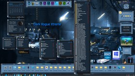
Dark Rogue XtremeUpdated Jan 05, 2022 by RedneckDude |
Comment #2 Thursday, January 6, 2022 12:47 AM
Hey man...lol. You do know that everything can be scaled via settings?
Dig into settings, you'll see. Docks and modules have scaling settings, the taskbar and shelf auto scale.
Right click a module, scaling settings are there. Docks scale by adjusting icon size.
It's all in the settings.
I have a 1080p laptop, and it looks awesome on it.
Comment #4 Thursday, January 6, 2022 1:49 AM
I have a 17" HP gaming laptop with 1920x1080 res, and it looks fine on it....
Great job Jim....
Comment #6 Thursday, January 6, 2022 9:21 AM
Look great! Thanks for skinning the Nexus dock too; sometimes it doesn't get a lot of love
Comment #9 Thursday, January 6, 2022 3:09 PM
Theme looks great and works fine on 1920 x 1080. Is there any way to change the dock and shelf background to dark? If not, maybe an all light and all dark background theme could be made?
Comment #10 Thursday, January 6, 2022 10:35 PM
Maybe I'll make an all dark version, no all light, sorry.
I'll need a day or so. Doing computer repair and sales right now.
Comment #11 Friday, January 7, 2022 12:07 AM
Did you try playing with the colorization options for the dock and shelves already?
Comment #12 Friday, January 7, 2022 4:15 AM
In all truth, no. I first thought of a dark and light theme because Webgizmos would often add theme variations. I hate to expose my ignorance, but is there a separate colorization control for just shelves, docks, specific modules and subdocks?
Comment #13 Friday, January 7, 2022 6:00 AM
Yes. In the Themes tab of Preferences, select an object in the combo box at the top left and press the round arrow at the bottom right to bring up the quick colorizing controls.
You can also do this for individual shelves and docks in the Themes tab of each shelf/dock Properties dialog. For modules, it is also available in Preferences -> Modules tab -> Press down arrow to expose quick colorization settings.
Comment #14 Friday, January 7, 2022 11:01 AM
This is good to know.
I used the original skin colors. I was trying to be as authentic as possible.
Comment #15 Friday, January 7, 2022 6:55 PM
Your skins are the3 only ones that don't look correct on any of my laptops so it's not on my end. I don't know how they look fine on everyone else's when 4 different laptops all have the same issue. I shouldn't have to go into settings to fiddle around with it for it to look correct. Like I said your themes all have this issue since GAX theme. that was the last one that looked fine.
Comment #16 Friday, January 7, 2022 9:21 PM
"Your skins are the3 only ones"
I have way more than 3.
NeverExists07, Ok, you are the only one with an issue. I'm not charging so I make them to suit MY setup. They can be scaled very easily. I didn't program Winstep, only skinning it.
I'm sorry about your issue, but the skins are made on my system, FOR my system. I share without payment. It is what it is. Sorry man.
Please login to comment and/or vote for this skin.
Welcome Guest! Please take the time to register with us.
There are many great features available to you once you register, including:
- Richer content, access to many features that are disabled for guests like commenting on the forums and downloading files.
- Access to a great community, with a massive database of many, many areas of interest.
- Access to contests & subscription offers like exclusive emails.
- It's simple, and FREE!
Comment #1 Wednesday, January 5, 2022 11:30 PM
This winstep is way too big for most people's screens. I told you about that a few years ago and you said you'd check it. Guess you never did cause there still unusable.
Rhttps://postimg.cc/sG567t6R
here is what it looks like on my screen 1080p. Ive went through about 4 computers in the last 3 years and your winsteps have been like this on all of them