











Animated Wallpapers: July '08 Edition
Animated Wallpapers from July '08
Wednesday, August 6, 2008 by Island Dog | Discussion: OS Customization
August is here, so now its time to take a look back at some of the featured .dreams (animated wallpapers) that were submitted to WinCustomize throughout the month of July.
Now for this months video!
To use .dreams (animated wallpaper) you need to have Windows Vista and Stardock's DeskScapes (free) installed. If you are an Object Desktop subscriber, you have beta access to DeskScapes 2.0 which will run on virtually any version of Vista.
The .dreams featured in this months video can be found at the links below.
-
Fire Storm by TheMasterBaron
-
SpyroGyro by CarGuy1
-
Lagerfeuer by Marco820
-
Fish Tank by preechor
-
Dead Planet by AgustSigurdsson
-
sunset_at_fairyglade by muckyman
-
Stardock Cloud Logo by Seabass
-
Asteroids by TheMasterBaron
Icon-A-Day 2.0, Day 1. Not ready for the wrecking ball.
Tuesday, August 5, 2008 by mormegil | Discussion: OS Customization
 For those of you not familiar with the Icon-A-Day series of tutorials, and icons, you can find the Tutorial Index Here, and the final Iconpackage Here. I hope you will find the new series helpful and fun, and I hope you find the new icons to your liking. For those of you who were around for the first go, welcome back, and thank you all for making the Icon-A-Day series such a great success. The original Icon-A-Day Iconpackage has been downloaded 225,673 (as of today) times from Wincustomize alone, not to mention that the individual icons are up to 761,444 when you put them together. And thanks to you guys my Wincustomize Home Page has been in the top 5 blogs on Wincustomize for the last 3 years. For those of you not familiar with the Icon-A-Day series of tutorials, and icons, you can find the Tutorial Index Here, and the final Iconpackage Here. I hope you will find the new series helpful and fun, and I hope you find the new icons to your liking. For those of you who were around for the first go, welcome back, and thank you all for making the Icon-A-Day series such a great success. The original Icon-A-Day Iconpackage has been downloaded 225,673 (as of today) times from Wincustomize alone, not to mention that the individual icons are up to 761,444 when you put them together. And thanks to you guys my Wincustomize Home Page has been in the top 5 blogs on Wincustomize for the last 3 years. Like last time, I want to use the first day to let you know what the goal of the project will be, and how we will be going about it. First off, despite the name "Icon-A-Day," I will often be posting multiple icons each day, and there will probably be days were I don't get a final icon posted. I do hope to get a post up each day, with at least a short tutorial, even if the resulting icon is not final. This is one reason why I will be naming each post with the day and a title, rather than the the icon # and name. And finally, I have had to admit that there is just not enough time in the day. Unlike last time, I will only be posting on the weekdays; Monday - Friday. I will also be skipping most holidays. Icon-A-Day 2.0, will be Part 1 of a new series of icons. Part 1 will be going through the original Icon-A-Day icons and making them ready for the Vista World. Part 2, will be a brand-spanking-new icon set, one that is only a sparkle in my eye at the moment. So you can think of Part 1 more as Icon-A-Day 1.5. I do these tutorials for my own pleasure, however I LOVE to get feedback; please comment and let me know what you like and don't like. I will be taking feedback seriously, and want to make sure that both the updated Icon-A-Day package and the new icon set are some of the best icons on the net. Once again, I will be doing these icons, in CorelDRAW. I just recently updated to X4, and have been happy with it. For those of you who want to follow along, and don't have X4, you should be able to do so with any version newer than version 9, since I will be using a lot of Mesh Fills. You can also get the Trial Version from Corel here. If you find yourself loving it as much as I do, you can buy it at your local retailer, or even get it Directly from Impulse. (Stardock Plug). For those of you who don't care for vector graphics, or who love Illustrator, or Photoshop, you might find some interesting techniques that you can borrow, and might find the tutorials more useful than you think. That's enough exposition for day one, lets move on the the reason we are here. | ||
| ||
| As I mentioned above, part one of this new series will consist of updating the original Icon-A-Day icons. When I started the original icons in January of 2005, Vista was still called Longhorn, and was still a mythical OS that would do everything for everyone. Early screenshots were leaking out, most of which were not at all what we ended up with in Vista, but I did know that we were most likely going to end up with 256x256 icons. So even then I was pretty sure I would need to upsize the icons, and when I exported them I did so at 384x384. This has made it possible for me to quickly create Vista quality icons of the original images. Even three years later I am still quite proud of the Icon-A-Day icons, and think that many of them only now, in Vista, can truly shine. So today, rather then jumping into creating any new icons, I will start going through all the existing icons and updating those that are not ready for the wrecking ball. Most of the icons that will need drastic updates will be the folders, since we will be rotating them so as to take advantage of Vista's Live Folder feature. We will also be creating many new folders to fit in better with the new user folder structure. I will however be updating many of the system and file icons, since some of them are obsolete, or just dated. Today we will start with the System icons that I feel stand up to vista's 256x256 scrutiny. These can be divided up into two groups, icons that I think are still look great in Vista, and icons that look good, but are not often seen in Vista. I will be updating them despite this, because I want the final 2.0 pack to be as complete as possible. | ||
| Internet Icons: I still love this globe, even if it is kind of simple, so we will be keeping it, as well as most of the Icons that are derived from it.  | ||
| Drives: The hard drive was one of the first icons in the Icon-A-day series, and I think that it stands up well. Even if it is technically an external. In 1.0 we also made several of the less common drive types. I think these all stand up to time, and I am sure we will have to add several more as we work our way through the 2.0 update. 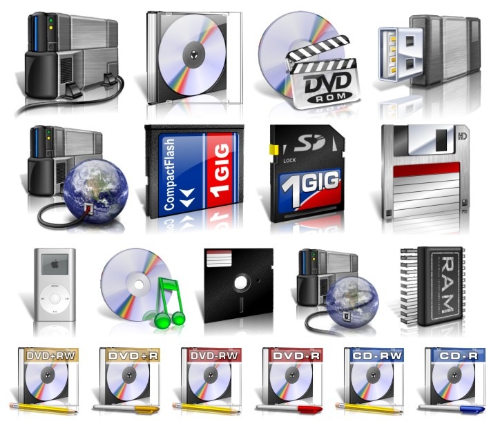 | ||
| Other System Icons: I am still quite proud of this Recycle Bin, and I think people like it since I have seen it ripped more times than I can remember. The rest of these system files I don't really think need updating; some are just too basic, and some are only used in XP, or even 2000/98, so I will simply be making Vista versions for the fun of it. 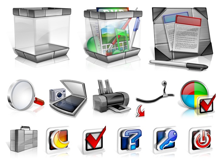 | ||
| System Icons that Will See Updates. As much as I liked the My Computer icon for 1.0, it is a bit dated, and I want to give it some love. This will mean that many of the other system icons will be getting updated as well; My Network, Control Panel, etc. We will also be adding several new System, and Control Panel icons, as the project continues. | ||
| Wrap Up: I think that is enough for Day One; I will back tomorrow, and we will get the File icons that are still in vogue updated. I will be posting the above icons into the Miscellaneous Icons category, all ready for Vista. I will be compiling all the icons with the complete complement of of size, from 16x16 to 256x256, so they should work with just about any system or application you want to use them on. Have fun! | ||
| |

Download Updated Icons: |  |
All Icon-A-Day artwork, copy, and Icons, are copyrighted by Paul Boyer © 2008, and may not be used with out express permission.
Icon-A-Day 2.0, Day 2. Files, Files, and Files.
Tuesday, August 5, 2008 by mormegil | Discussion: OS Customization
 I was never happy with the quantity of File Type icons in the original Icon-A-Day Iconpackage. I wanted to do more, but by the time I got to the end of the project I was about burned out. This time around should be easier since we should be able to keep almost all of the original file type icons. I was never happy with the quantity of File Type icons in the original Icon-A-Day Iconpackage. I wanted to do more, but by the time I got to the end of the project I was about burned out. This time around should be easier since we should be able to keep almost all of the original file type icons. | ||
| ||
| One of my favorite things about the Icon-A-Day File Type icons, is the glassy reflective style. I want to keep that theme throughout the update as well. This is going to save me a lot of work, and give me the opportunity to expand the file selection with the time that I save. | ||
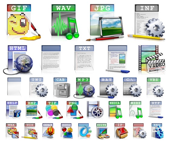
| Old Favorites: Despite this I don't see any reason not to update almost all the original File Type icons for those of us who still enjoy a sight-seeing trip though the file system every now and then. | ||
| Missing in Action: | ||
| Wrap Up: Once again I will be posting the above icons into the Miscellaneous Icons category; all ready for Vista. I will be compiling all the icons with the complete complement of of size, from 16x16 to 256x256, so they should work with just about any system or application you want to use them on. Have fun! | ||
| |

Download Updated Icons: |  |
All Icon-A-Day artwork, copy, and Icons, are copyrighted by Paul Boyer © 2008, and may not be used with out express permission.
Corel Paint Shop Pro Photo X2 Walkthrough
Tuesday, August 5, 2008 by Island Dog | Discussion: Personal Computing
I have used Paint Shop Pro since about version 8, and I have upgraded to almost every other version update since then. I was always recommended PSP from many members of the skinning community, and even today I know many popular skinners who use this. Paint Shop Pro has come a long way since I first started using it, and even though it has moved more towards use with photography, I found it’s still a great graphics tool that is perfect for making skins and themes. Best of all, it’s a great alternative to other higher-end imaging software which costs much, much more.
The first thing I notice when opening Paint Shop Pro Photo X2 is it’s sporty a sleek new graphite theme, which can be disabled if you rather have the previous style. The graphite theme works well and gives a darker look to the whole application, which at least to me, makes working on graphics easier on the eyes. If you are new to Paint Shop Pro, or just need some help in some areas, there is a Learning Center docked to the left side which guides you through the process of several techniques like making photo collages, adding effects, adjusting images, etc. Of course you can configure the interface to your liking, but I found the default quite suitable for my needs. There is also an image browsing window where you can easier organize, find, and edit images stored on your computer.

All the tools you would ever need to either create graphics for skinning, or for adjusting photographs, are right here. I was happy to see one of my favorite tools, the picture tubes, are still there. There is such a wide variety of settings and tools available that I could write all day about, but take my word for it, it has what you need. On the photography side, there are several “one-step” fixes for various common corrections in photos. There is also a new Express Lab which can batch edit several files or folders at once with actions like crop, resize, etc.
Some other new features are the HDR Photo Merge which combines two or more images and corrects the contrast automatically. Also new is the addition of layer styles and watermark support, both of which should be welcomed to both beginner and seasoned professionals. The Black & White conversion tool has also been enhanced along with the Makeover tools which are essential for fixing any impurities in images.

While I was once concerned that Paint Shop Pro would only be useful to photographers, I have now realize that it’s only added to the graphics experience. Whether you are a photographer, graphic designer, or skinner, Paint Shop Pro Photo X2 has all the features necessary to bring your creativity to life.
Corel Paint Shop Pro Photo X2 is now available from the Impulse Store for just $79.99.
This Week in Skinning - August 1st
Skin Roundup for 8-1-08
Friday, August 1, 2008 by Island Dog | Discussion: OS Customization
Now for this weeks picks!
|
|
DECEPTICON Cobra Edition for Bootskin by nimbletongue How cool is it to boot up Windows and see this come up? |
|
|
Prototype III for CursorFX by Libardo Libardo is just cranking these cursor themes out, and here is another in the Prototype series. |
|
|
EvolveFX for CursorFX by TYCUS The detail in this cursor theme is amazing, not to mention the animation. Check it out. |
|
|
Starry Starry Night in Dreams by CarGuy1 This .dream goes perfect with a darker WindowBlinds skin, and has a nice subtle movement. |
|
|
Gaiety Tabbed Docks in ObjectDock Backgrounds by WebGizmos Gaiety is a really fantastic WindowBlinds skin, and now WebGizmos has shared a collection of dock backgrounds to match. |
|
|
Palms View in Wallpapers by Rahul29 I really like the colors and scenery in this wallpaper. Nice work. |
|
|
Butterfly Effect in Wallpapers by DEVJIT This is another wallpaper that makes great use of color, with a very minimalistic approach. |
|
|
LED3: Dot Matrix for WindowBlinds by vStyler This Master Skin for WindowBlinds is one of my new favorites. It's just a great design all around, so be sure to pick this one up. |


Have a great weekend and remember if you have a skin in progress, feel free to post a teaser preview in the "What are you working on" thread. See you next week!
Harley-Davidson Raw MyColors Walkthrough
Thursday, July 31, 2008 by Island Dog | Discussion: OS Customization
The Harley-Davidson Raw MyColors Theme was recently released, so as usual, I want to take you through a walkthrough of what is featured in this theme. This is a theme designed for MyColors, and to find more information about MyColors, you can read through a walkthrough or view a screencast with more information.
Visual Style and Wallpaper
The visual style for the Harley-Davidson MyColors theme is a bit hard to describe, but the “Raw” name is one of the first things that come to mind. The start button is of course the Harley-Davidson logo, and the rest of the skin has a dark, but well designed feel to it.

The wallpaper is also in tune with the “raw” look as well. Pictures of Harleys take the space along with what I would call graffiti-like artwork across a wall backdrop. If you want to change to a different resolution, just look in the Wallpapers tab in the MyColors Theme manager.

Icons
These icons are really awesome. They are just filled with all types of Harley-Davidson goodness! The Mailbox icon is probably one of my favorites from this group.

Gadgets
The Harley-Davidson MyColors Theme include 3 gadgets for use on the desktop. Gadgets are mini-applications and this theme includes a weather gadget, clock, and calendar all staying true to the Harley-Davidson Raw style.

The Harley-Davidson Raw MyColors theme is available for both Windows Vista and XP. If you are a subscriber to Object Desktop then you are eligible for a discount for MyColors themes. For more information visit the Harley-Davidson Raw MyColors page.
Stardock Central Clarification
Wednesday, July 30, 2008 by DorkCoffeez | Discussion: Stardock Support General

There have been multiple responses from many different Stardock Representatives and community members about the status of Stardock Central and Impulse. At this time I would like to clarify the situation as it stands. This is of course subject to change but this is the current situation at the time of this posting. Any changes I am made aware of I will post here as well.
Impulse is the new downloading tool for Stardock software, games, published games, and store front. It will receive priority in all new downloads and updates. There are a great many plans for updates to the software including tools, features, and so on. If you have not already, we encourage you to make the switch.
Stardock Central will continue to feature updates for Stardock software only at this time. This will not include games, even Stardock original ones. However WindownBlinds, Icon packager, and so on will still have the updates made available to them as a service to our customers.
As I said any of this is subject to change but as it stands right now this the policy regarding these two free tools. I do apologize for any inconvenience in these matters.
As always if you have any troubles or questions you can let us know at [email protected].
Seabass
The Blur feature and effecting Shadows
A must read for WindowBlind skinners!!
Wednesday, July 30, 2008 by SKoriginals | Discussion: WindowBlinds Tutorials
Ok so your a skinner, you make a skin with transparency and you've added a shadow to your frames and such. Now you want to add the blurring feature to your skin but you get something like this...

hum... now we have a problem cause that looks like hell.
But take notice, the image is square but the blur is effecting only SOME of the whole image area for that part of the frame. So whats happening here? This didn't just hit me till last night even though I've been dealing with it personally ever since the blur feature was added. After some discussion with another Master (Lasse, aka PixelPirate) skinner it dawned on us and here are some 'test' results for my working theory on this 'discovery'.
The Theory
The blur effect has a threshold point. At some point in the opacity of the image the blur feature no longer effects the image being used.
The Tests
I'm going to test this as I write this post so bare with me. For the test I'll make a white wallpaper with a 2 pixel stroke on it, make a 100 pixel long frame section gradiented with a 100% to 0% opacity set with a blur and at true size. This should give a 1% opacity change per line of pixels on the frame and we'll see where the blur stops taking effect. Here goes...

ok here is test 1... first is our 'control' (the plain stroke, no frame) then blue, red, green, black and last white. As you can see pure black has no blur effect at all. This isn't exactly what I expected. Lets try different shades of grey because it seems white does have an effect where black doesn't. there must be some point at which this changes.
Test 2... I'm not going to post the pics of this but oddly enough black up to 3,3,3 does not blur and anything lighter does. The odd part is the white gradient (used as the inactive part) also did not blur at the same time. Need to run some different tests...
Test 3... Here I made something like a frame and added a pure black gradiented outer glow in frame 1. This blurred the frame but not the outer glow. In frame 2 I added a dark blue shadow to the outer glow as you can see where the dark blue shadow appears so does the blur. Additionally even though the inactive frame did NOT have the dark blue shadow it also blurred the same area. In frame 3 I changed the dark blue shadow to pure black and again the blur effect did nothing to it. See the image below.

My Conclusion (updated Aug. 2nd '08)
Window Frames - You must use pure black (or RGB 3,3,3 and lower) for the shadows to not blur. Blur will effect anything with color. Image for the frame must have a clear line of pixels on the outter rim for the widnow frame. Blurr effect is square, it does nto support odd shapes, you can use the settings under the 'Extras' tab to round off the corners.
Taskbar - untested
Start Menu - Not fully tested. Blur effect looks odd when 2 transparent parts are touching in XP, Vista is uneffected by this.
_________________________________________________
Now you might ask why I went through this trouble and why the big write up. As a skinner and an advocate to 'pushing limits' and finding out what those limits are these sort of things help both me and all you other skinners. Currently there is no 'Mask Layer' for the blur effect but this might be one way to (in some fashion) create one to an extent.
My conclusion is based solely on the above testing plus comments and further testing below. Please if you find some variation or the like, feel free to post your results here for others to see and read.
Thanks and happy skinning as always 
Camtasia interviews Island Dog
And he doesn't embarrass himself or us!
Tuesday, July 29, 2008 by ZubaZ | Discussion: Community
The new admin of Wincustomize is always making efforts to improve the experience of both new and old ("used", "experienced"?) users of Stardock apps and this site better. One of the most effective methods is through the use of web-based video. It gives the users a chance to understand faster and more completely than text and still images could.
Apparently the developers of the software ID uses is impressed with what he has done and has interviewed him on his use of Camtasia Studio.
Spencer covers the how and why pretty well. It's well worth a read! Great job Island Dog!
Tips for Uploading and Moderation
Get the most out of your WinCustomize submissions
Monday, July 28, 2008 by Island Dog | Discussion: OS Customization
 On one of the episodes of the WinCustomize SkinCast, we touched on how some of us look for skins to feature, and gave some tips on getting featured and getting more downloads. This is especially useful for new users who have just started skinning, or are considering picking it up. I wanted to put some of these tips into a guide, and also offer some suggestions and guidelines for when you do upload a skin to WinCustomize.
Uploading Tips
- Previews. Make sure to have a preview of at least 1024x768 for submissions such as wallpapers, .dreams. logons, etc. Smaller previews can be made for items like CursorFX themes, Icons, etc., but be sure that you do include a preview with the upload, or otherwise it will be rejected. When doing a preview of your skin, there really isn’t a set way to design them, but keep a few things in mind.
- Make sure the preview matches what the skin really looks like.
- Just don’t take a quick screenshot. The preview itself is the first thing people will see about your skin, so you want it to make a great first impression. Take some time and design a preview that really shows off the skin.
- Files. If you need to upload a pack or something that contains more than one element, you have to use the .zip format, no .rar.
- Clear Description. Too many skins get uploaded that have little or no description. A good tip is to give as much relevant information as possible about your submission. Does your wallpaper have multiple resolutions? Is the skin compatible with both XP and Vista? Are there color variations? Let people know what they are downloading.
- Rips. This is a particularly sensitive area, but I wanted to emphasize that not everyone knows the rules about this, so today we can make this clear. Ripping (or Rips) is basically taking someone else’s work and distributing it without the authors permission. If you upload something to WinCustomize it must be your own work, or you must have the written permission from the original author included. This includes any type of modification to someone’s work as well. If you are also wanting to create and upload a matching skin based off another persons work, you still need to have their permission included.
- Test the Skin. Before you upload, you might also want to consider having friends or other members of the community give your skin a test to make sure there are no issues. The forums on WinCustomize are a great place to ask for assistance and even more tips.
- Use Sub-Styles and .Zips. This is particularly true for WindowBlinds skins, wallpapers, and logons, but can apply to pretty much any skin or theme. If you have multiple variations of a skin, for example, a WindowBlinds skin that has several different colors. These need to either be included as sub-styles or multiple files in a .zip. If it’s a wallpaper that has several resolutions, those would also need to be included in a single pack.
Tips for Getting Featured
- Good Previews. The preview tips above are very important for this. If your preview doesn’t show off your skin well, there’s less of a chance of someone actually downloading it to see that it is a perfect skin to feature.
- Promote Yourself. Every member of WinCustomize can have their own personal page with their own personal domain. For instance, mine is islanddog.wincustomize.com. As you see on my page, my Skins Gallery is listed, along with a guestbook where other members can leave comments, there is a photo gallery I can upload images to, and more. You can include your personal URL in forums signatures, e-mail signatures, and anything else to get people to come visit your gallery.
- Recommend a Skin. If you see a skin you like, or you think yours is good enough to be featured in various articles, drop myself or a site moderator a PM. We always welcome feedback from the community.