Use Tiles for a Minimal Desktop Setup
Tuesday, May 10, 2011 by Island Dog | Discussion: Personal Computing
Tiles is the newest app in the Object Desktop lineup, and it’s main purpose is to manage running applications and windows on your desktop. It is also useful to those who want to achieve a minimalistic desktop environment, and today I will show you how I did that using Tiles.
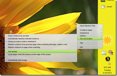
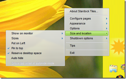
Right-clicking inside Tiles gives you a menu of various options, and here is where we will start. Right-click and select Size and location, then select Hide taskbar. As it says, this will hide your Windows taskbar clearing up a big part of your desktop.
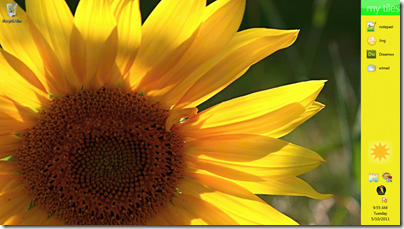
Really at this point, you are there already with a minimal desktop. All you should have now is your wallpaper and Tiles, and since I use the smallest size of Tiles it is tucked away nicely on the right side of my screen. I have a Tiles page setup that hold my frequently used shortcuts, and I set the date, time, and running tasks to be shown so I have just about everything I need in Tiles.
Of course if you want to go the extra step, you can also auto hide Tiles and have just a tab showing to make it active. That’s a little too minimal for my taste, but the options are there!
More about Tiles here.
Reply #2 Tuesday, May 17, 2011 6:11 PM
Wondering if there's any updates coming soon for Tiles, I really love it, haven't taken it off my deskop since day one. I rarely use my Start Menu anymore.
What I would like to see in an update would be...
- Transparency options either in the skin editor or in the right-click menu
- Option to move files around on each page cause I like to group things or have it alphabetal
Reply #3 Tuesday, May 17, 2011 7:31 PM
heh... why do I wish I could buy this as a stand alone... and also realize that will probably never happen ![]()
Reply #4 Tuesday, May 17, 2011 8:40 PM
My favorite app since right click. I'm using it like a 2nd monitor taskbar until some of the wish list items are put in ....then I'll probably hide the taskbar. ![]()
Reply #5 Tuesday, May 24, 2011 4:43 AM
Why add this to Object Desktop only? You'll lose a lot of sales that way. $50 is a lot when you don't care about skinning but want a great productivity app.
It makes sense for WB, DS and IP to be in Object Desktop, but not apps like this. Productivity apps should be seperate, like Object Dock is.
Reply #6 Tuesday, May 24, 2011 8:45 AM
New apps are always given as betas to Object Desktop subscribers, that is a benefit of a subscription. Once Tiles is out of beta, it will most likely be available stand-alone.
Reply #7 Tuesday, May 24, 2011 9:44 AM
Not trying to be difficult here, but how is that image in the OP minimalist? Wouldn't it be more minimalistic to NOT have tiles, and just use the start menu? The start menu takes up less room, and you can pin stuff to it. I guess I just fail to see what this brings over the start menu.
Reply #8 Tuesday, May 24, 2011 9:18 PM
You think the Start menu is more minimalist than Tiles?
Reply #9 Tuesday, May 24, 2011 9:58 PM
Well...the taskbar is smaller and the start menu is hidden until you activate it...
Reply #10 Tuesday, May 24, 2011 10:34 PM
It's better than the start menu because with Tiles you only have the apps/folders/files that you want. With the Start Menu you have to go through everything in All Programs. With Tiles, each tile (page) can be organized how you want it. And you can always put it on autohide for a minimal look.
Reply #11 Tuesday, May 24, 2011 10:36 PM
ID, can you reply on my comment above? I keep asking, but nobody answers :sad:
Reply #12 Tuesday, May 24, 2011 11:17 PM
Just create a menu on the taskbar and place shortcuts to apps you commonly use in that. (Or use the quick launch menu in versions prior to Win7).
Reply #13 Tuesday, May 24, 2011 11:39 PM
Quoting impinc, reply 7Not trying to be difficult here, but how is that image in the OP minimalist? Wouldn't it be more minimalistic to NOT have tiles, and just use the start menu? The start menu takes up less room, and you can pin stuff to it. I guess I just fail to see what this brings over the start menu.
It's better than the start menu because with Tiles you only have the apps/folders/files that you want. With the Start Menu you have to go through everything in All Programs. With Tiles, each tile (page) can be organized how you want it. And you can always put it on autohide for a minimal look.
Like Gwenio1 stated, this is all stuff you can do with the windows taskbar. The bar that tiles uses is WAY bigger. Both can autohide. Both can have whatever icons you want in it. I'm just curious to what tiles does that you CAN'T do with the taskbar. Like I said, I'm not trying to be difficult, just trying to understand the advantage of this program.
[quote who'"Frogboy"]
You think the Start menu is more minimalist than Tiles?
[/quote]
Wiseass, heh. I meant the default taskbar. To me, that bar for tiles is WAY bigger than the taskbar. I'm just trying to see the advantage of this particular app. The only thing I see is that you can group icons together like in that shot above. But advertising it as minimalistic is a bit much.

To me, THAT is more minimalistic than the tiles one. Granted, I dont usually bother with a desktop image because I usually have a bunch of apps open, and dont see it anyways. And I haven't yet bothered to remove the IE icon, but that takes two seconds.
Reply #16 Wednesday, May 25, 2011 12:26 AM
http://www.mediafire.com/?90car2vv9j22d4d
An example of what I meant by a menu can be seen in the upper right. It is label Launch and has button that generates a drop down.
As to the command prompt, when it is maximized and running (being filled with text) and you minimize and restore it the console moves up the screen.
Reply #17 Thursday, May 26, 2011 10:41 AM
I'll ask WBlinds to take a look at it, I don't have an answer for it.
Reply #18 Thursday, May 26, 2011 11:40 AM
I have to agree with impinc. Win7 comes with the ability to reduce things to the Taskbar. Hell, I don't even have the Computer shortcut up on the screen like him, just a series of rotating background images. As for the Start Menu, you can not only set the Taskbar to only pop up when you bring the mouse to the bottom, but you can pin things to the Start Menu's list, making it a huge list of quickly accessible apps. If done right, there is nothing but a vein at the bottom at the screen when idle.
Tiles would work wonder with Vista, no argument. Win7 I feel has pretty well taken this general idea into account.
Reply #19 Thursday, May 26, 2011 12:51 PM
Just curious...how is Tiles different than ObjectDock in terms of functionality? I'm also struggling to see the difference in function between Tiles and the Windows 7 Taskbar. The only thing I can't use the Windows 7 Taskbar for right now is I can't put a folder on them. The only thing I can't do with ObjectDock is get the Windows 7 preview tiles (the icon-sized preview just doesn't quite do it for me).
I'd love to see the WindowsFX version of tiles come back...those were pretty cool (speaking of which...I should see if that works on Windows 7...).
Reply #20 Thursday, May 26, 2011 1:04 PM
I'd love to see the WindowsFX version of tiles come back...those were pretty cool (speaking of which...I should see if that works on Windows 7...).
As far as folders are concerned, if you drag a folder onto the taskbar, it pins it to the favorite folder locations list. If you right click on the explorer icon in the taskbar, a list will come up with frequent places, and your pinned locations.
Please login to comment and/or vote for this skin.
Welcome Guest! Please take the time to register with us.
There are many great features available to you once you register, including:
- Richer content, access to many features that are disabled for guests like commenting on the forums and downloading skins.
- Access to a great community, with a massive database of many, many areas of interest.
- Access to contests & subscription offers like exclusive emails.
- It's simple, and FREE!


Reply #1 Tuesday, May 10, 2011 12:30 PM
Whilst what you say is absolutely true i have 2 issues which prevent me from running it insted of the taskbar. First the size, it takes too much space. Second i am a obsessive compulsive window closer. It's rare i have more windows open then i really actively use. I guess my generation who survived windows 3.0 is so used to the OS BSOD'ing with more then 2 windows active one just doesn't dare opening more.
So there's no real advantage.