WindowBlinds 15 years in pictures
Wednesday, November 13, 2013 by Frogboy | Discussion: OS Customization
WindowBlinds 1.0 was released in November 1998! Since then, it’s gotten over 100 MILLION downloads! Over on CNET’s Download.com version 8 has received over 18 million downloads.
It was the first program to enable users to customize the look and feel of the Windows GUI. 15 years later it is still going strong. Let’s take a look at its evolution in pictures.
Version 1
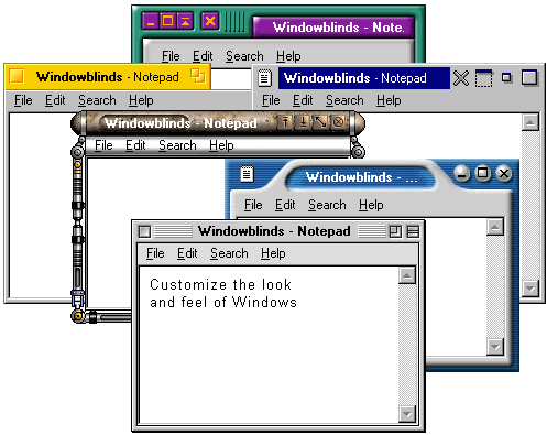
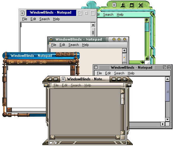
Changed window frames, menu bars.
Yea, this was the config UI we had..cough..
Version 2
Adds per-window skinning, semi-transparent explorer windows, skin colorizing
Desktop light sourcing
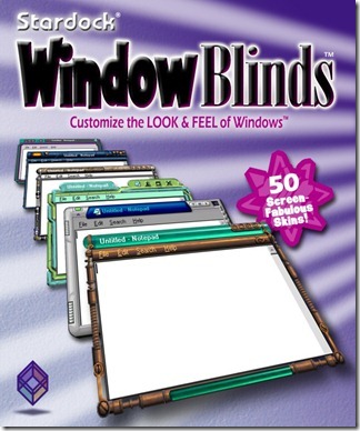
WindowBlinds gets into retail!
WindowBlinds used to send data back to us on what skins people had. We took this out because users were unhappy about their “privacy” (anonymous data being sent). Seems quaint now.
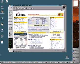
WindowBlinds skins supported adding buttons and other objects into the frames (such as this stock ticker).
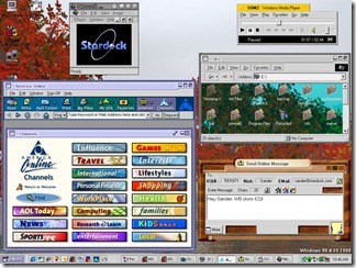
Remember AOL? Their client was a huge pain the skin correctly. Also, look at the BeOS skin.
MacOS’s “Aqua” look for its newly launched MacOS X helped make WindowBlinds incredibly popular for Windows users who suddenly recognized how ugly Windows NT/2000 were.
In fact, making Windows look like other, less ugly, OSes was a big deal.
Version 3
Designed with Windows XP in mind, 3.0 was the first version that could skin every part of the Windows GUI. The competition had stiffened as Microsoft had released uxtheme.dll that, once hacked, allowed people to create GUI skins freely. WindowBlinds thus had to provide significant value-add to justify $20.
The quality of the skins had to really go up to compete with the bland but free uxtheme skins.
Third-parties began licensing WindowBlinds for marketing purposes (Nvidia here)
(Nintendo)
(The Microsoft XBox team here – one wonders what the Windows team felt about this at the time)
Sometiems it was just a matter of making Windows XP look a bit nicer than Windows XP defaulted to.
Other times it was about reminding power users just how gimped the Windows XP “Luna” UI made Windows.
Version 4
Version 4 was the point where WindowBlinds “won” the contest versus uxtheme.dll in that it could not only do everything it could do and more but version 4 made use of DirectX draw acceleration to make WindowBlinds substantially faster (i.e. noticeably faster) than using Windows XP without it.
However, this popularity would come at a price – the quality of the average skin submitted became substantially lower. WindowBlinds skins acquired the reputation for being ugly, gaudy, fat.
WindowBlinds 4 added a lot of neat controls for controlling how coloring worked.
Version 5
The era of Aero had arrived. Microsoft was finally taking the aesthetics of Windows seriously and created a new glassy looking UI called Aero. WindowBlinds 5 was designed to support per-pixel alpha blending, toolbar button changing, progress animation improvements, animated per-pixel Start menus, title bars, etc.
Aero all the time
Our own take on Aero
However, the problem Stardock and its community faced was that a “complete” skin was a significant amount of labor. Thus, a lot of the most talented skinners began finding other things to spend their time on. It wasn’t “fun” anymore.
Version 6
WindowBlinds 6 added the ability to apply effects such as Gaussian blurs to skins in real-time. However, the biggest change came in the new configuration because it was becoming clear that the number of high quality new skins was dwindling (while the user base continued to increase). The new config allowed end users to heavily modify their skin library.
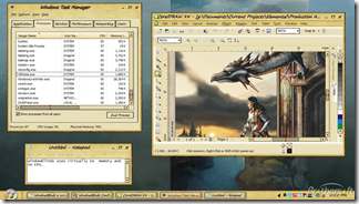
That dragon is fully animated and so is the title bar.
The new config allowed users to do all kinds of crazy things to their skins and then save them as a sub-style
The official World of Warcraft skin got a second life with WindowBlinds 6
The Elemental skin for WindowBlinds 6
Version 7
It is with some irony that WindowBlinds 7 was ready in time for Windows 7 (the versions being the same was coincidence). WindowBlinds 7 introduced a new type of skinning format called UIS0 which allowed users to just modify the existing Aero skin. This made WindowBlinds a lot more popular for people who liked Aero but wanted a bit nicer look and feel to it.
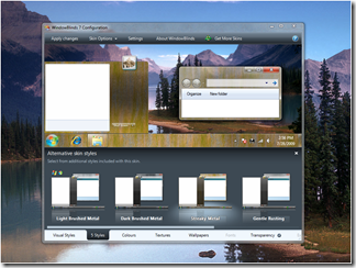
A new, simpler and just as powerful config window.
Stardock began contracting professionals to make skins to ensure that there were some good, new, benchmark skins available.
Mac inspired skins remained popular
So with UIS0, you could apply a texture and color to the existing Windows 7 Aero making it look, imo, much nicer.
Version 8
Version 8 was mostly about getting WindowBlinds to work on Windows 8. Microsoft essentially gimped the underlying window theming system they had – they killed Aero! No Aero, no UIS0. They replaced it with the stripped down UI seen in Windows 8 and 8.1.
Once again, a new and improved configuration UI.
BEYOND 8
WindowBlinds 8 is still very new, what but the challenge going forward is coming up with new and interesting ways to skin the Windows GUI that make it attractive for new users! Visit www.windowblinds.net to learn more about WindowBlinds!
Reply #23 Tuesday, January 7, 2014 10:01 AM
As a non skinner I'am stuck in the past. 90% of the skins I use are old and still great. I do know how long it used to take to make WB's as my ex made them. Am using W7 and will till MS forces me to change. Most of the skins are bloated now. I like them streamlined. Example, am using Tronnix by Mike Bryant.
Reply #26 Saturday, January 25, 2014 9:29 AM
I still have 4 of his after the puter crashed and the hard drive went tits up. But its the 4 I like the best. Also 3 by APB. Loved her work.
Reply #27 Monday, February 3, 2014 5:08 PM
GREAT history lesson A Lot of work just putting this up THANK YOU! ![]()
Please login to comment and/or vote for this skin.
Welcome Guest! Please take the time to register with us.
There are many great features available to you once you register, including:
- Richer content, access to many features that are disabled for guests like commenting on the forums and downloading skins.
- Access to a great community, with a massive database of many, many areas of interest.
- Access to contests & subscription offers like exclusive emails.
- It's simple, and FREE!









![wb5-3[1] wb5-3[1]](https://draginol.stardock.net/images2012/819c80f84130_ED02/wb5-31_thumb.jpg)




Reply #21 Tuesday, January 7, 2014 4:27 AM
I started in 2004 with w4 I think Phoon is right, try to find a way to change those horrible tiles would be a good way to go for the future of Stardock to look at perhaps you get some new skinner