This Week in Skinning - April 30th
Skin Roundup for 4-30-10
Friday, April 30, 2010 by Island Dog | Discussion: OS Customization
![]()
Lets get back to TWiS after taking a short break because of the launch of the new site. I know uploads have been flaky for some, but I see the skins are starting to roll in again, so lets take some time and highlight some from the past week.
This weeks skin picks!
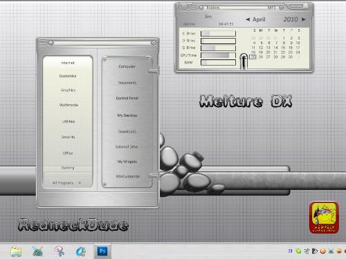
| Melture DX by RedneckDude Made to match the WB skin by lypnjtu, this is another great DX theme from RND. |
|
| FIFA Worldcup 2010 by Ausvet Celebrate the Worldcup 2010 with this slick animated wallpaper. |
|
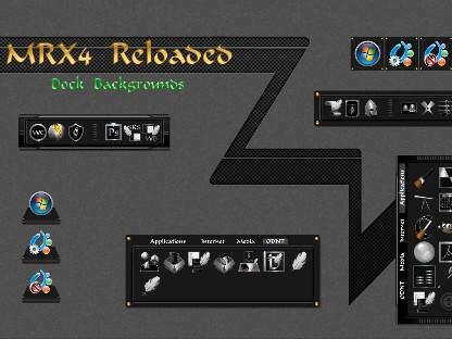
| MRX4 Reloaded Docks by Xiandi Matching dock backgrounds for the MRX4 DX Theme. Great job! |
|
| Colors & Smoke by alkiak99 I like the simplicity and color of this wallpaper. Looks great on the desktop. |
|
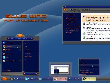
| Blue Wing by 2of3 Another awesome WindowBlinds skin from 2of3. Clean design and perfect use of color make this a must-have. |
|
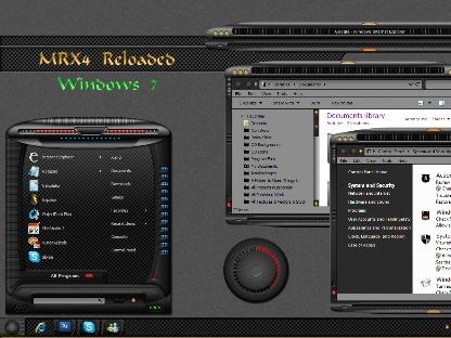
| MRX4 Reloaded WB by Xiandi Another in the MRX4 series, this time with a nice, darker style WindowBlinds skin. Nice work! |
Finding WinCustomize Subscriber Skins
Tuesday, April 27, 2010 by Island Dog | Discussion: OS Customization
One of the benefits of becoming a subscriber to WinCustomize.com is that you get access to premium skins and themes that have been released, and skins that will be released in the future. The links have changed since the new site launched, so I wanted to give a quick tip on how to find it.
Of course you can go directly to the subscriber skins link, but otherwise by clicking your username you are taken to your personal page. There you will find the link to the subscriber skins.
Impulse Weekly Roundup - April 23rd
Friday, April 23, 2010 by Island Dog | Discussion: PC Gaming

Hey folks! Another super crazy busy week has gone by and time once again for the weekly wrap-up of what’s been going on with Impulse. Need for Speed: Shift was released on Impulse earlier this week, and if you are a fan of racing games, this one needs to be on your list. The graphics are phenomenal and the cockpit view makes you feel like you are really driving one of these high-end cars.
If you are in the Elemental: War of Magic beta, there were some updates pushed out this week, and you can find links to the changelogs in the links below.
News and Articles:
- Impulse Weekly Top 10
- Elemental Beta 1-Z3 Changelog
- April/May 2010 2v2 Demigod Community Tournament - Round 1a/1b Results
- Demigod Refer-a-Friend Contest Winners!
- Elemental: A preview of the modding
New and Updated Releases on Impulse:
- Immortal Defense
- Gratuitous Space Battles v1.37
- Need For Speed: Shift
- Painkiller: Overdose
- SpellForce Platinum
- Aqualux
- VVVVVV
- Warhammer Online: Age of Reckoning
- Zombie Driver v1.14
Weekend Impulse Buys
Impulse Weekly Roundup - April 16th
Friday, April 16, 2010 by Island Dog | Discussion: PC Gaming

Happy Friday everyone! Now that Friday is here we can start to wrap up the week and begin a long weekend of gaming. I think I will dip my toes into the Majesty 2 Bundle water this weekend just to start off. What do you plan on playing? Well we can start the re-cap of the past week with the news that the Splinter Cell Conviction pre-order is up and with that order you will get the original Splinter Cell for free! The original is a classic, and I’m hearing some great things about Conviction too.
Fans who are keeping up to date with Elemental: War of Magic should check out some of the Dev Journals posted over the last few days, they are definitely worthy of a read.
Be sure to stop by and become a fan of Stardock on Facebook!
News and Articles:
- Why I Like ImpulseTV
- Seeing Betas and Pre-Release Versions in Impulse
- Elemental: Why it’s important to get it right
- Elemental Beta 1-Z2 News and Changelog
- Sorry guys, there will be a beta 1z3
- Impulse Weekly Top 10
New and Updated Releases on Impulse:
- Splinter Cell Conviction (Pre-order)
- Splinter Cell Conviction Deluxe Edition (Pre-order)
- Determinance
- Red Faction Guerrilla (update)
- War on Folvos
- Caster
- Tom Clancy’s Splinter Cell
- Zombie Driver
Weekend Impulse Buys
This Week in Skinning - April 16
Skin Roundup for 4-16-10
Friday, April 16, 2010 by Island Dog | Discussion: OS Customization
![]()
Another week has flown by, and at last we are at the weekend. Lets first start off by saying congrats to the winners and a big thank you to everyone who participated in the Spring 2010 wallpaper contest. Another contest should be coming up soon!
Now for this weeks picks!
CursorFX Screencast
Wednesday, April 14, 2010 by Island Dog | Discussion: OS Customization
Lots of folks have been asking recently how to change the cursors in Windows 7. Well here is a quick screencast to show you how!
Download CursorFX from www.cursorfx.com.
Impulse Weekly Roundup - April 9th
Friday, April 9, 2010 by Island Dog | Discussion: PC Gaming

After a nice long holiday weekend last week we are back! Everyone has been pretty busy behind the scenes lately. We have the Elemental betas being worked on, and the Impulse publishing crew has their hands full with releases and updates for Impulse. I have been really excited with the classic games that have been added to Impulse lately, and it seems I am not the only one judging from the comments we have been receiving on Twitter and Facebook.
Speaking of classic games, Total Annihilation was updated with the Battle Tactics expansion which is a free update for existing customers, and at just $10 it’s a real bargain for those classic game hunters.
Lets take a look at some highlights from the week on Impulse, and be sure to follow @stardock and @impulsedriven for more!
News and Articles:
- A walkthru of Beta 1Z
- Gaming and The Cloud
- Elemental: Rebuilding a civilization
- Our Demigod task list
- Gaming Nexus Review of Sins: Trinity
- This Week in Skinning - April 9th
- What Are Your Current Impressions of Windows 7?
- Impulse Weekly Top 10
New and Updated Releases on Impulse:
- Call of Juarez
- Mayhem Intergalactic
- Trine 1.06 update
- Total Annihilation
- Adam's Venture
- Avencast: Rise of the Mage
- Plain Sight
- Dead Space
Weekend Impulse Buys
This Week in Skinning - April 9th
Friday, April 9, 2010 by Island Dog | Discussion: OS Customization
![]()
Happy Friday to all our friends and community members out there. I hope you had a good week, and have a fun weekend planned ahead. Today we will end the Spring wallpaper contest and begin taking a look at the entries. Hopefully we can announce the winner some time next week.
Now for this weeks picks!
The state of skinning: WinCustomize 2K10 Edition
Tuesday, April 6, 2010 by Frogboy | Discussion: OS Customization
I can’t believe it’s been 9 years since WinCustomize.com first launched.
Today I’m taking a look at the 4th iteration of WinCustomize during that time. The iterations have tended to reflect the particular skinning age they were developed in. Let’s look at them.
The First Age of Skinning
 This was the age of “Skinz”. It was literally a cottage-sized community. Mian. Toasty. Shoggot. Doreen. These were just a few of the names from back then. Skinning was such a niche back then that there were only a handful of skinners. The tech was primitive, buggy and often unusable. But it was fun.
WinCustomize launched at the first age was ending. The original skinz.org went down along with other skinning sites as the “dot com bomb” went off taking out the means to pay for these sites. Software developer Stardock decided to create a site and hand it over to the community. That was the original WinCustomize concept launched at the end of March 2001.
The first WinCustomize was designed as a quick way to get to a ton of different skinning libraries and had a major focus on the skinners themselves. When you came to WinCustomize.com, the home page focused a great deal on the skinners themselves.
The Second Age of Skinning
The Second age was the era of intense competition. Some might call it the golden age of skinning. Skinning had gotten popular and there were lots of people making skinnable programs.
We had widget wars (DesktopX vs. Konfabulator vs. Samurize vs. etc.). We had skinning wars (WindowBlinds vs. Msstyles). Media player skinning wars (Winamp vs Media Player).
This was the period of the GUI Olympics where the popular skinning sites (back when there were several) got together and competed in making skins of various types.
The Second age was the noontide of diversity in skinning. The second WinCustomize focused much more on the world of skinning itself rather than on the people who made it. It still had quick access to all the libraries but the focus now was on the skins themselves.
Skinning had gotten mainstream. It also came to an abrupt end on January 30, 2007.
The Third Age of Skinning
 The the age could be described as the twilight of skinning. I’m just calling a spade a spade. Windows Vista had begun to make skinning seem quaint and retro. Who are these weirdos taking a perfectly clean, nice OS and adding a bunch of crap to it?
The number of actively developed apps started to drop quickly. By the end of it, Stardock was the only company with full time developers still making programs for the express purpose of skinning things. Konfabulator had been bought by Yahoo. Hoverdesk was gone. TGT Soft had closed down.
There were still people out there making skins professionally. WinStep continues forward. The Skins Factory created Hyperdesk and updated it to support Windows XP, Windows Vista and Windows 7.
There was also a GUI Championships in 2008 where China emerged as a leader in skinning.
The skinning community had changed drastically. It moved from being a community of skinners to being a community of consumers. The expectations on the quality of the software and quality of the skins had increased to the point that only full time professionals could really produce the king of “assets” that were acceptable to consumers. Part of this was because Windows Vista/7 had become so good on their own that the bar had been raised beyond most casual skinners.
In the beginning, skins were made by guys like me:
 Early skins were easy to make: This screen shot represents all of the art assets in the whole skin

Today’s skins require a great deal of time and effort.
The software, when it ran, tended to crash often. The skins were simple. But compared to Windows itself, it was all an improvement.
By the end of 2009, skinning, which had started out as a niche techie hobby had become a niche consumer hobby. Nothing highlighted this more than the recent updates to DesktopX and ObjectDock where users complained loudly at various aspects of how the beta was handled. They weren’t users anymore. They were customers of a product.
The challenge to skinning in this new age remains daunting. Producing high quality software and content in which people expect to pay nothing or virtually nothing for. In a world where a 500 line iPhone game sells for $0.99 and can sell 50,000 copies easily, it becomes harder to produce a 250,0000 line program that people are outraged to pay $20 for – even it if includes professionally created skins and themes.
And so that’s how the third age ends. Not with a bang but with a whimper.
The Fourth Age of Skinning
The goal of the fourth age is to get back to skinning’s roots: Appealing to techies who want to do interesting things to their computer. The new website tilts very much back over to skinners. The home page provides quick access to the top skinners (the age 3 site didn’t even list skin authors on the home page). It’s also designed to be much cleaner and more approachable.
There is a definite migration away from commercialization and back into grassroots. While “Master skins” and such are here to stay, there’s a lot less advertising on the site. The subscriptions will soon be changed to only be $19.95 but no longer provide “premium suites” as part of the subscription but instead site specific services and features.
The site will increasingly return to the original mission of being a community site for the customization of things. The site’s new design lends itself to a lot more user customization (for subscribers anyway). We’ll talk more about that in the coming weeks.
We are pretty excited about the new site and the new era for skinning. Over the coming months, we expect to be able to introduce more and more features that allow skinners and the community to interact and share creations.
The Fourth Age is scheduled to begin this month. But you can see a sneak peek at www.wincustomizetest.com.
What Are Your Current Impressions of Windows 7?
Thursday, April 1, 2010 by Island Dog | Discussion: Personal Computing
So it’s been many months since Windows 7 was released to the public, and during my travels on the web, I have seen praise from so many people about how they are enjoying Windows 7. Some of these are even coming from Mac users which really should tell you something.
My experience has exceeded my initial expectations, and I enjoy using Windows 7 every single day. Performance has been outstanding on my main rig, which is obviously quite powerful, but I can say the same thing for my Acer Netbook which I also have Win7 installed on.
Obviously I run quite a few games and applications, and haven’t had one single issue with one, including older applications. On the customization side, having apps like Fences, ObjectDock, and WindowBlinds make the desktop experience that much better – especially in terms of organization.
Now that many of you have had quite a bit of time to use Windows 7, what are your current impressions so far?


