


A Sneak Peek of DeskScapes 11: Designing your own Backgrounds
Thursday, January 7, 2021 by Tatiora | Discussion: Stardock Blog
Happy New Year! Here’s hoping that 2021 is significantly kinder to us than 2020 was. To get back into the swing of things (I’ve just enjoyed a 2-week vacation and I need to find my groove again), let’s take another look at DeskScapes 11!
I gave a little preview of the upcoming version of Deskscapes just before our holiday break, but today I want to focus on something a little more specific within the app: designing your own backgrounds (Dreams).
There are plenty of ways to go about this. You can start with a totally blank slate or you can choose an existing background to modify. I pulled up a blank page and chose a static image I happened to have on my desktop - in this case, a screenshot from Final Fantasy XIV - and decided to start exploring some of the options.

First I just started playing with some of the provided effects. I chose some ripples (rings on water) and clicked around to explore some of the options. With all of the effects, you can change shape, size, speed, and so on to make it work for your image in any way that you want. I also tested the playlist feature by uploading a song.
After playing around in effects, I moved into animations - and there were a ton of choices. I played with them for a bit, experimenting with resizing/relocating where the effects pop up on my background. With this particular effect, I can adjust the angle that the stars are falling at, as well as the speed, size, and density, which I thought was pretty cool.

I got caught up in exploring all of the different effects for a while, I won’t lie. There are a lot of cool things that I can add to my background to make it unique and fun. In the image below, I added some snowflakes and pumped their size up a lot so that I could see them really well. I also eventually adjusted it so that they fell really slowly.

You can also adjust the color on most effects! I played around with the fireworks effect and tried colors from green all the way to purple, adjusting the main color, glow, and translucency to see all different sorts of variants.

If you don’t have a pre-existing image that you want to add effects to and make into a DeskScapes Dream, you can select one that’s already in the app. I played around with this dragon background a bit; it was actually really helpful to see all the layers of what the artist had already added to it so I could get better ideas of how to formulate my own the next time I try from scratch.

As you can see, DeskScapes 11 makes creating your own animated background really easy and straightforward! I am not particularly artistic, so having an easy to navigate program with pre-created effects and animations really helps me out and makes me want to play with customization more than I might normally otherwise.
Are you excited about the new DeskScapes? What features are you hoping to see in DeskScapes 11? Share with me!
DeskScapes 11: A Sneak Peek
Thursday, December 31, 2020 by Tatiora | Discussion: Stardock Blog
Happy almost New Year, everyone! I have a little treat for you before we go on break here at Stardock: that’s right, I have a sneak peek at the new DeskScapes!
I have to say, even though there are a few features that aren’t completely hooked up yet, what I’ve seen so far of DeskScapes 11 is pretty darn cool. Let’s have a look at what’s coming!

New UI
The new UI makes for an all-around better browsing experience. You can browse for backgrounds using “categories”, “authors”, or “latest” as filters. You can also toggle easily between animated and static wallpaper tabs so you can find exactly what you’re looking for!
I love the completely in-app browsing experience. It makes it easy to discover things I wouldn’t have otherwise thought to search for, and I appreciate not having to spend a bunch of time guessing search words or clicking through hundreds of web pages.

Playlists
This is totally awesome: now you can create “playlists” for a series of DeskScapes backgrounds - animated or static! - to rotate through on your PC. You can set a timer for every time you turn on your PC, which gives you a nice surprise every time you log in, or you can make it so that the image changes after a certain amount of time, from as little as thirty seconds to as much as several hours.

I have a couple of playlists created here - one full of animated backgrounds and one full of Final Fantasy XIV screenshots - that I can rotate through. This feature, along with a few others, isn’t fully implemented yet, but when it is I’ll see what I can do about maybe doing a little video tour of the app for all of you.
DeskScapes Creator
You’ve always been able to create your own custom Dreams, but DeskScapes 11 makes the experience much smoother. The DeskScapes creator lets you choose an image of your own - or one already within DeskScapes - and adjust it with plenty of tools and tweaks. You can get as particular as you like, and it’s convenient and easy to use.

Effects
As other versions have before, DeskScapes 11 comes with an impressive array of applicable effects for your backgrounds. You can sort through the effects easily thanks to the new UI, layer multiple effects, and see previews before you even hit ‘apply.’

Well, that’s it: a little tour of what we’ve been working on! DeskScapes 11 is coming soon, so keep an eye here on the forums for more sneak peeks and announcements leading up to the release! And of course if you’re an Object Desktop member, you’ll get beta access to try it out before anyone else does as soon as we’re ready to release a beta for the public.
If you have any questions, please toss them in the comments below and I’ll make sure to pass them along to our software team. Until next time, have a safe and wonderful holiday season, and HAPPY NEW YEAR!
Star Wars is Copyright © Lucas Films Limited
Looking Back on Object Desktop 2020
Let's take a look at the major updates to Object Desktop this year
Wednesday, December 23, 2020 by Tatiora | Discussion: Stardock Blog
As 2020 draws to a close (I thought it would never end, to be honest!) I thought we would take a look back on Object Desktop and all of the great apps and updates we’ve added this year.
If you’re unfamiliar with Object Desktop, it’s a suite of desktop enhancement apps that lets you completely customize your Windows experience. It has several award-winning applications - including Fences, Groupy, and Multiplicity - and will completely transform the way you use your PC.
New to Object Desktop this year
Back in February, we released the newest version of SoundPackager and added it into the Object Desktop suite.

If you’re tired of the Windows default sounds, SoundPackager 10 lets you instantly change them with high quality and cohesive sound packages. It comes already pre-loaded with several high quality packages, or you can download some more on WinCustomize
SoundPackager itself isn’t new, but SoundPackager 10 came with some great updates, not the least of which is full compatibility for Windows 10. It included lots of all-new sound packages and an in-app editor so that you can create your own sound packages.
On April 8th, we released our newest version of CursorFX and added it to Object Desktop.

With CursorFX, you can create your own cursors, animate cursors using special effects, and add custom mouse click sounds. You can apply skins, shadows, motion trails, and sounds to your cursor easily.
We released the beta to all Object Desktop users so that they could try it out before anyone else. We made sure that it had support for Windows 10 and high DPI monitors so that your cursors can look the best. CursorFX also supports 144hz or higher refreshes, and includes cursors that take advantage of these features.
We made a big addition to Object Desktop back in July with Curtains, a customization tool that lets you apply new styles to your desktop that are along the lines of Dark and Light Modes to Windows 10.

Using Curtains, you can add new styles to your desktop that enhance and change the entire look and feel of the Windows UI and apps that already support light and dark mode. You can create and share your own styles, browse through and download tons more on WinCustomize, and adjust hundreds of other small elements in Windows.
One of my favorite things about Curtains is being able to customize the Start button, title bar buttons, and title bar. I can mess with font faces and sizes, pick out more detailed color choices, and so much more.
Curtains v1.1 added a pretty major feature: blur and transparency effects! Certain Curtains styles already come with blur built in - specifically, most of the Fluent styles that you find in the program integrate this feature automatically.

In the image above, though, I've taken another style - Cairo Dark - that doesn't have it as the default and changed the option to "Acrylic Blur," which gives the lovely effect you see here. The cool thing about this update and these features is that you can apply them to any of the styles you download from WinCustomize or already have within the app itself. You can also see Groupy in action and how nicely it integrates with Curtains. Which leads us to one of our next major updates we made this year...
Other Object Desktop apps updated this year
Last, but certainly not least, we had several different updates release over the year for various apps in the suite. Some of them were small, community requested updates or quality of life adjustments, but others were fairly substantial.
Groupy isn’t new to Object Desktop, but we implemented a major v1.4 update back in August that introduced full integration with the Curtains app. This update made it so that aspects of Groupy blended seamlessly with whatever style you have set to your PC.
We made it so that Curtains would automatically select suitable colors anytime you’re using a Style mode without custom Groupy parts. When in dark mode, the tab will remain dark in all apps for the foreground state, and a new “close all” button was added to the far right of the tab.
We updated Start10 back in August with some UI changes to better accommodate Curtains. We fixed some crashing issues and tweaked how blur is handled in the menu so that we could address a mixed DPI setup issue. We also made sure to correct the missing control panel search entries on the 2004 Windows build.
Multiplicity's update improved performance for your PC when it's under heavy load from other processes and added messages informing you of potential incompatibilities with Clipboard sharing across devices and VirtualBox. We knew that a lot of our users worked on machines with mixed DPI setups, so we included fixes to account for that. Additionally, we added the ability to Flush DNS right from the Multiplicity UI and fixed some issues for users who had Swap Mouse Buttons enabled.
Thanks for a great year!
We actively listen to community feedback and will often make updates based on what users have requested. We appreciate all of you and how much you’ve used and helped us evaluate and perfect our software over the years.
What’s been one of your favorite updates or additions to the Object Desktop suite? If you’re not an Object Desktop member yet, you can get a membership here.
Have a safe and happy New Year!
DeskScapes: Simple, Fancy, and Everything in Between
Thursday, December 17, 2020 by Tatiora | Discussion: Stardock Blog
I have seen quite a lot of desktop backgrounds over the years from all manner of friends and family. Heck, I remember as far back as one of my family’s first PCs, a Packard Bell, that we excitedly bought a screensaver and background software for so that we could have aquarium fishes swimming around when we idled.
I mention the above mostly to point out a pretty obvious fact: everyone has different tastes. There’s no right or wrong way to customize your desktop - and, whether you’re looking for something fancy or a little more simplistic, DeskScapes will have something for everyone.
Recently, I talked a little bit about Fences and how I use it - combined with DeskScapes - to segment my two monitors during my stint working from home. One of the most important elements to that mental separation of “work monitor” and “play monitor” for me was having two different desktop backgrounds, something that is made possible thanks to DeskScapes.

DeskScapes offers plenty of other desktop customization options beyond just changing backgrounds on each of your monitors. Let’s take a look at a few of our most popular desktop backgrounds on WinCustomize and see how we can tweak additional effects to make them just right.
Currently, this is how my two monitors look:

I am using two different static image backgrounds - one of them is a screenshot from Final Fantasy XIV, a favorite game of mine, and the other is a cool image I got from the Windows Backgrounds gallery. I headed over to WinCustomize.com and took a look through some of the most popular Dream downloads there and selected a couple of them to play around with.
Now, these backgrounds happen to be animated, so please know that I can’t fully do them justice with just a static image. I chose the Dream in the #1 spot of “most popular downloads of all time,” “Big Blue Sea HD” by sntXrrr, and applied it to my first monitor.

This works just fine on its own, of course, but I did say we would be playing around with effects, didn’t I? I scrolled through the options and eventually settled on trying out the rainbow filter because, I admit it, I like lots of color.
There are options for sepia, textured, static noise, and so much more. You can also combine multiple effects in most circumstances, creating a truly custom look that’s perfect for you.

People have said to me in the past that DeskScapes wouldn’t be useful to them because they don’t really like the idea of having animated wallpapers because they prefer something simpler. That’s all well and good, but DeskScapes can actually be just as useful for customizing static backgrounds as it is for applying and altering animated ones.
As an example here (again - it’s tough to show animation with a screenshot), I’ve taken a screenshot from my game and applied it to my desktop background. Then, using deskscapes, I applied a couple of different effects - snow, which is animated overtop the image, and textured, to give it a different look.

There are tons of different effects you can layer on your own images in order to create something truly unique! As I mentioned above, there are thousands of options on WinCustomize.com - you can always look there for both animated and static backgrounds. Below, I’ve linked a couple of our most popular downloads so you can see them for yourself.
What do you keep on your desktop’s background? Share with me!
Top WinCustomize Dreams for DeskScapes
#1 - Big Blue Sea HD by sntXrrr


Remember IconX? Let's check it out!
I wanted to see if it still worked on Windows 10.
Thursday, December 10, 2020 by Tatiora | Discussion: Stardock Blog
Sometimes, my blog writing has me diving back through years of Stardock’s history from the development and evolution of WindowBlinds, to the evolution of the Drengin in Galactic Civilizations III, and even all the way to a history of desktop icons. This time, I’m taking a look at one of our old products, one that was here long before me: IconX.

A screenshot of IconX on Windows XP, pulled from the program's original website.
First, let’s talk a little bit about what IconX is.
IconX is a program that enhances your Windows desktop icons by giving them shadows, making them any size you like, and more. With IconX, you could make it so that your icons would zoom-up on mouseover, re-label your icons, and make your icons smoother and more attractive thanks to the addition of anti-aliasing.
Other options included the ability to alter the font, size, and color of icon labels. You could also trigger sounds and special effects on mouse over, click, and double-click events.
Once I had an idea of what IconX was and what its history was, I had one big question: would this program, which was originally released in 2004 for Windows XP, still work on Windows 10?
The answer: Yes! Sort of.
I had some trouble getting it to load properly on my PC, so I enlisted the aid of our resident expert, Matt. With some finagling - he actually had to change the properties of the download to initiate the compatibility mode and set it to XP - he managed to get it to run.

Although all of the features aren't in tact and there are some bugs, the program does run on Windows 10. You can see on the left side of the image above how it has adjusted the icons slightly, but it did kill the background image on the desktop and would occasionally make the taskbar blink.

Above, you can kind of see here the kinds of options and customizations that were available in the original program. Some of the icons still worked(ish) and hovering over them would change the color/size.

Installing this older program onto a modern PC came with quite a few side-effects, like messing up the right click menu by making it the wrong size and just straight up making some icons go missing. But, in IconX's heyday it had all sorts of perfectly compatible options for changing your icons, like sliders for adjusting brightness and contrast. You could also be very specific with your shadows, adjusting things like sharpness, darkness, height, and angle.

Although IconX isn't fully compatible with Windows 10, we have a much more current program that works wonderfully: IconPackager. You can replace all of the default Windows icons at one time using custom icon packages that come with the app or that you download from WinCustomize. If you’re into making your own icons, you can also have some fun with IconDeveloper.
Since IconX and IconPackager technically serve different purposes, in theory they could work side-by-side to offer you even more customization for your icons. Not only could you change all the default Icons with IconPackager, but you could then adjust shadows, font size, and interactions with IconX.
Did you use IconX back in the XP days? Is it something you'd want to see updated for Windows 10 someday? Share with me!
Fun with Fences: Using Fences on Multiple Monitors
Thursday, December 3, 2020 by Tatiora | Discussion: Stardock Blog
A recent surge in coronavirus cases here in Michigan sees me once again working from home. Fortunately, the work I do at Stardock is pretty easily taken remote, but that doesn’t mean that certain tools don’t make that transition easier. I am, of course, talking about Fences.
In a previous blog, I gave a rundown of a bunch of the really cool customization options that Fences has to offer - but I couldn’t cover everything. I wanted to share a little bit about how I separate my workspace from my playspace while it’s all contained on the same machine, while at the same time sharing a few other Fences customization tidbits.
I would like you to know, also, that this shuffling of icons and creation of Fences was a relatively recent idea. The last work from home stint I was on, I pretty much lived in chaos: icons everywhere, mingled, mixed, and not at all matched. I’ve decided to start with a clean slate and try something new this time around. Let’s have a look!
The “Play” Monitor
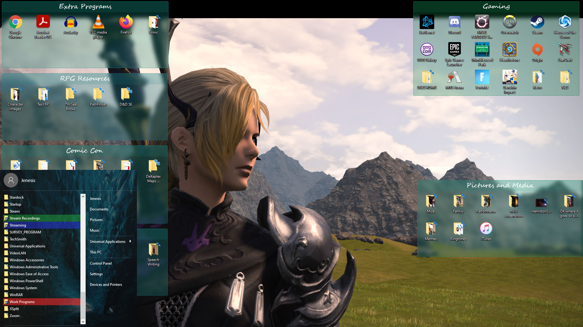
This is my primary monitor. I’ve chosen to keep all of my personal stuff in fences here, making it easy for me to find while also keeping it separate from work stuff (which I’ll show you shortly). Also, don’t judge me on my gaming choices - I tried Fortnite as a favor to a friend (what I’ll never admit is how much fun I had with it, don’t @ me!).

My desktop background reflects my “play” aspect - it’s a screenshot from Final Fantasy XIV, a game I spend too much a lot of time on. I chose to keep all the Fences uniform in color and separate all of my stuff into fairly straightforward and easy-to-navigate categories.
It took me a little bit of time to clean up all of the icons I had just sitting on my desktop and organize them into this, but honestly I think it was time well spent. I also went into my Fences “sorting and organizing” options and directed where certain file types will go: for example, I adjusted it so that any saved images I have will go straight to my Pictures and Media Fence, where I can easily find it and place it where I want it to go from there.
I may fiddle with it more later, but right now I’m happy with where it’s at.
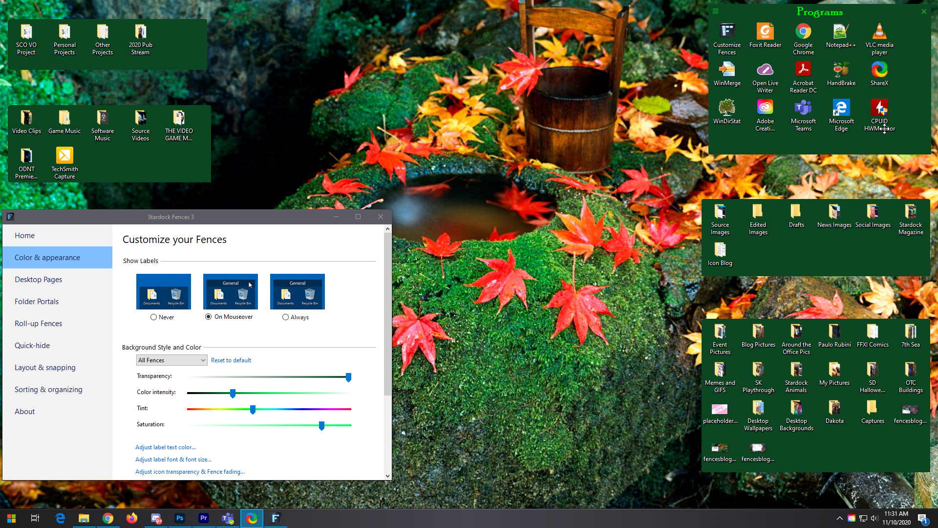
The “Work” Monitor
For the most part, I just need a word processor to perform the primary part of my job function. That said, when I write, I have to write about something - and usually that means making sure I have certain software installed so that I can explore them, much like I am now.

We also wear many hats here at Stardock, which means that there are certain other functions I perform that require other programs like, for example, XSplit. There are also some folders that I access frequently via our VPN, so I created Folder Portals for them on my desktop so I don’t have to constantly go digging through Explorer for them. You can see that I have them rolled up here to conserve space.
On another note: did you know that all your fences don’t have to be uniform? I decided to have a little bit of fun with my work monitor and choose a colorful background with enough black that would make the different colors I’ve chosen for my fences really pop.
I love this separation of work and play because it lets me find things easily and helps me to segment my work from my leisure time (since I spend a lot of leisure time at my PC to begin with anyway).
Side by Side
You can see that the two monitors are extremely contrasted. I did that on purpose as a bit of a mental trick that would help me further separate the two and their varied functions. I’m not really sure that it actually works that way, but since I’ve convinced myself that it does, that should be good enough, right?
Oh, I should also mention: the reason I’m able to apply two different backgrounds to two different monitors is all thanks to DeskScapes. I’m not using anything animated right now, but one of my favorite features of DeskScapes is being able to use animated backgrounds on my PC, so definitely check that out if you haven’t!
A Fun Discovery
I’ve written a lot about our software, especially lately, but that doesn’t mean that I don’t discover something new from time to time.
I knew, for example, that Start10 perfectly integrates with Fences. What I didn’t realize, though, was that the Fences labels in the Start menu would actually match the colors that I’ve selected for the individual fences! Cool, right?
This is how I’ve made Fences work for me on multiple monitors, especially as I work from home. Do you use Fences more at work or at home, or equally at both? Share with me!
Fences: Making Desktop Customization Work for YOU
Thursday, November 26, 2020 by Tatiora | Discussion: Stardock Blog
We make a lot of software here at Stardock, and while all of it is wonderful and useful in their own ways, there are just a couple of programs that I consider my “ride or dies” for my PC experience. Fences is absolutely at the top of that list (followed very closely by Groupy).
The basic functionality of organizing my icons, folders, and programs into fenced in areas on my PC desktop is great enough on its own, but the more I explored Fences I began to realize that there was quite a lot more that I could do with it, especially aesthetically. With all of the customization options available in the program, you really can make your desktop look exactly how you like it.
Let’s take a look at some of the cool stuff you can do!
Color Customization
This one is fairly straightforward, but is probably one of my most favorite options: colors. I can adjust the color of my Fences (both as a group or individually!) to complement the background that I’m using on my Desktop.

There are a lot of options available here. You can adjust the transparency, color intensity, tint, and saturation of your fences using the sliding scale, choosing to either apply the options uniformly across all of your fences, or individually to a select few. You can color code your fenced areas if that’s something that helps for organization - or if you just want a myriad rainbow of color on your desktop, that’s valid too!
You can achieve drastically different effects by choosing varying levels of saturation and transparency. Below, I have an image that shows a more solid fence without the transparent effect, plus you can also see that I have an option enabled that hides labels unless I mouse over them.
You can also adjust the font colors of your fences labels, which leads me into the next set of options you have…
Label Text and Size
You can customize the labels to your fences in lots of different ways besides just what you name them. The color and size of your fonts can change, as well as the font itself. Many of the options you’d find in any Word processor are available in the Fences option menu. Several of them allow for variations like bolding and italicizing if you feel like it.
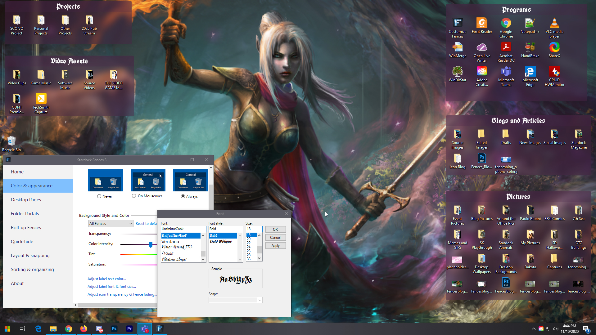
I like to adjust my colors and fonts to match whatever I choose for my background. I’m a pretty big Dungeons and Dragons nerd, so I think the medieval script font goes nicely with this image of one of my first ever original characters, Tatiora, that my friend Leo drew for me a couple years ago.
You can also change the font color if you want, though I find that usually keeping it simple with white allows me to read the labels more easily. I also keep my fonts sized somewhere in the middle (in this case, I believe I selected size 16), but you can go bigger or smaller if that suits your needs better.
Speaking of needs, let’s say you prefer a little less noise on your desktop and like to hide away excess things. You can do that!
Visibility
I personally like seeing my Fences and my labels - it makes it easier for me to find what I’m looking for. But, if you’re not into that, there’s ways you can work around it while still keeping your icons and programs grouped together so you can access them quickly.

By taking the transparency all the way down to 0, you can make it so that your fences don’t show up at all, but your icon groupings remain within their fenced areas. You can leave labels on, set them so that they only show when you mouse over them, or even turn the labels off altogether.
Let’s say you don’t like your icons showing, either - you’re all about a clean desktop! You have a couple options for that. You can either double-click on your desktop to hide everything (don’t panic if you do this by accident - not that I would know from experience or anything - another double-click will return them all), or you can change the preferences in your individual fences to make the icons transparent.

As you can see in the image above, I’ve lightened the visibility on some of the fences to make them hard to see. To do this, you go to the title bar of one of your fences, click on the options icon on the left, and go to view > opacity. You can make a fence completely invisible until you mouse over it, if that’s what works for you.
I’d also like to mention the option for rolling up fences. If you want to keep your desktop uncluttered but still see where you’ve put everything, you can double-click on a Fences title bar to hide the rest of the fence so that just the bar is visible.

As you can see, there's a lot you can do to keep your desktop neat and orderly with Fences! There's just one more thing I want to touch on that goes beyond just aesthetic customization, and that's...
Organization and Sorting
In a previous blog, I talked a little bit about Folder Portals and what makes them so helpful, so I’m going to focus on another indispensable aspect of organization: the sorting option.

There are a ton of options here for editing rules on how icon placement and auto-organizing will work. You can choose to make rules for everything from folders to program shortcuts that will determine what fence they sort into when they’re added to your computer.
For example, I have my images set to go directly into my Pictures fence whenever I save an image file to my desktop. It makes it easier for me to find them and then make sure they get into the correct folder that I want. I also do the same for program shortcuts. For general downloads, I actually just make a Folder Portal on my desktop so that I can easily access anything that I download.
You can be really broad with these rules, or get extremely particular. I play pretty loose and wild with my desktop to begin with (in fact, before I set up rules for where images sort to, my desktop was getting really crowded) so I don’t fuss over it too much personally, but you definitely can!
Fences is one of those programs that I don’t think I can ever stop using. It has made my desktop organizing so much easier and it makes my desktop look better overall.
Don’t have Fences yet? No problem, just download it here. Or, if you want to go full throttle with desktop enhancement, customization, and optimization, just get a low-cost membership to Object Desktop and get access to a bunch of our top-rated software all at once.
If you’re already a Fences user, I want to see it in action on your desktops. Share some screenshots with me!
For Workflow Efficiency, Look no Further than Groupy
Thursday, November 19, 2020 by Tatiora | Discussion: Stardock Blog
Back at the beginning of quarantine, I talked a little bit about how Groupy helped me work from home. It saves me the desk space of having to juggle around too many monitors by letting me use my two-monitor setup more efficiently.
It’s about more than just saving space, though. Groupy allows me to sort my work into categories, making it easier for me to compartmentalize what I’m working on, especially when I have several tasks working all at the same time.
To be honest, I have pretty simple needs when it comes to what I do for work on the computer. I live in word documents - Google docs, specifically - and so initially I thought that Groupy couldn’t do a whole lot for me since they’re all tabbed in my web browser anyway.
I was wrong.
At times, I will be working on multiple products or releases at once. I’m scatterbrained on a good day, so it is sometimes really difficult to keep track of all of the things I need to get done before my deadlines are up. To make it easier for myself, I can split my browser tabs into different group categories, separating the work I’m doing on, say, Stardock Magazine and the work I’m doing on The Political Machine release.

I often will reference old materials when working on something new, just so that I make sure I am delivering a consistent message and I’m not missing any crucial details. Above, you can see how I’ve chosen to sort my work: I have a tab filled with web browser tabs all dedicated to my work on Stardock Magazine, a tab filled with tabs relating to The Political Machine, and a tab filled with tabs of old forum posts that I can reference for products as I work.
I also use Microsoft Teams quite a bit in order to collaborate with the rest of the marketing team. To make things easy on myself, I pop out the chats for the key people I talk to during a workday and put them all into one group along with my main teams window. This way, I have quick access to all of the conversations important to my workflow, without having to spend a ton of time searching.
Teams will automatically place a “popped out” chat Window into a tab within the group, too, which is just a small added bonus.

Here's a close-up of what my Teams tabs look like. I also have Discord added into this group, because I like to keep any chat programs I'm using together. This works really well for me when I have a lot going on (which is often). I've mentioned it in a previous blog before, but Groupy also comes in super handy for me when I'm streaming either at home or at the office.
My teammate Jillian recently started using Groupy to help her manage all of her Explorer windows and the many projects she works on in Visual Studio. Visual Studio doesn't have an inherent way of keeping multiple projects tabbed and open at the same time like Adobe Photoshop does, for example.
She told me this morning, "I always thought Groupy was neat but never really tried it out because I thought, 'I work the way I work, and I have enough multi-monitor space, I don't need that.' But it's really awesome for being able to get to stuff quickly and not have to do a bunch of clicking around."

Whenever I stream, I need no less than about 8 tasks open at a time: about 3 Teams chats, the stream chat itself, several documents that have all of the information I need for the stream (usually ID numbers and process walk-throughs so I don't miss anything), and of course I need X-split open as well.

Normally, all of those web browser tabs would group together and be its own tab within this group. However, I separated them so I can more easily see each of them while I have X-split active, rather than having to select my web browser tab and then search the Chrome tabs in there to find what I need.
Sometimes I also keep multiple Explorer windows open when I stream so that I can share art or other pieces quickly, if the stream calls for it. The main thing here is that Groupy is super versatile, and I can adjust it however I want in order to suit my needs on a given day.
Groupy can also be extremely helpful when you're dealing with graphic or video design projects. I'm the writer on the marketing team here, so I don't have anything to do with the graphic design side of things, but my two teammates do. Like me, they can find themselves designing for multiple projects all at once, which is where Groupy can come in handy.
They can keep design programs like Photoshop or Illustrator open together and add tabs into that group with all of the folders containing their source material so that it's easy to find. For me, I use Groupy to help me work through the sometimes dozens of assets that I need for projects in Adobe Premiere.

How do you use Groupy to keep yourself organized? Share your experience with us!
Don't have Groupy yet? Get it here. You can also purchase a low-cost membership to Object Desktop to get Groupy, plus a bunch of other fantastic productivity and customization apps for your PC.
The Evolution of Computer Icons
Starting with the (now ancient) Xerox Alto and moving into today's Windows 10
Thursday, November 12, 2020 by Tatiora | Discussion: Stardock Blog
Do you remember when you (or a family member) brought home your first computer? I do.
It was right around 1995 when my dad purchased a Packard Bell (when I called him to talk about this blog, he informed me that his first PC was a Commodore Vic 20). At 10 years old, this technological marvel that he brought into our home fascinated me and drew my attention right from the second it was plugged in. The main draw? Packard Bell’s Navigator, an alternative shell for Windows 3.1 - specifically, Kidspace.

I spent a lot of time playing using the Navigator Kidspace and playing games like 3-D Dinosaur Adventure
that came with my dad's Packard Bell.
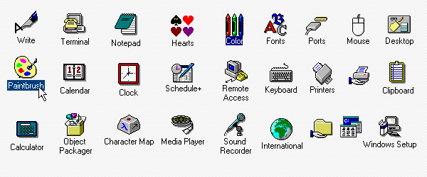
Just look at the GUI and the icons here! We’ve come quite a long way since 1995, haven’t we? Today I’m going to take a look at how icons have developed and changed over the years. To start, we’re going to have to jump back quite a bit before my first computer memories into a time before I was born: 1973.
Xerox Alto

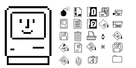
The Xerox 8010 Star’s icons laid the foundation for how future icons would develop.
As you can see, Calculator, Document, Folder, and Trash have barely changed!
The Xerox Alto debuted in March of 1973 and was the world’s first GUI (Graphical User Interface) based computer system. With only 2,000 machines worldwide, the Alto was originally built as a research computer and wasn’t available for commercial release. In 1981, the Xerox Star came out as the first consumer GUI computer. It incorporated many of the design features of the Alto and was the basis for how a lot of our computer icons developed over time.
1983 Apple Lisa

You can see that Lisa’s icons aren’t all that different from Xerox’s, except for the size and single pixel outlines.
The “preferences” icon, as time has gone on, has been replaced to look like a cog in most cases.
Apple’s goal with the Lisa was to make navigation easier for new users. To do this, they implemented drop-down menus, folder-based directories, and movable “Desk accessories” that were basically early widgets.
1984 Apple Macintosh
This was the first time an artist was brought in to design the icons.
Apple hired Susan Kare, who went on to do many other icon designs in the future.
Only a year later, Apple released its first Mac. The icons for this machine were clear and concise, plus they carried over certain things from their predecessors that made them instantly recognizable (notice that “Trash” and “file” are still very distinct). Apple’s goal was to remain user-friendly and boost themselves in the commercial market.
There are a few other developments between the 1984 Mac and what’s next on our list, but for brevity’s sake I am going to skip over them and into 1985, when Microsoft breaks into the market.
1985 Windows 1.0x

The Windows 1.0x icons weren’t all that fancy, and they didn’t include color.
Not to be outdone, Microsoft released its first GUI in 1985, just two years after Apple’s Lisa debuted. By the time it was released, Windows had color and all the usual GUI elements like scrollbars, window control widgets, and menus. Each application actually had its own menu bar (just below the title bar) attached to it, unlike the single menu bars on Lisa and Macintosh.
1991 Macintosh System 7

This was the first Mac OS with colors!
The icon images have changed slightly to be a little more dimensional - they appear slightly raised.
System 7 was codenamed “Big Bang” and was introduced on May 13, 1991. It remained Mac’s main OS until OS 8 in 1997, and added features like virtual memory, personal file sharing, QuickTime, QuickDraw 3D, and of course, an improved user interface.
1992 Windows 3.1
Microsoft hired Susan Kare to greatly improve the icon design for 3.0. For 3.1, she refined the colors and designs of the icons.
Windows 3.1 is my earliest memory of an OS (and of course, at the time, I didn’t even know what the heck an OS was). I rarely used it as intended, however, since I spent most of my time using the Navigator “alternative shell” that came with my dad’s Packard Bell computer. Although, the icon design pictured above was still evident throughout even Navigator.
1995 Windows 95

Hooray for isometric designs! Windows 95 was a complete design overhaul and includes elements that are still part of today’s designs.
The Start button made its big debut in Windows 95. The icons here have more color to them, and this version of Windows would also include updated elements for the taskbar, the menu, and of course, the famous Start button.
2001 Mac OS X v10.0
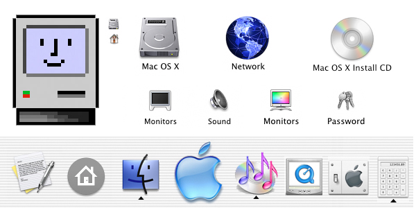
Skipping ahead a bit! According to one article I read, this Mac apparently earned the nickname “jelly mac”
for its ultra shiny and jelly-like finish on its icons.
This is the OS style I remember most vividly, since I used mostly Macs for video editing during my college years that started in 2003.
These icons are a huge leap in design from previous Mac OSes. Mac also added the Dock, which renders the icons from either a straight forward or slightly above point of view. These icons showed reflections and textures, and were a great draw for the user.
2001 Windows XP

Don’t forget about Windows! Microsoft overhauled their OS system again,
introducing a brand new OS with a saturated color palette and an illustrative look.
The icons in Windows XP use a single light source and have a semi-transparent drop shadow. Continuing with the isometric style, these icons were attention grabbing and cutting edge for the time.
2007 Mac OS X Leopard

Apple decides to up its game even further, opting for a very clean, flashy, exciting look.
Check out that 3D reflective doc! The icons sit on them and the use of chrome and glass reflections make this even more popular than before. The icons themselves are pretty much the same as they were in 2001.
2007 Windows Vista

It seems like Vista wanted to get in on the more “reflective” look of its icons in order to keep up with Mac’s innovations.
Interestingly, the icons in Vista are pretty different-looking from what Microsoft releases with Windows 7 later. The Windows 7 icons almost seem like a step back from the glossy, updated look that Vista showcases.
2009 Windows 7

I don’t know about you, but I clung to Windows 7 as long as humanly possible before I finally had to switch to Windows 8.
Windows 7 re-imagines its icons almost completely differently from Windows XP. These icons are “softer” and appear to be more glassy than their predecessors.
2012 Windows 8

I definitely did NOT love this version of Windows. If I’d known about Start8 back in college,
I’d have downloaded it immediately to avoid all of the menu headaches.
The successor to Windows 7 introduced some pretty big changes to the OS’s platform and user interface. Windows 8 was meant to be touch-optimized in order to compete with mobile operating systems like Android and iOS. The Start screen presents programs on a grid of tiles; white icons on backsplashes of color. Admittedly, I like the look here, but I hated the OS as a whole.
2015 Windows 10
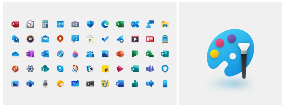
Windows 10 is where we’re at today.
Ah, good old Windows 10. It supports universal apps and the UI was revised in order to handle transitions between mouse-oriented interface and a touchscreen-optimized interface. It also introduced the Edge browser...which, admittedly, I never use personally.
The icons for Windows 10 are modern, sleek, and above all, recognizable.
Honestly, I really loved digging back through the last 40+ years of computer innovation and seeing how icons and imagery have evolved. If you're a fan of custom icons for your PC, make sure you check out IconPackager from our Object Desktop suite! You can replace the default Windows icons - lovely as they are - with cohesive and customized packages of icons that the app provides, or you can make your own! You can also change individual file type icons or recolor entire packages. I wrote a blog about it once upon a time.
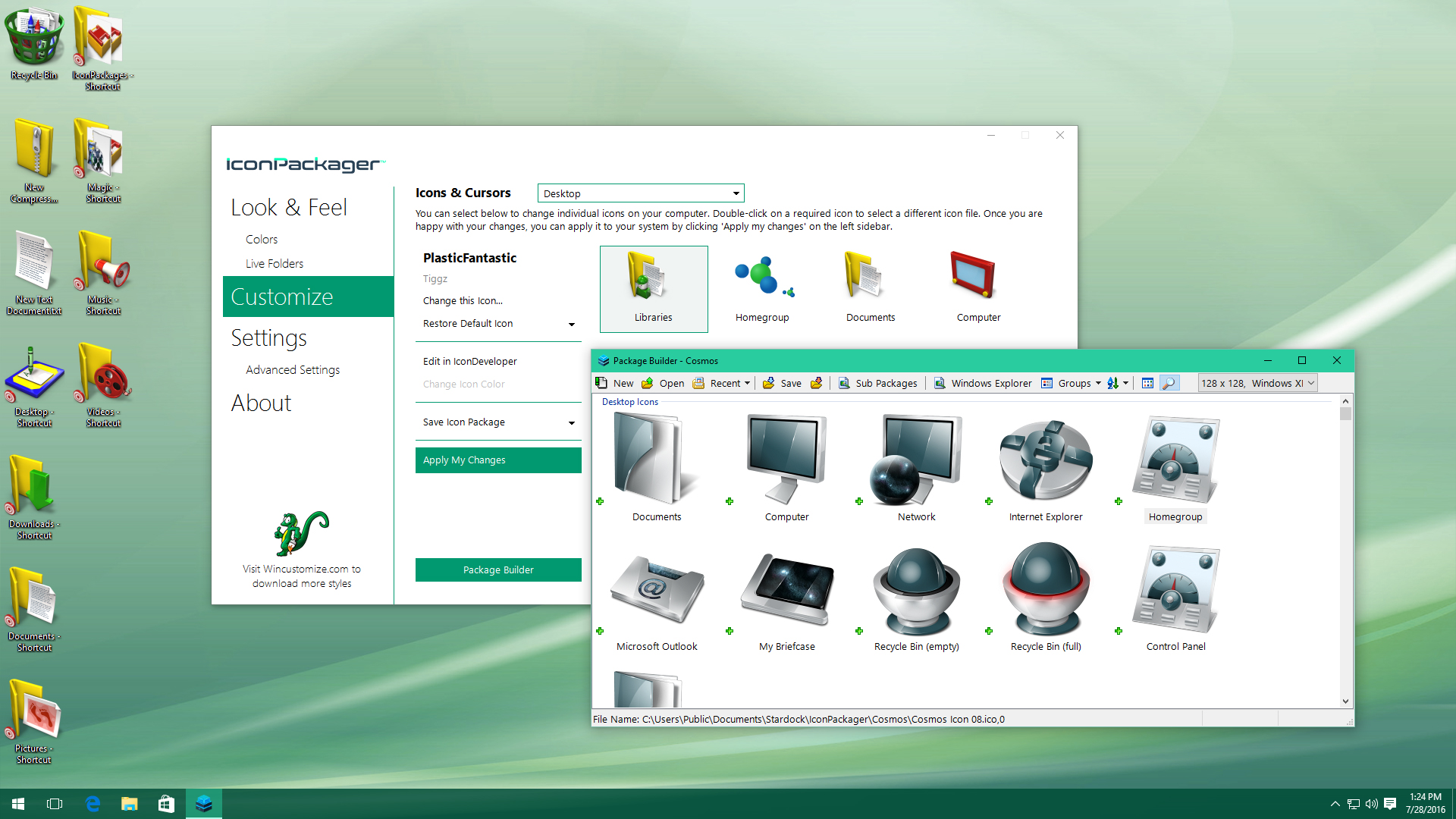
IconPackager will let you build your own icon sets with the included Package Builder!
Which OS has your favorite look? Did you ever use a Xerox Alto? Let me know in the comments!
Happy Halloween! Is your Desktop Spooky Yet?
Check out WinCustomize for all your holiday needs!
Thursday, October 29, 2020 by Tatiora | Discussion: Stardock Blog
Happy spooky season, everyone! Here at Stardock, we love two things: Halloween, and desktop customization.

Stardock Halloween 2019!
Actually, we love quite a lot more than just those two things, but stick with me here! Halloween is on Saturday, and unfortunately this year won't be filled with the usual trick-or-treating hullabaloo (normally I get 400+ kids in my neighborhood!). That doesn't stop me from decorating for the holiday anyway! I'll be turning my porch light off this year, saving around $80 on candy, and visiting with my sister, her husband, and my almost-one-year-old niece.
I don't actually own much in the way of Halloween decor (that's really my sister's thing), but I have a few pumpkins around the house and some spooky lighting. And, as soon as the Calendar flipped to October 1, I went over to WinCustomize.com and started looking through all of the customizations there so I could add some spooky flare to my desktop.
Several of our desktop applications offer unique customization for your Windows PC. The most popular apps for dressing up your desktop for the holidays is DeskScapes, which will let you apply static or animated backgrounds, called Dreams, and WindowBlinds, which lets you skin your desktop in lots of different ways.
Here are a few of my favorite Spooky Dreams and WindowBlinds skins to help you dress up your desktop this Halloween!

Spooky Halloween Forest With Bats by WC_Bot

Happy_Halloween_Night by cyberslober


NineHalloween Recut by doortech1
Is your desktop decked out for Halloween? Share your screenshots with me!