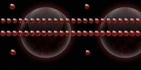
Dark Lava
Average Rating: 5
Yours: -1
File Size: 1.74MB
Downloads Today: 0 Downloads Total: 4479

Dark Lava

Updated Jan 28, 2009 by zigboom


First Previous Page 1 of 2 Next Last
sjc1963
Comment #1 Wednesday, January 28, 2009 8:49 AM
This s not a very good cursor set. They all look alike and they're all spheres, even the pointer.
zigboom
Comment #2 Wednesday, January 28, 2009 9:26 AM
Well, that's not so accurate... did you really try to use it? Just a little clearing info... *The pointer is the point where the rays are crossing on the left/upper corner. *if there is an active choice(button or hand for example)then it will roll *if there is a resize then it will roll and glow red *when it's clicked then it glows red or glows and rolls so you can always see the change from the normal stage *for various alternative stages(also very rare) it will glow red *when working in background or busy it will roll and glow red *text select and precision select are "normal" not round ... *there is even one backward rolling stage guess which one ... So, that's quite many stages already(5 different ones as i said).. if you actually use it you could see that it changes every time there is anything happening and it's doing so in a way that you'll know exactly what's happening. I could explain more about the different stages of the cursor but i'd rather just say, it's free to try Hope you'll like it if you'll try it
sjc1963
Comment #3 Wednesday, January 28, 2009 10:01 AM
It is still not very impressive.
SinbadKRT
Comment #4 Wednesday, January 28, 2009 1:01 PM
SinbadKRT
Comment #5 Wednesday, January 28, 2009 1:01 PM
I think it is nice for a non-pointer cursor and added that it is a 1st cursor I would say it clearly passes my test. �
djt0711
Comment #6 Wednesday, January 28, 2009 1:01 PM
sjc1963, Sorry- none of us realized when we woke up today that our goal was to impress you. Please forgive- we will certainly try to right this wrong.
zigboom
Comment #7 Wednesday, January 28, 2009 4:30 PM
Thanx for the support sinbadKRT and djt0711. That's a real compliment sinbadKRT, i was trying very much to make it usefull and accurate while staying round and pretty , that's why i made the hilite as a target so it's acurate on the pixel (that's the actual pointer ofcourse, the lava is for fun:). i even menage to work with it without any problems & even enjoy . Hope people like sjc1963 will bother to try before they judge , i've put alot into it and it can show only when it's really used. djt0711, i agree with you on this one, will try harder next time ...
olddss99
Comment #8 Wednesday, January 28, 2009 8:00 PM
I for one like it it is easy to use and it is pretty
snaarl
Comment #9 Wednesday, January 28, 2009 9:28 PM
This is SOOO beautiful and it works perfectly! Thanks very much, zigboom, I love it.
MouseGoddess
Comment #10 Thursday, January 29, 2009 12:05 AM
Not too many cursors being made lately, so the fact that you put in the work deserves a thanks, even before I've tried it!
zigboom
Comment #11 Thursday, January 29, 2009 7:02 AM
Hey, thanx for all the positive feedback. You're very welcome guys. oldss99 & snaarl, That's exactly what i need to hear... Thanx for the feedback also about how it works.. not less important ..(than looks ofcourse Thanx MouseGoddess, that's very nice to hear (specially after comments #1&3)... hope to hear from you if you try it, i'm very interested in the way it works for you doing the everyday missions. I actually work with it for few days and even doing some graphics ...
theAVMAN
Comment #12 Thursday, January 29, 2009 5:46 PM
Very different ,cool idea!
zigboom
Comment #13 Friday, January 30, 2009 3:40 AM
Thanx for your feedback(JourneyMan)theAVMAN, it means alot.. love your work!
RoxDad
Comment #14 Friday, January 30, 2009 8:45 AM
Don't listen to haters, the fact that you did such an imaginative, and artistic, cursor on your first outing deserves to be applauded. As for the working of the cursor itself, the pointer is very easy to see, and the animation is, as one user stated, beautiful. I am using it now... I prefer a very visable change for links, and thou this one does not turn into a finger, the animation is very clear. I am looking forward to your next project... Thank you for sharing.
zigboom
Comment #15 Friday, January 30, 2009 10:10 AM
Thanx RoxDad, that's very nice to hear .. i'll take your advice & plug my ears when hate comes around ... Thanx for sharing some real feedback about the design and usability.
BoXXi
Comment #16 Friday, January 30, 2009 7:25 PM
I like to see people do something different!! You certainly did that. Keep applying this kind of imagination and effort into all your work and you will do just fine!! Good stuff. Thanks for sharing......
zigboom
Comment #17 Saturday, January 31, 2009 6:02 AM
Thanx (Master)Boxxi for the compliments and feedback, it means alot and shows the way forward for all of us ...
aukaiknum
Comment #18 Tuesday, February 10, 2009 11:47 AM
$$$$$$$$$____$$_____$$_______$________$$$_______$$___$$_____$$____ ___$$________$$_____$$______$$$_______$$_$$_____$$___$$___$$______ ___$$________$$_____$$_____$$_$$______$$__$$____$$___$$_$$________ ___$$________$$$$$$$$$____$$___$$_____$$___$$___$$___$$$__________ ___$$________$$_____$$___$$$$$$$$$____$$____$$__$$___$$_$$________ ___$$________$$_____$$__$$_______$$___$$_____$$_$$___$$___$$______ ___$$________$$_____$$_$$_________$$__$$______$$$$___$$_____$$____
zigboom
Comment #19 Tuesday, February 10, 2009 12:13 PM
Welcome! thanx for all the $$$
GodSponge
Comment #20 Saturday, March 28, 2009 8:16 PM
First off, I think that it's very pretty, and imaginative. Some improvements could be made though. The first thing I noticed was that it is nearly inpossible to see the point of the cursor on white, which is what my mouse is over 90% of the time. Also, the glow that is around the outside is cut off at the edges of the image. The glow was essentially set to end outside the edge of the image.

Overall, great work though! Definitely great for a first time!

P.S. One thing that I've noticed about many of the cursors at wincustomize is that they all seem to be huge. These cursors cover up half or more of the tooltips when they appear. This makes it difficult to work with unfamiliar programs. Just something I noticed.

Please login to comment and/or vote for this skin.

Welcome Guest! Please take the time to register with us.
There are many great features available to you once you register, including:

  • Richer content, access to many features that are disabled for guests like commenting on the forums and downloading files.
  • Access to a great community, with a massive database of many, many areas of interest.
  • Access to contests & subscription offers like exclusive emails.
  • It's simple, and FREE!
Downloads remaining: 5
User Level: Visitor

Featured CursorFX

Popular CursorFX

Top CursorFX Skinners

Yesterday  |   Last 30 Days  |   All Time
1. Vampothika 856
2. BoXXi 817
3. B2R 686
4. JJ Ying 572
5. J. Aroche 489
6. 3java3 489
7. theAVMAN 486
8. neone6 452
9. rexorian 265
10. Gemmee 229
11. lMG0D5552666 225
12. Apocalypse_67 198
13. jalentorn 191
14. Erebus7 186
15. AeroPurple 168


web-wc01