|
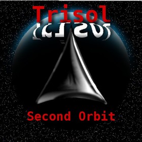
Trisol-Second OrbitUpdated Oct 26, 2010 by AlexStallard |
||||||
Comment #2 Wednesday, October 27, 2010 9:09 PM
I think it's awesome....sleek design and easy on the eyes. Awesome work! ![]()
Comment #4 Friday, October 29, 2010 2:00 AM
Another way to put my point (above) is that the transition to the i-beam equivalent is extremely smooth in Trisol. Smoothness is obviously valued in cursor design, but smoothness has degrees. Most designers are content to have no interruption before the i-beam equivalent's appearance. There no real transition in most cursors, even those made by most of the top designers. In my obsessive review of cursors, I've found only two designers who transition to the text instrument smoothly: J. Aroche and Alex Stallard. In one important sense, this puts them at the very top.
Comment #5 Saturday, October 30, 2010 12:01 AM
OK, one more try, since people are still e-mailing saying I'm unclear. An animation is smoothest when one form gradually evolves into another. ("Gradually" can mean over a fraction of a second, as in J. Aroche's work, or over a slightly longer time, as here.) The alternative--the one that describes almost all cursor designs--is that a quantum leap occurs rather than a gradual evolution. One minute it's a pointer, the next an i-beam. Here, instead of a quantum leap, you see a process of transformation.
Just try it. That probably easier than trying to understand the explanation.
Comment #6 Tuesday, November 9, 2010 12:25 AM
It blows bubbles. The transition is like glass. Very neat. Cute too. ![]()
Please login to comment and/or vote for this skin.
Welcome Guest! Please take the time to register with us.
There are many great features available to you once you register, including:
- Richer content, access to many features that are disabled for guests like commenting on the forums and downloading files.
- Access to a great community, with a massive database of many, many areas of interest.
- Access to contests & subscription offers like exclusive emails.
- It's simple, and FREE!


Comment #1 Wednesday, October 27, 2010 4:48 PM
This cursor has three strong reasons for its use: 1) It has the most ergonomic and intelligent approach to enhancing the i-beam (no, I don't know the author); 2) it has the most stunning "hand" substitute; 3) it is the product of the single-minded focus of one skinner, now in its fourth iteration--a unique and exciting approach to authoring cursors.
I think the cursor's name should advertise the cursor's virtues, like the first two did, but now the greatest virtue has changed. (In the earlier versions, the text adaptation was worse than the windows i-beam, but one learns only from error.) Ergosol comes to mind, but I'm not good at these things.
I think color is important to many users. It's important to me, and the color is a blue violet, my least favored color. I don't think in general it's overwhelmingly popular. Multiple colors might be the ticket, but this color might be critical--I just don't know--to your theme or purpose. T