Comment #2 Thursday, January 24, 2008 2:46 PM
Comment #3 Thursday, January 24, 2008 3:17 PM
See I like the reverse with space for my desktop icon and side bar. I think I might try something more like a picture frame for one of these. I also keep more space on the top and bottom for Object Dock. Its a matter of preferance I am sure.
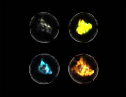
What would you suggest for showing some more firey and earth in energy form?
Comment #4 Thursday, January 24, 2008 7:25 PM
Beautiful colors and beautiful concept.�
5 stars from me..
D
Comment #5 Thursday, January 24, 2008 11:28 PM
Johhny Storm and Ben Grimm
I think of lava when I think of Earth energy, not green-ish plama. And the fire . . it looked rocky to me; like earth.
For the record . . I couldn't come close to making anythign that looked half as good. Thanks for sharing.
Comment #6 Friday, January 25, 2008 8:04 AM
It makes sense that Lava would be earth but I think more of fire with lava. I suppose I could have modeled up some rock doing it's thing but I didn't think people would find it as interesting.
Also thanks for the praise everyone.
Comment #7 Thursday, July 17, 2008 4:16 PM
Please login to comment and/or vote for this skin.
Welcome Guest! Please take the time to register with us.
There are many great features available to you once you register, including:
- Richer content, access to many features that are disabled for guests like commenting on the forums and downloading files.
- Access to a great community, with a massive database of many, many areas of interest.
- Access to contests & subscription offers like exclusive emails.
- It's simple, and FREE!


Comment #1 Thursday, January 24, 2008 2:40 PM
Is it supposed to be:
Air | Fire
Water | Earth
Fire and earth don't look really firey or earthy.
Also, usually I have windows near the center of my screen. I like to see a little more animation around the edges where I have desktop showing. . . but that could just be me.