


|
Vista ReflectionsUpdated Nov 19, 2005 by BP Marimon |
||||||
 |
|
Page 2 of 2 |
|---|
MillaMeter
Comment #23 Thursday, November 24, 2005 6:03 PM
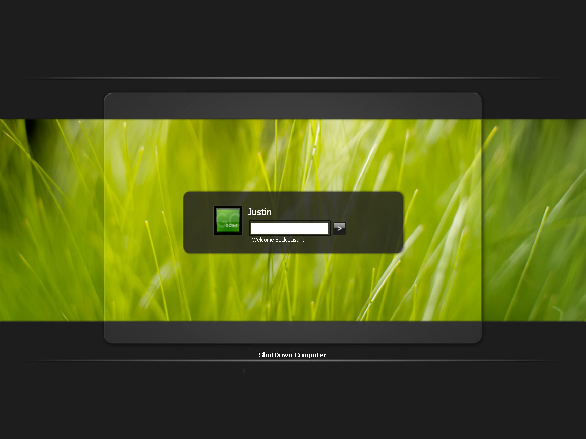
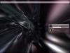
Sorry, but I kinda agree with shelbyGT here, I tryed the logon out myself and the buttons don't so much feel like they're apart of the vista theme. Like Yap3agentKC said, the password text comes up as some dodgey unknown font. The way you've layed it all out it not so much terrible, but it is badly scripted. If you have your monitor res other than 1280x1024 (which is the res you set it at), the picture stretches and doesn't look right.
Also, when you have more then 1 person user that uses the PC, they seem to go outside the black box in the middle and kinda looks weird
But all in all, it's a really nice design
Rated 3 stars
Comment #23 Thursday, November 24, 2005 6:03 PM
| This looks good - but you can do so much better with a real splash on the wall... That and adding the scroller to help others who have more than one acct. on there system. Ican show you how to complete that and even add the welcomes messages for the acct. also. Otherwise I rate this logon as a 3star - and with a vista look it should have the right images for it to really be part of any vista logon. SGT |
Sorry, but I kinda agree with shelbyGT here, I tryed the logon out myself and the buttons don't so much feel like they're apart of the vista theme. Like Yap3agentKC said, the password text comes up as some dodgey unknown font. The way you've layed it all out it not so much terrible, but it is badly scripted. If you have your monitor res other than 1280x1024 (which is the res you set it at), the picture stretches and doesn't look right.
Also, when you have more then 1 person user that uses the PC, they seem to go outside the black box in the middle and kinda looks weird

But all in all, it's a really nice design

Rated 3 stars
bmwchubb
Comment #24 Friday, November 25, 2005 8:11 PM
Comment #24 Friday, November 25, 2005 8:11 PM
I made one lol...With my own rendeers ....blah ....nice one ....
Hey p;us i watch yous
Hey p;us i watch yous

george757
Comment #26 Saturday, November 26, 2005 7:18 PM
Comment #26 Saturday, November 26, 2005 7:18 PM
AAH! My computer went into lockdown from it!!! It had some message saying code 40 failed or something 
It looks GREAT but I had to get rid of it

It looks GREAT
 but I had to get rid of it
BP Marimon
Comment #27 Monday, November 28, 2005 9:59 PM
Comment #27 Monday, November 28, 2005 9:59 PM
Wow, 10,000 downloads. Really makes me want to make the next release something really great. Stay tuned.
As for errors,I really don't know... I'm not really the skinner type that knows all that code and difficult stuff. I'd help if I knew what the issue was, sorry guys.
As for errors,I really don't know... I'm not really the skinner type that knows all that code and difficult stuff. I'd help if I knew what the issue was, sorry guys.

BP Marimon
Comment #28 Monday, November 28, 2005 10:48 PM
Comment #28 Monday, November 28, 2005 10:48 PM
Actually, as I begin work on the next version of this logon, I'd love to hear what you think.
At this point, I plan on fixing all the technical aspect, as well as give it a much more refined look.
I'd love to hear any and all ideas. They would certainly help, especually in the beggining stages of making it.
Send all ideas to GCTHawk7@gmail.com. Or just post them here.
Thanks.
At this point, I plan on fixing all the technical aspect, as well as give it a much more refined look.
I'd love to hear any and all ideas. They would certainly help, especually in the beggining stages of making it.
Send all ideas to GCTHawk7@gmail.com. Or just post them here.
Thanks.

Qx9
Comment #29 Tuesday, November 29, 2005 6:38 AM
Comment #29 Tuesday, November 29, 2005 6:38 AM
...or you could check this, which was made back in June 05: http://www.deviantart.com/view/19793505/ It's virtually the same as this logon...same buttons and all, even the strange artifact in the alpha channel on bmp128. Boss's gallery: http://boss019.deviantart.com/gallery/
- Web
- Web
BP Marimon
Comment #30 Tuesday, November 29, 2005 4:01 PM
Yes, that was kind of what I modeled it off of. I did use the buttons, I wasn't sure if I needed permission for that? I alsoused the... INI file I think, to get the format the same.
Comment #30 Tuesday, November 29, 2005 4:01 PM
| ...or you could check this, which was made back in June 05: http://www.deviantart.com/view/19793505/ Link It's virtually the same as this logon...same buttons and all, even the strange artifact in the alpha channel on bmp128. Boss's gallery: http://boss019.deviantart.com/gallery/ Link |
Yes, that was kind of what I modeled it off of. I did use the buttons, I wasn't sure if I needed permission for that? I alsoused the... INI file I think, to get the format the same.
Qx9
Comment #31 Tuesday, November 29, 2005 8:05 PM
Comment #31 Tuesday, November 29, 2005 8:05 PM
That's cool. Keep it up BP, you've got the basics down. - Web
- Web
jono san
Comment #32 Thursday, December 1, 2005 2:03 AM
Comment #32 Thursday, December 1, 2005 2:03 AM
I found your font problem...in UIFILE.txt you have the line
and it should be
Also, the font listed for that definition is "Zero Threes" which is a non-standard font. you should stick to arial or tahoma.
passwordcharacter: 679;
and it should be
passwordcharacter: 9679;
Also, the font listed for that definition is "Zero Threes" which is a non-standard font. you should stick to arial or tahoma.
compukeith
Comment #33 Thursday, December 1, 2005 10:44 PM
Comment #33 Thursday, December 1, 2005 10:44 PM
I think it's a great logon. I like a simple theme that just looks awesome. Can it be upgraded to the latest version of LogonStudio? I tried to edit it and ended up really messing it up because it didn't upgrade very well at all.
Otherwise, great theme and keep up the good work!
Otherwise, great theme and keep up the good work!
IKross
Comment #34 Thursday, November 13, 2008 2:18 PM
Comment #34 Thursday, November 13, 2008 2:18 PM
Very Sexuall  ! GREAT JOB!
  2 bad things; use a scrole bar for people that have more than one contact change the passwordd symbol. try * or black o's. over all... great!
  5stars
 ! GREAT JOB!
  2 bad things; use a scrole bar for people that have more than one contact change the passwordd symbol. try * or black o's. over all... great!
  5stars
Please login to comment and/or vote for this skin.
Welcome Guest! Please take the time to register with us.
There are many great features available to you once you register, including:
- Richer content, access to many features that are disabled for guests like commenting on the forums and downloading files.
- Access to a great community, with a massive database of many, many areas of interest.
- Access to contests & subscription offers like exclusive emails.
- It's simple, and FREE!
|
|
Page 2 of 2 |
|---|


Comment #21 Thursday, November 24, 2005 7:55 AM