Comment #2 Friday, June 9, 2006 9:52 PM

Comment #3 Saturday, June 10, 2006 10:00 AM
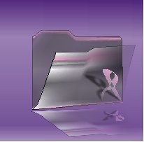
 Do you like the ribbon on the folder or off? not sure..My thinking was to put it on there since it is Breast Cancer Awareness lol. It is my first go at an icon pack--so, any input would be very helpful...Thanks
Comment #4 Sunday, June 11, 2006 10:55 AM
 I thought you were "Portraits." My bad!
Anyways, about the icon. Can I ask you what program you use to make icons with? The edges of these are quite jagged. They really should be made smoother, and the background needs to be made transparent.
Have you read any of mormegils tutorials on making icons? He shows you every aspect of making the icons, with videos, and also how to export them so they retain the quality of the icon as you made it.
http://mormegil.wincustomize.com/Articles.aspx?SID=83&AID=64104
At Skinartistry.com, we have a workshop that you can download your icons to, and have them tested before you submit them publicly. You may want to try that, too. http://design.skinartistry.com/news.php


Comment #5 Sunday, June 11, 2006 1:24 PM
Actually, I'm using Corel Graphics Suite12 and I have been viewing Mormegils Tutorials. I have also been having some problems transferring them after they're made with Icon Developer. I've been talking to a few folks and they have had the same issues, we're not sure if it's a bug between ID and Corel, but I've been "playing" some more and figured out how to work around the transfer between the two
 Po' has been very helpful as well..Anways----lol, I see what your saying about the background and edges. I work on that and thanks for input like I said this is my first go at a icon pack and I appreciate any help
Comment #6 Sunday, June 11, 2006 5:52 PM
For the transparency on the front part of the folder, did you use a linear type transparency from left to right? It seems more transparent to the right. But I believe you've left the ribbon fully opaque? You might want to try making the ribbon match the transparrancy with the folder, and/or also try using the uniform transparancy fill tool to make the front of the folder's transparancy more balanced. Once you start putting documents and pictures in the folder, you may want to see it more balanced.
Also, on your refelction, you may want to skew the right side of it up just a tad to meet with the bottom right side of the folder.
On my soapbox here: Since this is your first pack, I'd suggest forgoing the transparent folders.

Please login to comment and/or vote for this skin.
Welcome Guest! Please take the time to register with us.
There are many great features available to you once you register, including:
- Richer content, access to many features that are disabled for guests like commenting on the forums and downloading files.
- Access to a great community, with a massive database of many, many areas of interest.
- Access to contests & subscription offers like exclusive emails.
- It's simple, and FREE!


Comment #1 Friday, June 9, 2006 9:50 PM
I'm not going to vote on this because I have a feeling you may want to work on it a bit more... I'll check back vote on it later, okay????