Comment #2 Thursday, June 9, 2005 11:00 AM
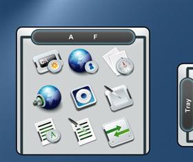
Well.....if and when these details are fixed, i will download, and complete my Tronnix suite! Honest opinion, i wouldnt put this next to such a perfect Suite!
P.S. the highlighted selected tab, would have sold me! Oh, and please dont take offense.......its just an opinion!
Comment #3 Thursday, June 9, 2005 11:25 AM

Comment #4 Thursday, June 9, 2005 12:58 PM
and cant u just make the entire dock like 10 pixels taller to compensate for the cutoff bit! Well sorry i had such a bad opinion!

Comment #5 Thursday, June 9, 2005 2:43 PM

It IS possible to highlight a tab, but the way this is designed, its as if the entire top section is one tab. I'm not sure how I could have any sort of highlight bit that wouldnt show up around all the edges of the dark bit, therefor making it look like both tabs were highlighted. As for making it taller, thats a possiblility, but then it really starts being obvious around the screen edges. I dont think it looks too bad...

Comment #6 Friday, June 10, 2005 3:26 PM
Please login to comment and/or vote for this skin.
Welcome Guest! Please take the time to register with us.
There are many great features available to you once you register, including:
- Richer content, access to many features that are disabled for guests like commenting on the forums and downloading files.
- Access to a great community, with a massive database of many, many areas of interest.
- Access to contests & subscription offers like exclusive emails.
- It's simple, and FREE!


Comment #1 Wednesday, June 8, 2005 8:36 AM