


 |
|
Page 2 of 2 |
|---|
cplair
Comment #22 Tuesday, November 20, 2007 10:13 AM
Well? You're a damn good teacher C-bo and this is my way of saying that I appreciate your lessons!� �
�
Thanks for checking it out my friend, color-synching and simplicity is one of your trademarks that I admire and in my attempts, what I try to convey!
The Maxstyles Team did a sweet job with Sexy, it's just addictive once you get it the way you want!
It's always an honor hearing from you C-bo, thanks again for being there for me dude!
Cp
� ���-->To Chasbo<--����
Comment #22 Tuesday, November 20, 2007 10:13 AM
CP: This is HOT!
Well? You're a damn good teacher C-bo and this is my way of saying that I appreciate your lessons!�
 �
�Thanks for checking it out my friend, color-synching and simplicity is one of your trademarks that I admire and in my attempts, what I try to convey!
The Maxstyles Team did a sweet job with Sexy, it's just addictive once you get it the way you want!
It's always an honor hearing from you C-bo, thanks again for being there for me dude!
Cp
�
 ���-->To Chasbo<--����
cplair
Comment #23 Tuesday, November 20, 2007 11:29 AM
Hey thanks for the visit and comment Kaazz, I'm glad you came by to check on things, hope you like the setup!
I really try to avoid putting out blue shots because they're so common, well I guess I flunked 'cause I couldn't resist using the Sexy components!
So since I'm not an artist or storyteller I wanted to once again express accessability and usage in my design.
I appreciate hearing from you my friend and I will try harder on the next concept!
Cp
����-->To Kaazz<--����
Comment #23 Tuesday, November 20, 2007 11:29 AM
Cplair back to buisness.
Hey thanks for the visit and comment Kaazz, I'm glad you came by to check on things, hope you like the setup!
I really try to avoid putting out blue shots because they're so common, well I guess I flunked 'cause I couldn't resist using the Sexy components!
So since I'm not an artist or storyteller I wanted to once again express accessability and usage in my design.
I appreciate hearing from you my friend and I will try harder on the next concept!
Cp
�
���-->To Kaazz<--����
cplair
Comment #24 Tuesday, November 20, 2007 11:37 AM
Here, let me stand up and applaud the man that really made all of this possible, Mr. John "vStyler" Gordon!
So you caught me using your stuff again huh JG?�
My hope with this design was to give all of the Sexy components the nobility they deserve!
You and the team aced this bad boy here John, I mean an incredible job all around!
I couldn't have done it without you bud, you're tops!
Mucho thanks dude, hit me up if you need some help on the next project!
Later;
Cp
����-->To Mr. vStyler<--����
Comment #24 Tuesday, November 20, 2007 11:37 AM
Mmmmmmmmm..... thats puuuuuurty.....PUUUUURTY SEXY !!!!
Here, let me stand up and applaud the man that really made all of this possible, Mr. John "vStyler" Gordon!
So you caught me using your stuff again huh JG?�

My hope with this design was to give all of the Sexy components the nobility they deserve!
You and the team aced this bad boy here John, I mean an incredible job all around!
I couldn't have done it without you bud, you're tops!
Mucho thanks dude, hit me up if you need some help on the next project!
Later;
Cp
�
���-->To Mr. vStyler<--����
RoseNell
Comment #25 Tuesday, November 20, 2007 11:23 PM
Comment #25 Tuesday, November 20, 2007 11:23 PM
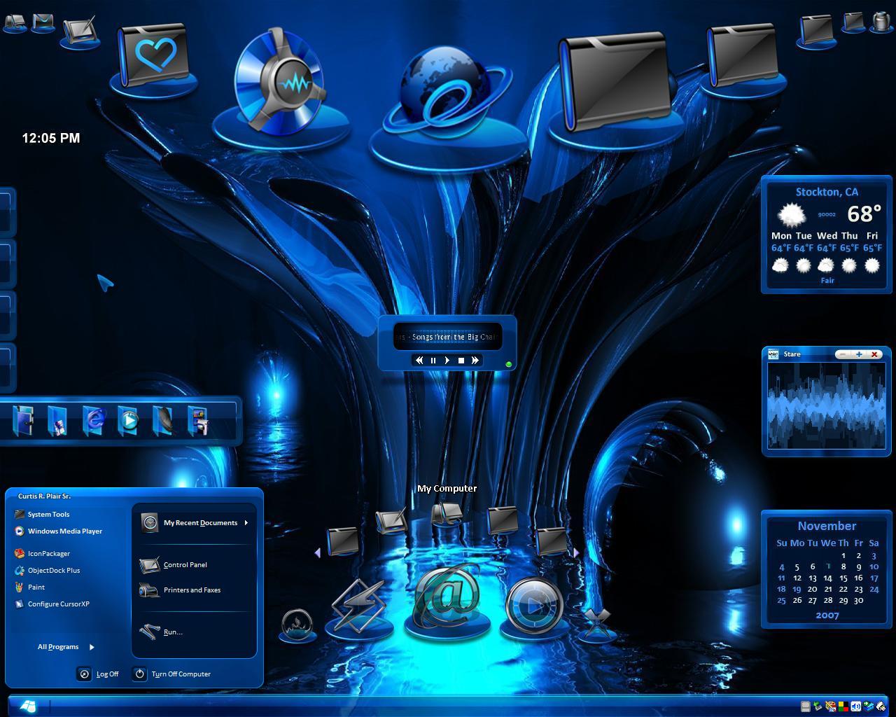
Blue , I love Blue, thats MY favorite color.. Beautiful screenshot cp.
You worked it....S E X Y ....... S M O O T H.....It certainly came together...��
Five from Me. DRC'd... ����������
You worked it....S E X Y ....... S M O O T H.....It certainly came together...�
�Five from Me. DRC'd... �
���������
cplair
Comment #26 Wednesday, November 21, 2007 12:23 AM
Awwwww thanks so much for the visit and the always warm comments MsRoseNell! Hearing from you makes an already good day, great!��
I'm glad you like the setup, blue is my all time favorite color if I had to choose one, but being that it's the most common color for PC customization, I was very nervous when I started to post this shot!
I wanted this blue shot to be different, something special, so I'm please at how it turned out. And even though "Sexy" has been showcased several times since it came out, I think this version with Atomnet's wall did pretty good for itself!
Thanks again for stoppin' by dear friend, it means a lot to me, and happy holidays to you and yours!
Cp
����-->To MsRoseNell<--����
Comment #26 Wednesday, November 21, 2007 12:23 AM
Blue , I love Blue, thats MY favorite color.. Beautiful screenshot cp. You worked it....S E X Y ....... S M O O T H.....It certainly came together...Five from Me. DRC'd
Awwwww thanks so much for the visit and the always warm comments MsRoseNell! Hearing from you makes an already good day, great!�
�I'm glad you like the setup, blue is my all time favorite color if I had to choose one, but being that it's the most common color for PC customization, I was very nervous when I started to post this shot!
I wanted this blue shot to be different, something special, so I'm please at how it turned out. And even though "Sexy" has been showcased several times since it came out, I think this version with Atomnet's wall did pretty good for itself!
Thanks again for stoppin' by dear friend, it means a lot to me, and happy holidays to you and yours!
Cp
�
���-->To MsRoseNell<--����
HG_Eliminator
Comment #27 Thursday, November 22, 2007 10:51 AM
Comment #27 Thursday, November 22, 2007 10:51 AM
Well built Curtis.. nicely organized and good Element matching. Colors are spot on.. 
My only suggestion would be to move the digital clock somewhere to where it looks placed .. Resting on the top of the Calendar widget may lend the clock an belonging/attached look.
My apologies to all for not commenting on everyones SS, but I as of lately am limited on time...
5 stars from me

My only suggestion would be to move the digital clock somewhere to where it looks placed .. Resting on the top of the Calendar widget may lend the clock an belonging/attached look.
My apologies to all for not commenting on everyones SS, but I as of lately am limited on time...
5 stars from me
cplair
Comment #28 Thursday, November 22, 2007 12:28 PM
Right on HG, thanks for coming by to check out the diggs, and a huge congrats on your feature!
Now, you know I'm still a student so any suggestion is a good one for me. And you're right about the clock, something small or minor like that can make or break the overall effect!
So I do dearly appreciate your suggestions and encouragement my friend.
Life happens, I wish I could just sit around daily and do this stuff, but there's work, bills, livelyhood all that. So no need to apologize because you couldn't make the time, even though you probably wanted to.
Thanks again for stopping by and leaving the great thoughts! Happy holidays to you and yours!
Cp
����-->To My Bud Mr. HG Eliminator<--����
Comment #28 Thursday, November 22, 2007 12:28 PM
Well built Curtis.. nicely organized and good Element matching. Colors are spot on..
Right on HG, thanks for coming by to check out the diggs, and a huge congrats on your feature!
My only suggestion would be to move the digital clock somewhere to where it looks placed .. Resting on the top of the Calendar widget may lend the clock an belonging/attached look.
Now, you know I'm still a student so any suggestion is a good one for me. And you're right about the clock, something small or minor like that can make or break the overall effect!
So I do dearly appreciate your suggestions and encouragement my friend.
My apologies to all for not commenting on everyones SS, but I as of lately am limited on time...
Life happens, I wish I could just sit around daily and do this stuff, but there's work, bills, livelyhood all that. So no need to apologize because you couldn't make the time, even though you probably wanted to.
Thanks again for stopping by and leaving the great thoughts! Happy holidays to you and yours!
Cp
�
���-->To My Bud Mr. HG Eliminator<--����
Duke261
Comment #29 Wednesday, November 28, 2007 4:36 PM
Comment #29 Wednesday, November 28, 2007 4:36 PM
Cp
Apologies...I was so wrapped up in my wounded ego I totally missed a beauty of a SS...YOURS. Personaly I can't get enough of this deep rich blue color so I'm still feasting on it. I love the way you arranged your Icons on top and reversed on the bottom Great job. 
Duke
Apologies...I was so wrapped up in my wounded ego I totally missed a beauty of a SS...YOURS. Personaly I can't get enough of this deep rich blue color so I'm still feasting on it. I love the way you arranged your Icons on top and reversed on the bottom Great job.

Duke
cplair
Comment #30 Thursday, November 29, 2007 1:28 AM
Hey Sir Duke thanks for stopping by to check things out, I appreciate any and all constructive comments, basically my work ethic demands that I display the utmost in quality, unique and highly usable features!
So any suggestions you have for me is a good one!
No need to apologize for feeling uncertain about your acceptance in the community and how your work is received Duke. I went through the same pain, elation and ambivalence.
Anyway, I glad you like the setup my friend, it's taken me a year and some frustration to get my designs to this point. And it's also an excellent blueprint for you to take your designs beyond!
Thanks again for the visit Duke, looking forward to years of friendship with ya!
Cp
����-->To Sir Duke<--����
Comment #30 Thursday, November 29, 2007 1:28 AM
Apologies...I was so wrapped up in my wounded ego I totally missed a beauty of a SS...YOURS. Personaly I can't get enough of this deep rich blue color so I'm still feasting on it. I love the way you arranged your Icons on top and reversed on the bottom Great job.
Hey Sir Duke thanks for stopping by to check things out, I appreciate any and all constructive comments, basically my work ethic demands that I display the utmost in quality, unique and highly usable features!
So any suggestions you have for me is a good one!
No need to apologize for feeling uncertain about your acceptance in the community and how your work is received Duke. I went through the same pain, elation and ambivalence.
Anyway, I glad you like the setup my friend, it's taken me a year and some frustration to get my designs to this point. And it's also an excellent blueprint for you to take your designs beyond!
Thanks again for the visit Duke, looking forward to years of friendship with ya!
Cp
�
���-->To Sir Duke<--����
AtomArts
Comment #31 Sunday, January 27, 2008 1:47 PM
Comment #31 Sunday, January 27, 2008 1:47 PM
Heh, have to bother you...kinda cant find all the icons u used in this one? Help? Links?
cplair
Comment #32 Sunday, January 27, 2008 5:29 PM
Not a problem at all my brother...
IP and Upper Dock: The Preface WWW Link
Left Bottom Tab: Sea Foam Energy Folders WWW Link
Lower Dock: Opus Black Collection WWW Link
Didn't know which one you wanted, so here's all of them!
Cp
� ��
�� �
�
Comment #32 Sunday, January 27, 2008 5:29 PM
Heh, have to bother you...kinda cant find all the icons u used in this one? Help? Links?
Not a problem at all my brother...
IP and Upper Dock: The Preface WWW Link
Left Bottom Tab: Sea Foam Energy Folders WWW Link
Lower Dock: Opus Black Collection WWW Link
Didn't know which one you wanted, so here's all of them!
Cp
�
 ��
�� �
�Please login to comment and/or vote for this skin.
Welcome Guest! Please take the time to register with us.
There are many great features available to you once you register, including:
- Richer content, access to many features that are disabled for guests like commenting on the forums and downloading files.
- Access to a great community, with a massive database of many, many areas of interest.
- Access to contests & subscription offers like exclusive emails.
- It's simple, and FREE!
|
|
Page 2 of 2 |
|---|


![Aero11 (Vista Edition) [Theme Preview]](http://skins17.wincustomize.com/40/19/4019518/13/28337/preview-13-28337-100x75.jpg?d=1677593646.38)
Comment #21 Tuesday, November 20, 2007 10:03 AM
What up Dwaine? As a fellow lover of Blue I'm glad that you approve of the effort!�
This one was loads of fun and I tried to keep things simple but informative and accessable!�
We do miss your designs around here bro, it'll be a great day when you get back to shooting again!
Thanks again for the props, hit me up on the chirp when you get a chance and let's see if we can get you up and running correctly!
Later dude;
Cp
�