


|
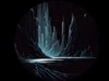
The WatcherUpdated Nov 03, 2001 by firescorpion |
||||||
cazzanova
Comment #2 Tuesday, October 30, 2001 1:04 PM
Comment #2 Tuesday, October 30, 2001 1:04 PM
looks cool, however its a little to red for me, the shape in the middle is great. but doesnt get the space it diserves with a similar backround!!
Try changing the surroundings and enhancing the centerpiece!
Just my opinion ofcource!
nevertheless...great job!!
Try changing the surroundings and enhancing the centerpiece!
Just my opinion ofcource!
nevertheless...great job!!
mooshoo
Comment #3 Tuesday, October 30, 2001 5:40 PM
Comment #3 Tuesday, October 30, 2001 5:40 PM
I agree (again) 100% with cazzanova. The wall looks great, but because everything is red, it all blends together too much.
firescorpion
Comment #4 Thursday, November 1, 2001 7:04 AM
Comment #4 Thursday, November 1, 2001 7:04 AM
Thanks for the tips. What would you think, perhaps a blue backround would be better? or green? apprecieate your suggestions 

mooshoo
Comment #5 Sunday, November 4, 2001 12:21 PM
Comment #5 Sunday, November 4, 2001 12:21 PM
Yes, I like this one much better. Good choice of background color, it uses the red to tie it all together but it's not overly red. Great job.
Transmutate
Comment #7 Sunday, November 4, 2001 4:46 PM
Comment #7 Sunday, November 4, 2001 4:46 PM
YES...this one is much better than the first....Great job in making a new version.
Nuvem
Comment #8 Sunday, November 4, 2001 5:21 PM
Comment #8 Sunday, November 4, 2001 5:21 PM
hey, what we have here?
listen to Cazz, you did a good job with the center piece but the wall looks a bit to busy with that lava/sea as background....and I�m not sure if I dig the blue n red combination...but looks cool tho.
listen to Cazz, you did a good job with the center piece but the wall looks a bit to busy with that lava/sea as background....and I�m not sure if I dig the blue n red combination...but looks cool tho.

queezendorf
Comment #9 Monday, November 5, 2001 1:43 PM
Comment #9 Monday, November 5, 2001 1:43 PM
looks alot like other pieces ive seen on here... mixed up objects in a spherical form. Intricate, but hard to look at. It doesn't flow. Color scheme is mixed. Easily could be made by throwing things together. It's just like splashing paint onto a canvas and calling it, "work." Suggestions, as i tols Sed, "try off setting your piece." Any time you put something smack dab in the middle of your work, theres only one statement being made. It doesnt leave much for a relationship between your focal point and the rest of your piece. Hence, "flow."
It could still work if you had made multiple objects or interest, perferably in a odd number like 3,5,7. It keeps it interesting. just a little critical huh? It helps and is always welcome back
It could still work if you had made multiple objects or interest, perferably in a odd number like 3,5,7. It keeps it interesting.
just a little critical huh? It helps and is always welcome back
firescorpion
Comment #10 Tuesday, November 6, 2001 2:06 AM
Comment #10 Tuesday, November 6, 2001 2:06 AM
Hi all, and thanks for your compliments suggestions and your critic!!! I really appreciate all your ideas and will keep them in mind, when i do my next wall, so far i have no idea what to create, but in time... I like the idea of queezendorf (multiple objects), so i probably will try something like that the next time.
Once again: THANK U ALL
I like the idea of queezendorf (multiple objects), so i probably will try something like that the next time.Once again: THANK U ALL
Please login to comment and/or vote for this skin.
Welcome Guest! Please take the time to register with us.
There are many great features available to you once you register, including:
- Richer content, access to many features that are disabled for guests like commenting on the forums and downloading files.
- Access to a great community, with a massive database of many, many areas of interest.
- Access to contests & subscription offers like exclusive emails.
- It's simple, and FREE!


Comment #1 Friday, October 26, 2001 7:16 PM
Actually.....I'VE BEEN "WATCHING"
............YOU..........