


|
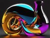
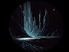
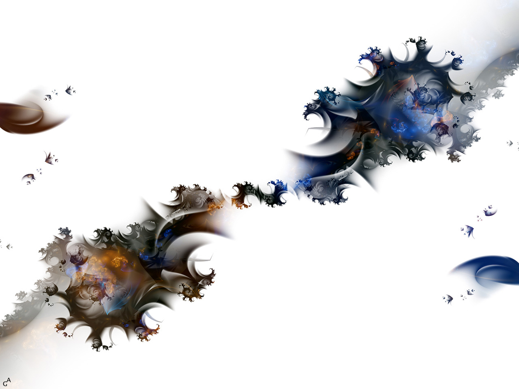
Autumn's BirthUpdated Oct 16, 2004 by Green Armani |
||||||

AtlanticCanadianScot
Comment #3 Saturday, October 16, 2004 7:05 PM
Comment #3 Saturday, October 16, 2004 7:05 PM
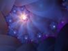
very richly detailed & the contrast of extension with the Jet White background showcasing the lushly detailed objects is breathtakingly original & totally in balance ......keep up the great work
Fond Regards from Atlantic Canada


Fond Regards from Atlantic Canada


Fuzzy Logic
Comment #4 Sunday, October 17, 2004 1:50 PM
Comment #4 Sunday, October 17, 2004 1:50 PM
Nice design with plenty of detail. I too would like to see less white though.
Aurath
Comment #5 Sunday, October 17, 2004 2:36 PM
Comment #5 Sunday, October 17, 2004 2:36 PM
Could I inquire as to the program that you used to make this? I've been using Apophysis, but this doesn't look like something out of that. I love this peice and i can't I would love to know how it was created.
aufisch
Comment #7 Sunday, October 17, 2004 4:41 PM
Comment #7 Sunday, October 17, 2004 4:41 PM
WOW, I am speechless....
I could stare at the rich details for hours..
Thanks a lot!
I could stare at the rich details for hours..
Thanks a lot!
Matchbook
Comment #8 Sunday, October 17, 2004 6:16 PM
Comment #8 Sunday, October 17, 2004 6:16 PM
aurath
Ultra Fractal was used. [I think hehe..]

Ultra Fractal was used. [I think hehe..]

I.R. Brainiac
Comment #10 Sunday, October 17, 2004 7:58 PM
Comment #10 Sunday, October 17, 2004 7:58 PM
very nice imagaery but the white gets to me too
jimmy_c
Comment #11 Sunday, October 17, 2004 8:18 PM
Comment #11 Sunday, October 17, 2004 8:18 PM
Awsome Wall G.A. would look cool also with a Light blue background...Thanx Again...
Green Armani
Comment #12 Monday, October 18, 2004 11:35 AM
Comment #12 Monday, October 18, 2004 11:35 AM
Hi everyone............thanks for all the comments........
This image was made entirely in Ultra Fractal 3.03 which you can freely download to test at this http://www.ultrafractal.com
As far as too much white..........that's the way I like it.....stark contrast to the fractal so that it's deep colors stand out more. Sorry if you don't like
This image was made entirely in Ultra Fractal 3.03 which you can freely download to test at this http://www.ultrafractal.com
As far as too much white..........that's the way I like it.....stark contrast to the fractal so that it's deep colors stand out more. Sorry if you don't like

Dreamsssss
Comment #16 Wednesday, October 27, 2004 2:57 PM
Comment #16 Wednesday, October 27, 2004 2:57 PM
One of my favorite walls, very well done.
MeltedCheese
Comment #17 Tuesday, November 9, 2004 9:13 PM
Comment #17 Tuesday, November 9, 2004 9:13 PM
this would be beautiful with a different back, the white is boring, maybe a pastel blue or peach?
Spion
Comment #19 Saturday, January 14, 2006 6:07 AM
Comment #19 Saturday, January 14, 2006 6:07 AM
I love this. Like the white & colors in it. Keep the good work man 

hellokitty000
Comment #20 Tuesday, February 14, 2006 1:12 AM
Comment #20 Tuesday, February 14, 2006 1:12 AM
this wallpaper is AMAZING bro keep it up 

Please login to comment and/or vote for this skin.
Welcome Guest! Please take the time to register with us.
There are many great features available to you once you register, including:
- Richer content, access to many features that are disabled for guests like commenting on the forums and downloading files.
- Access to a great community, with a massive database of many, many areas of interest.
- Access to contests & subscription offers like exclusive emails.
- It's simple, and FREE!


Comment #1 Saturday, October 16, 2004 6:35 PM