HL_2
Average Rating: 8
Yours: -1
File Size: 1.13MB
Downloads Today: 0 Downloads Total: 11488

HL_2

Updated Nov 25, 2004 by Apocalypse_67


First Previous Page 2 of 2 Next Last
Apocalypse_67
Comment #21 Thursday, December 2, 2004 4:07 PM
LOL Just make sure the label on the present doesnt say To: Apocalypse_67
Tempest2k4
Comment #22 Saturday, December 18, 2004 10:22 AM
Cool one! I played HL2 and it´s my game of the year! It took my 5 days. A bit short maybe but it took over a week for Doom 3 (just because in D3 i was scared ) Great work A-67!

-Daniel
Apocalypse_67
Comment #23 Saturday, December 18, 2004 2:35 PM
Thanks Daniel for the comment
soup2
Comment #24 Saturday, February 26, 2005 2:15 PM
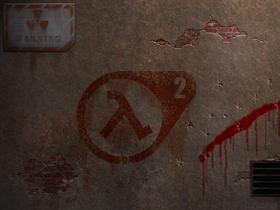
looks like crap
esspecially the 'blood' and the nuclear icon thingy rofl
123four5
Comment #25 Saturday, March 5, 2005 1:09 AM
Useless on a level you can clearly not understand.
Apocalypse_67
Comment #26 Sunday, March 6, 2005 12:18 PM
Hey 12345, maybe you can enlight us with your "not useless stuff"
Envy can be really funny some times
iamthemik
Comment #27 Thursday, September 29, 2005 10:09 AM
yea i agree. its not too great. i like the idea but not too much thought was put into the texturing. the blood is waaay too transparent. you shouldnt be able to see stuff thru the blood. also, this is true for everything in the picture, its WAY too clean. all the edges on everything are horribly smooth. it looks like youre trying to get a run-down kind of look so youd need to roughen up everything. the HL2 logo's edges are too straight as if it was printed on the wall. it should look more roughly painted. the wall itself is smooth as glass. concrete isnt that smooth. also your scale is off. looking at the size of the warning sign, blood, and logo; the bricks are tiny. concrete also doesnt crumble like that. use less contrast when showing depth of the cracks.

just giving suggestions. not like the assholes above
Apocalypse_67
Comment #28 Sunday, November 27, 2005 9:14 PM
This is exactly the way I like my designs.
All components of the design all well put together. Concrete cracks in a diversity of ways. Blood splater on a surface running down will get very thin/transparent. There is nothing clean about the design. The only smooth edges are those on the metal plate with the warning sign. The HL2 logo is supose to be sharp and printed on the wall. There is nothing smooth about the wall, the texture is an actual tiled picture of a real wall. The scale is right on point. The amount of contrast goes perfectly with the source point of light.

Thanks for the suggestions but the critic is way off base

Please login to comment and/or vote for this skin.

Welcome Guest! Please take the time to register with us.
There are many great features available to you once you register, including:

  • Richer content, access to many features that are disabled for guests like commenting on the forums and downloading files.
  • Access to a great community, with a massive database of many, many areas of interest.
  • Access to contests & subscription offers like exclusive emails.
  • It's simple, and FREE!
Downloads remaining: 5
User Level: Visitor

Featured Wallpapers

Popular Wallpapers

Top Wallpapers Skinners

Yesterday  |   Last 30 Days  |   All Time
1. AzDude 20086
2. Sed 10830
3. DEVJIT 3514
4. teddybearcholla 2892
5. Ghzamfir54 2737
6. Frankief 2275
7. 3java3 2201
8. WC_Bot 1408
9. kenwas 1143
10. madcat21 1024
11. Richard Mohler 890
12. vlad 877
13. neone6 837
14. BoXXi 780
15. Ton-K300 736


web-wc01