


Sketch01
Comment #2 Saturday, March 15, 2003 8:42 PM
Comment #2 Saturday, March 15, 2003 8:42 PM
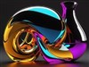
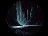
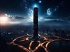
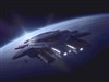
Interesting. However not quite balanced enough in my opinion. It is very heavy towards the centre with more graphic enhancements towards the bottom right. This leaves the left side sparse and essentially wasted, and though icons are likely to reside here, an equally poignant enhancement should ideally lie here. (For example: Half way down the left side introduce a series of tight horizontal lines that move toward an interconnected oval with the contents of the oval either zoomed or hued.) This idea could actually be better used a little furthur down, to coinside with the left 'eye' of the object. (With the contents of the oval zoomed  and hue matched to the redness of the bottom right corner.) You could then also include a schematic graphic of the close to the oval.
However, regardless of the above it is yet another valiant addition, please continue.... LOL
 and hue matched to the redness of the bottom right corner.) You could then also include a schematic graphic of the close to the oval.
However, regardless of the above it is yet another valiant addition, please continue.... LOL
Sketch01
Comment #4 Saturday, March 15, 2003 9:08 PM
Comment #4 Saturday, March 15, 2003 9:08 PM
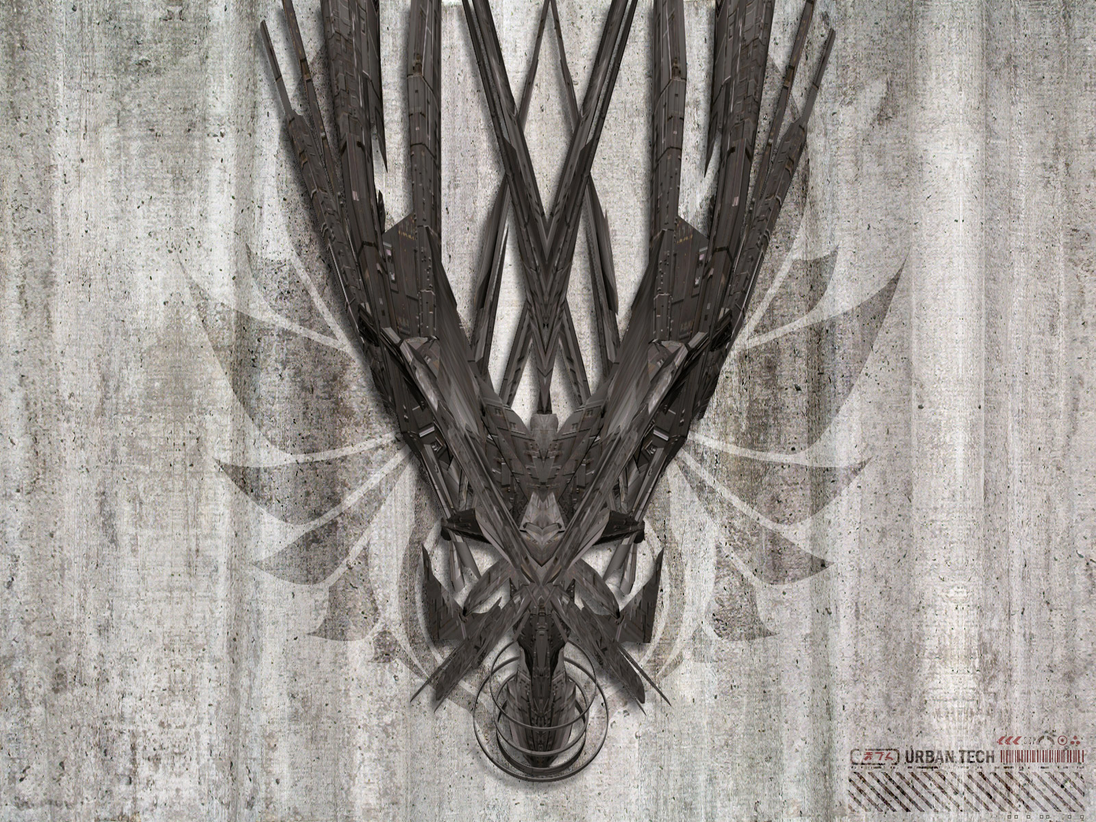
You would definately benefit in your schematic work I think if you were to implement some 'japanese?' symbolic pieces. Check out the cover art and instruction manuals of the 'Wipeout' series on PSOne for inspiration. 

Darco
Comment #5 Sunday, March 16, 2003 12:17 AM
Comment #5 Sunday, March 16, 2003 12:17 AM
I like it and I'm downloading it! It looks balanced to me, but then what do I know. It is very different from most art here.
SuperheroCanadian
Comment #6 Sunday, March 16, 2003 12:50 AM
Comment #6 Sunday, March 16, 2003 12:50 AM
thx for sharing, uve always been one of my greater inspirations, keep up the good work

adni18
Comment #8 Sunday, March 16, 2003 8:38 AM
Comment #8 Sunday, March 16, 2003 8:38 AM
Your art is great webdiod! 
But, we living in a very cruel world, so don't expect much, few comments and some bad ratings is all you can get!
In the other hand, I never saw you commenting in other authors works, so, don't you think that expecting something you never do to the others, is at least an outopia?
Your work is awesome in general! I really like it!

But, we living in a very cruel world, so don't expect much, few comments and some bad ratings is all you can get!
In the other hand, I never saw you commenting in other authors works, so, don't you think that expecting something you never do to the others, is at least an outopia?

Your work is awesome in general! I really like it!
DYSEQTA
Comment #9 Sunday, March 16, 2003 12:42 PM
Comment #9 Sunday, March 16, 2003 12:42 PM
shutup sketch01.... :/Very fine piece of work.If I was going to pick anything to constructively criticise it would be that the 3D rendered feature of this image is just a tad too matte. I felt that an ever so slight increase in specularity on the object's surface would have perfected the overall feel of the image. But that's just getting technical, it's your artwork and as such I am in no real position to 'suggest' anything as I don't know what you were trying to achieve. All I can say for sure is that it's a fine thing to look at Keep 'em coming.

Keep 'em coming. 
BoXXi
Comment #11 Sunday, March 16, 2003 9:19 PM
Comment #11 Sunday, March 16, 2003 9:19 PM
I think your wallpapers are some of the very best on this site. This is no exception. If you doubt the voracity of my statement, just click on Webdiod's name and scroll through his collection of stunning images.
Great work!
Great work!

joetheblow
Comment #12 Monday, March 17, 2003 3:28 AM
Comment #12 Monday, March 17, 2003 3:28 AM
Wow! Cool. I really like the style of it. Nice tones too.
Thornycat
Comment #14 Tuesday, March 18, 2003 1:14 AM
Comment #14 Tuesday, March 18, 2003 1:14 AM
it seems almost like a post-war piece. it reminds me of a kind of war symbol or idol ( i can't quite put my finger on it) . i think its an excellent piece. its already on my dektop. <---wheee!!!
<---wheee!!!
Tha_Gangsta_Nerd
Comment #15 Tuesday, March 18, 2003 3:51 PM
Comment #15 Tuesday, March 18, 2003 3:51 PM
hey gr8 pic i know my comments couldnt hold a caandle to may of the other that have been put up but gr8 work anyway i alove your site and the fact that u went thru so much trouble to put up a tutorial i wish some of the other users on wincustomize would do that anyway good work again 

SN4K3
Comment #17 Sunday, May 25, 2003 3:11 AM
Comment #17 Sunday, May 25, 2003 3:11 AM
Outstanding! Really pro quality. U have a nice vision. Big fan of no color ... and very designer. thx
thx
BloodMatrix
Comment #19 Tuesday, December 30, 2003 11:36 PM
Comment #19 Tuesday, December 30, 2003 11:36 PM
what can i say? this is TIGHT AS HELL!!! it has the quality of 3d art but doesnt look like all the other abstract 3d art i am sick of. has a GREAT futuristc taste, like something out of Independence Day. This has been my wallpaper for a while and i am still not tired of it.
regards,
bloodmatrix. graphic designer
regards,
bloodmatrix. graphic designer
BloodMatrix
Comment #20 Tuesday, December 30, 2003 11:38 PM
Comment #20 Tuesday, December 30, 2003 11:38 PM
addition: oh and the symetry really works great here. i sent this to all my friends ---they love it
Please login to comment and/or vote for this skin.
Welcome Guest! Please take the time to register with us.
There are many great features available to you once you register, including:
- Richer content, access to many features that are disabled for guests like commenting on the forums and downloading files.
- Access to a great community, with a massive database of many, many areas of interest.
- Access to contests & subscription offers like exclusive emails.
- It's simple, and FREE!


Comment #1 Saturday, March 15, 2003 8:15 PM